Exam Question:
Many photographers have explored detail. Using careful control of aperture, focus, lighting and background, Jo Whaley explores the detail in textures of groups of manufactured and natural objects. Henry Troup and Phil Straus have used camera position and control of depth of field to explore detail in close-up views of features in the landscape such as sand, water and the surface of rocks. Research appropriate resources and produce your own work that explores the visual qualities of detail.
Many photographers have explored detail. Using careful control of aperture, focus, lighting and background, Jo Whaley explores the detail in textures of groups of manufactured and natural objects. Henry Troup and Phil Straus have used camera position and control of depth of field to explore detail in close-up views of features in the landscape such as sand, water and the surface of rocks. Research appropriate resources and produce your own work that explores the visual qualities of detail.

WHY I PICKED THE THEME DETAIL
I chose this particular theme because of how much I can play and experiment with this it. I feel it is the most flexible and I can do a lot with it. This is my response to the theme 'detail'. These are my initial ideas and response to the theme, when I think of the theme, I think of the unseen, mundane, hidden, and overlooked details in objects. The things we are individuals pay no mind to. However, I think throughout the weeks of me exploring the theme, I think my ideas will change, I will use different media techniques to improve my overall idea.
I chose this particular theme because of how much I can play and experiment with this it. I feel it is the most flexible and I can do a lot with it. This is my response to the theme 'detail'. These are my initial ideas and response to the theme, when I think of the theme, I think of the unseen, mundane, hidden, and overlooked details in objects. The things we are individuals pay no mind to. However, I think throughout the weeks of me exploring the theme, I think my ideas will change, I will use different media techniques to improve my overall idea.
Initial response to detail
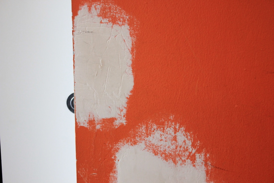
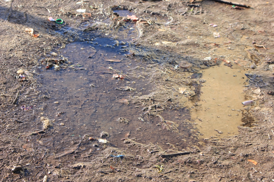
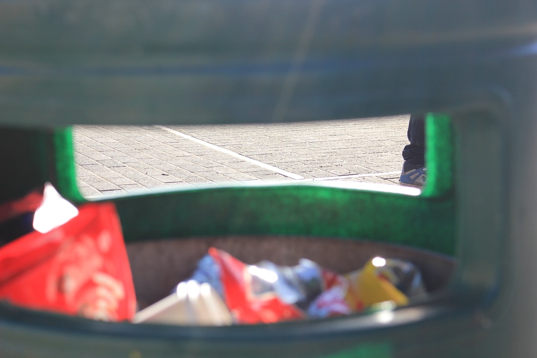
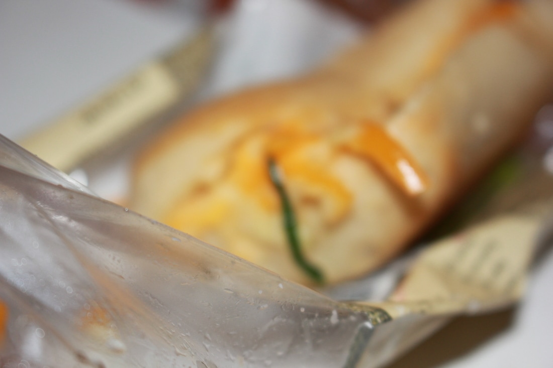
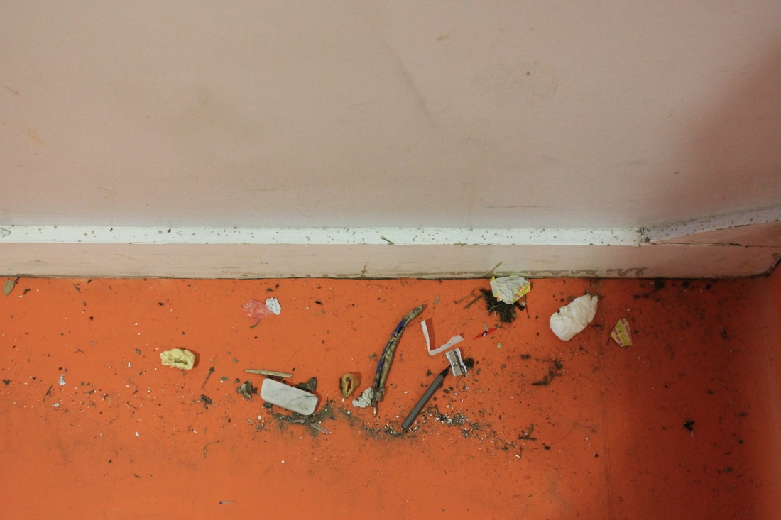
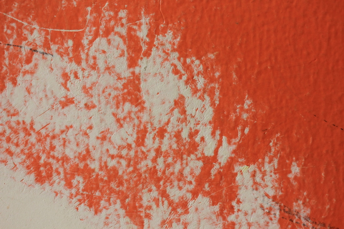
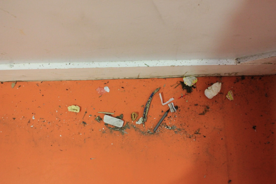
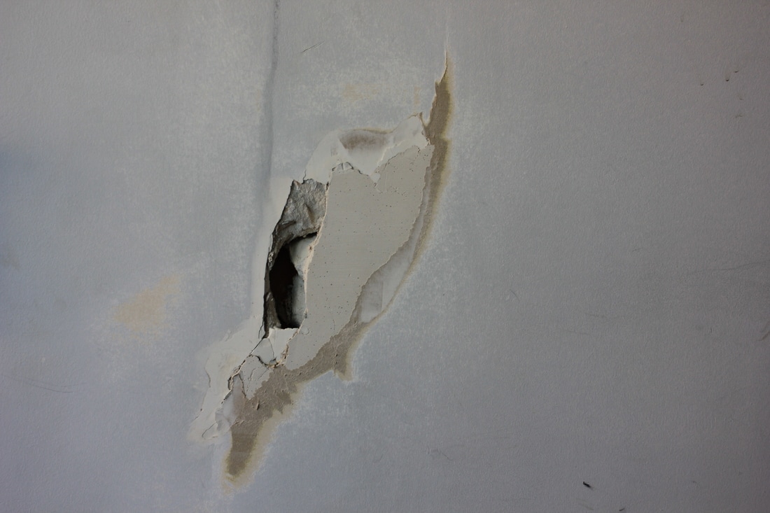
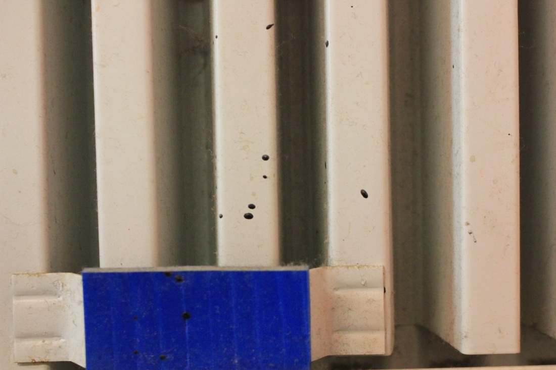
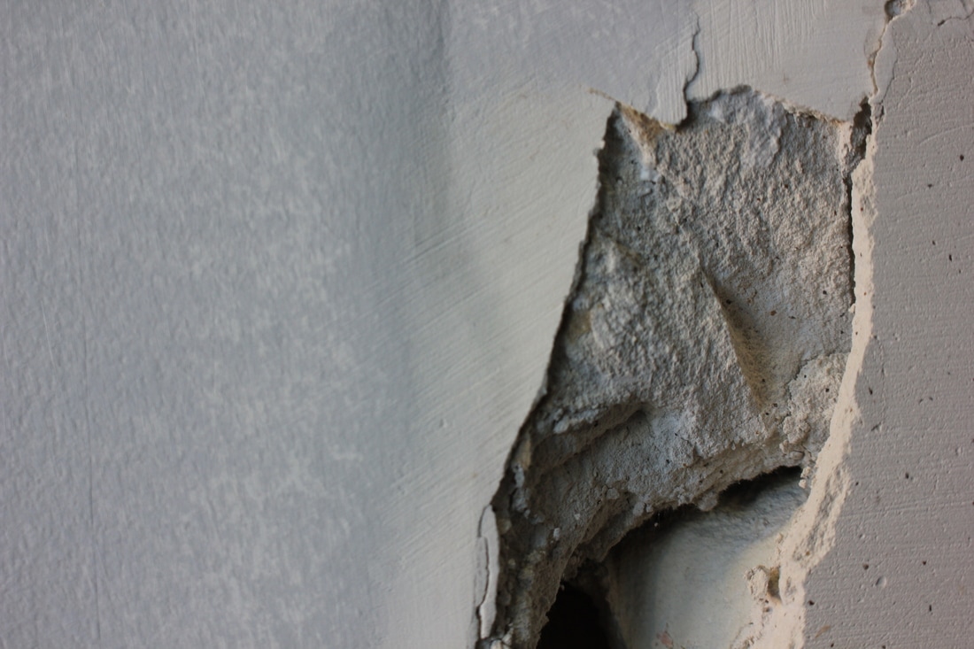
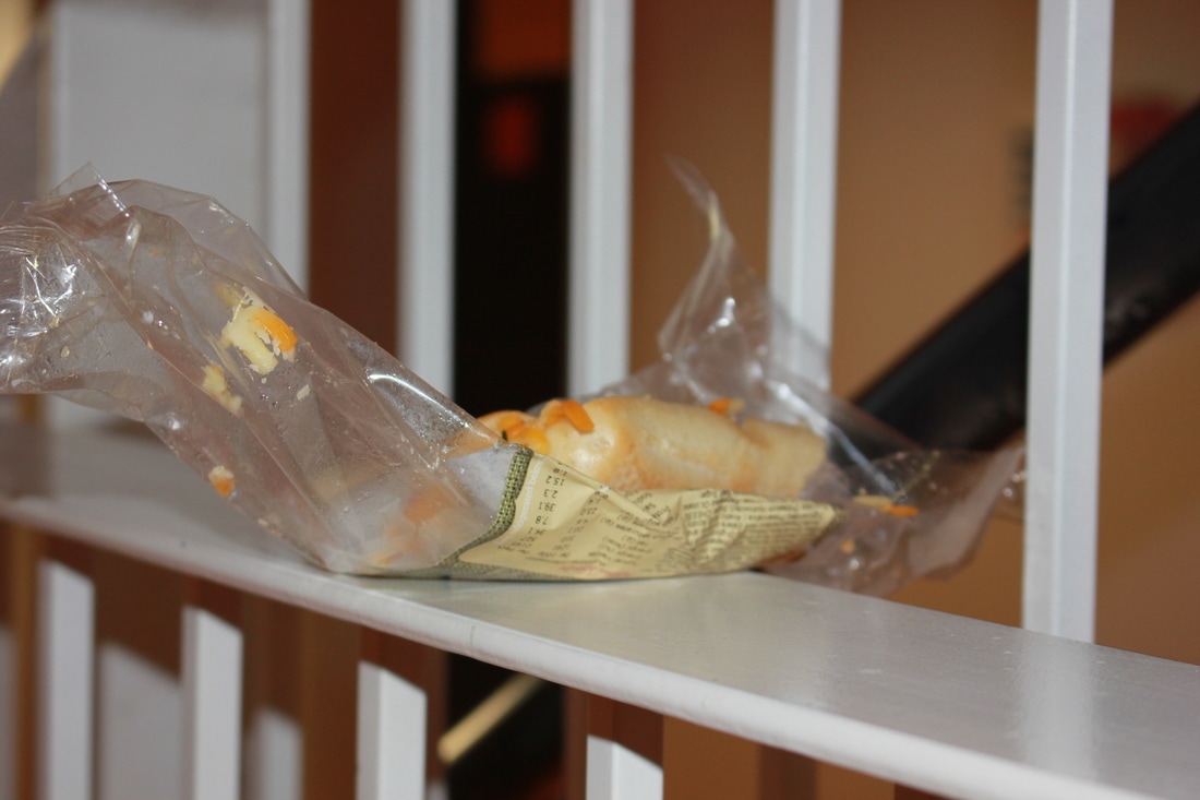
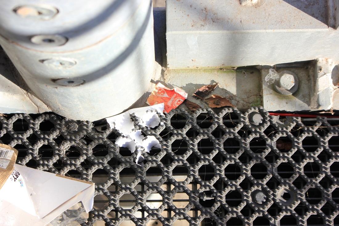
My first response to detail can be seen within the photographs above. Before conducting any research on the overall theme I aimed to interpret the theme by looking at the 'unseen' details in objects. All of the images represent my own understanding of detail and my overall aim for each photograph was to capture texture in order to emphasis the 'detail'.
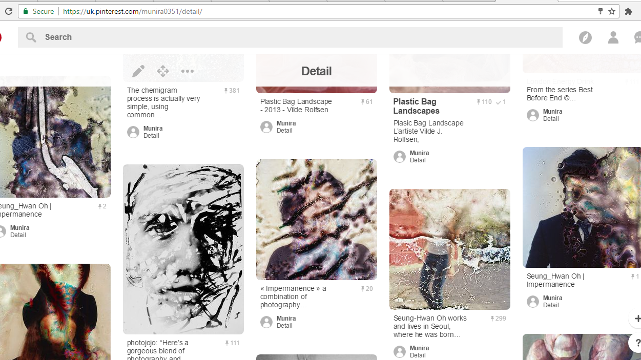
Pinterest of my chosen theme
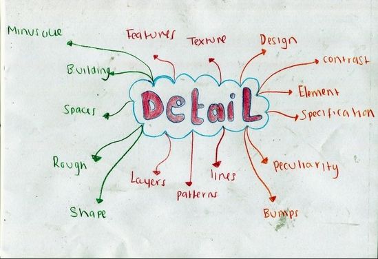
Mind-map
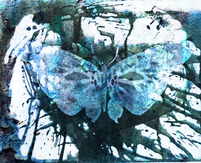
Jo Whaley and Keith Arnatt - Comparing photographs
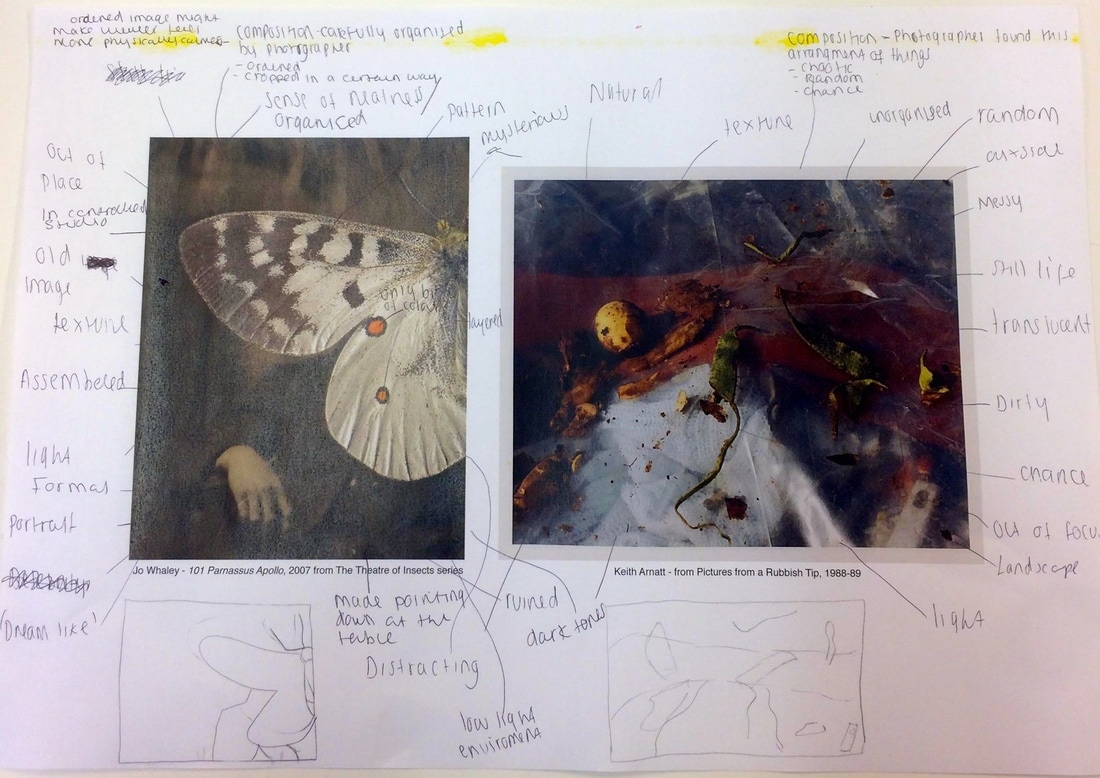
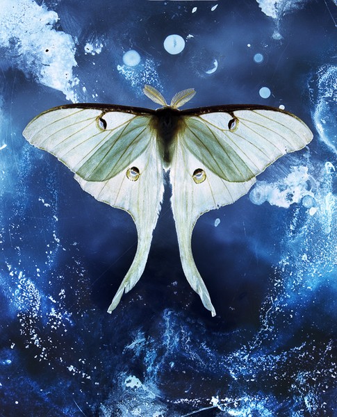
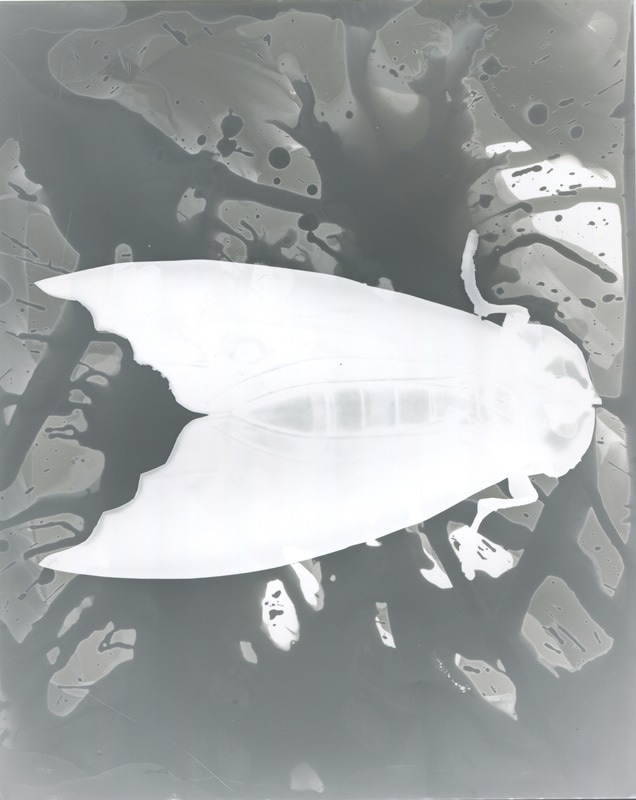
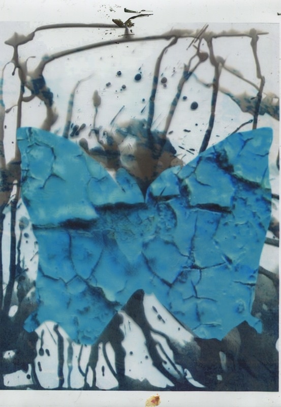
Jo Whaley's image I can clearly define what is in the images, which is a old that is maybe the 1930s because of its dark tones and the fact that it is not in colour. The photograph has a butterfly layered on top of it and seems to hold the only bit of colour. The photography underneaths looks like it was taken quite a while before Whaleys images. I would describe the image as neat, organised and surreal. It almost seems 'dream-like', it is not like anything I have seen before. The thing that is recognisable in Whaley's image is the butterfly. The photograph underneath is old and looks to be something personal, there are scratches on it which could suggest that it was cherished by someone before and the photograph was something they looked at a lot. The part of the person's clothing that I can implies that the photograph was taken sometime between the two World Wars.
In Arnatt's photograph I can see rubbish and bits of decayed foods. Also, I can see clothing and other random objects. It is hard to say what I can actually see because there is a sheet of plastic obscuring the objects underneath. I'd describe Arnatt's photograph as messy, dirty and chaotic, it is the opposite of Whaley's image. It's hard to distinguish what some of the things in Arnatt's photograph because of where is was taken. Since the photograph was taken at a rubbish tip, I don't believe its purpose was for us to understand or recognise what we are looking it. At first glance it is quite obvious the photographs are complete opposites, however, there are some similarities.
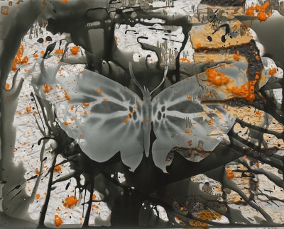
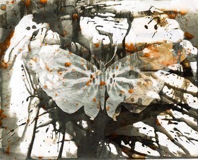
Whaleys photograph remind me of any other photograph I have seen before. I think the fact that it has a insect covering most of the image is what makes it stand out compared to the other images I have seen as they don't use insects to cover the main subject of the photograph. Whaley's and Arnatt's both have dark tone suggesting they were taken in a low light environment. In my opinion this is one of the minimal similarities. In addition, the only bright colours in the two images are orange the dots on the butterfly and the yellow skin of the potato. The patterns on butterfly of Whaley's photograph are really interesting because I feel as though they are the only 'life' in the whole photograph, this could suggest Whaley used a real insect for the image. In addition, the ridges on the edges of the wings reflect some of the light meaning the photograph could have been taken in a studio.
I think Whaley's image is linked with something about the past because of the aged photograph she used in the background, it might also symbolise the old and the new beginning, as a butterfly is an insect that is first a caterpillar and the transforms into a beautiful new insect. Arnatt's could possibly be about two things; the way we treat the environment or about just simply about the interesting and random things that can be found in a tip. I think it is all about perspective, and how the photographer interpreted it, so it is hard to say exactly what it is about.
Jo Whaley
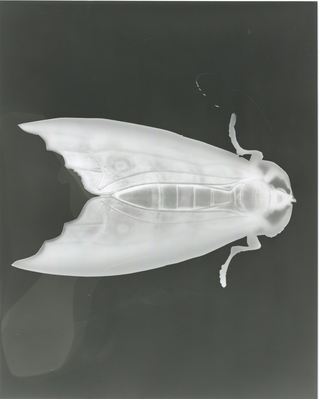
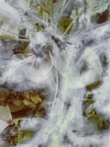
Jo Whaley uses a lot of insects in her work that have a lot of bright and bold colours and intract on their bodies which interests me a lot as it does link to my chosen theme. Whaley explores natures detail and the structures, patterns and designs of the insects. I think her work relates to my theme really well have because in her photographs, there is not an over load of things to take in, therefore, you can admire the subtle detail of the insects and strong ones of background.
Jo Whaley uses a lot of insects in her work that have a lot of bright and bold colours and intract on their bodies which interests me a lot as it does link to my chosen theme. Whaley explores natures detail and the structures, patterns and designs of the insects. I think her work relates to my theme really well have because in her photographs, there is not an over load of things to take in, therefore, you can admire the subtle detail of the insects and strong ones of background.
Analysis
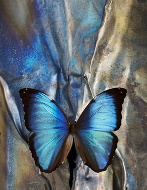
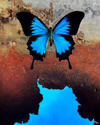
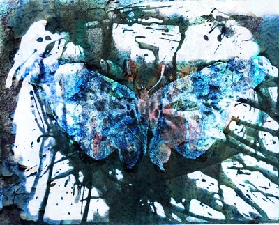
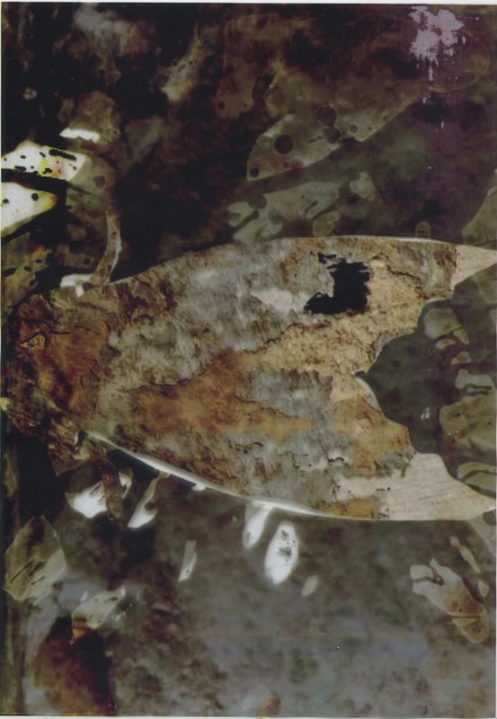
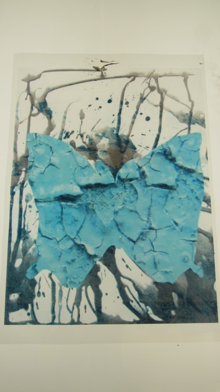
In this image I can see a butterfly that is placed on top of a metallic looking material that has different shades blending together. The image is very shiny and I can tell a lot of light was reflected back from it. This image is my favourite out of Whaley's images because it is naturalistic as it uses a butterfly. However, it can also be seen abstract because of the background and how the colours merge together well, also the the radiant colour of the butterfly which somewhat matches the background. The formal elements that are used really well in this photograph is texture and tone because I feel like I can almost feel smooth and silky texture of the butterfly. The element of tone was applied well because there are a lot of tones and contrast within the image that stand out. I feel as though this might have been taken in studio because of the light that it reflected back from the surface of butterfly and the material used background. All of image is in focus and I think so of the surroundings have been cropped because it we do not see the whole surround of the subject, but just what the photographer wants us to see. I think Whaley did this so so focus on in insect because she is interested in the their designs and patterns on their bodies.
The whole photograph strikes and captivates me because I have not seem something thing this done before, in addition, the colours of the material are so intriguing because I am still unsure of that background it really made of. I think this photograph is about nature due to the beautiful designs. Whaley is really interesting in exploring the structures, textures of the insects. She says in an interview ''As with all aspects of nature, their colors, structures, and desings are marvel and an inspiration...With some insects the visual design on their bodies serve a purpose for camouflage and mimicry.''
In my opinion, the most effective thing about this image is how the background, insect and colours all come together in a really sophisticated way. Everything in Whaley's images compliment each other and composition is simple and ordered. However, it would have been fairly interesting to see what the image would have looked like had there been small insects scattered around, or if the wings were bent as if ready to fly. What I thing people will remember most about this photograph is how the background and insect compliment on other very well. Overall, what I have learnt from Whaley is to not be scared to go for the vibrant colours and try risks like using insects.
Jo Whaley response

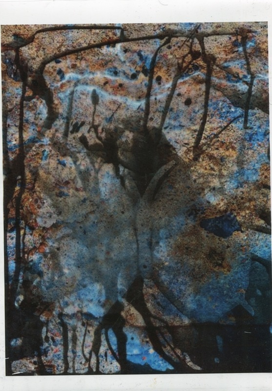
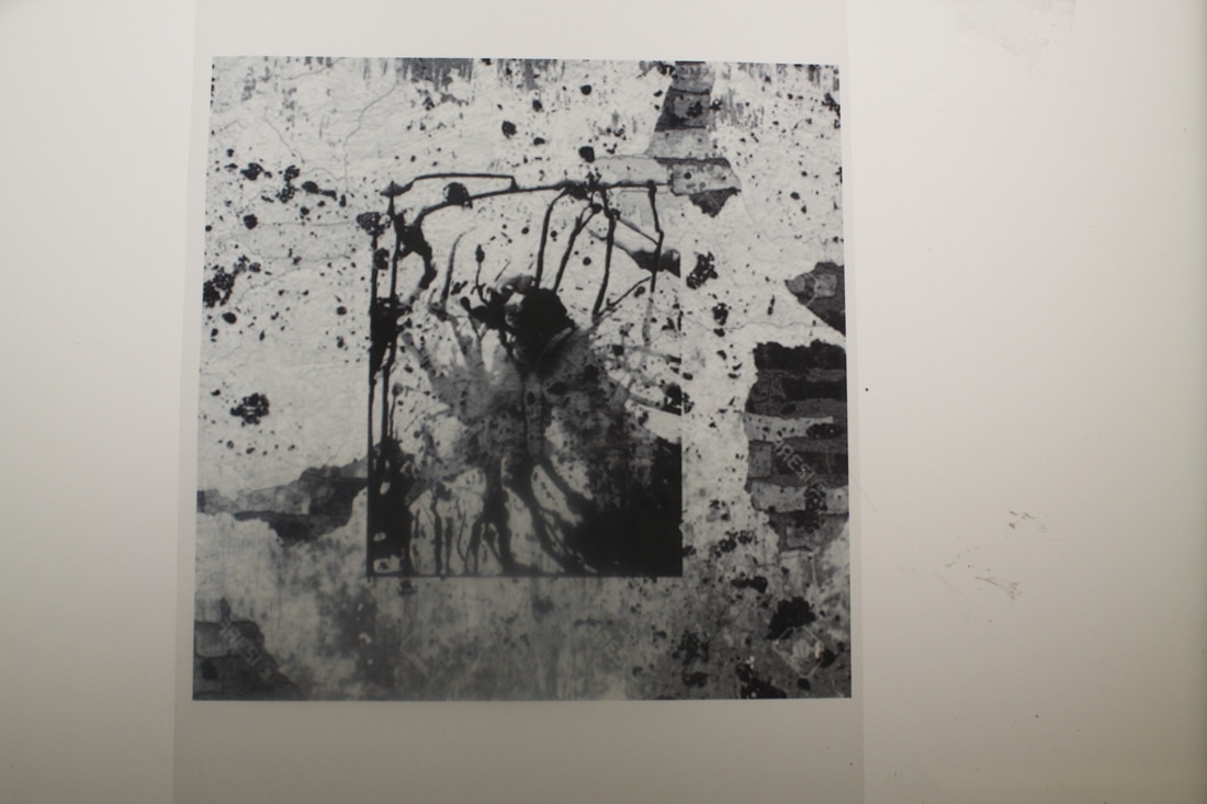
These photograms are my first response to Jo Whaley. To create these images, I first printed basic insect images from the internet, which I cut the outline of using the scalpel. I chose insects that had strong and bold patterns so that it could appear in the photograms, even though Whaley's insects in the photographs do not have such patterns, I thought I would try this with my images are there is a lack of colour. The first photogram is really dark and the outline of the insect cannot be clearly seen, this is because I let it be exposed to the light longer than it should have. Therefore, in my next attempts I left the light on for a shorter period of time so that the patterns of the butterflys could be seen. In the developing stage, I decided I would paint/ splash the chemical onto the photographic paper instead of just doing it the conventional way and dipping the whole paper into the developer. I did this because I thought it would look less boring and simple, also I wanted it look like something was going on behind the insects. In Whaley's photographs there is always something going in the background, it is subtle as to not take out attention any from the real subject but there is vibrance to it. That is was I was trying to achieve here. Overall, I am please with these photograms, I think they show my understanding of Whaley's work clearly however, I think to improve and to further develop this idea, I think I will try and add coloured ink or some type of colour to the white areas, that it can contrast with the black areas.
Brandon Seidler
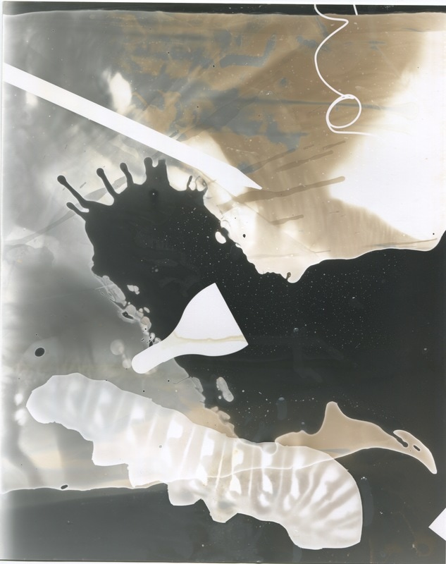
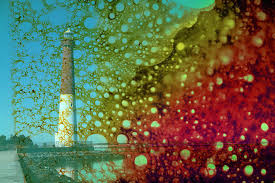
Seilder is a photographer I found whilst on Pinterest and I found is photographs to be really beautiful, the colours and how they all blended together is what drew my in the most. I did some research on him and found out how he makes them. He calls these series of photographs ''Impure Photography'' he treat the photographs how we treat the environment. Seidler uses harsh chemical to develop his films to illustrate and the result of that is loud colours and strange patterns. The most fascinating thing about these images for me it little detail it produces. For example, the in the send on image the circles become minuscule as they move down the page. In addition, I like that way that the colours just flow together, there is no end point to one or the other. The below is Brandon Seidler explain the reasons behind his photographs and how he did it.


Analysis
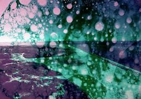
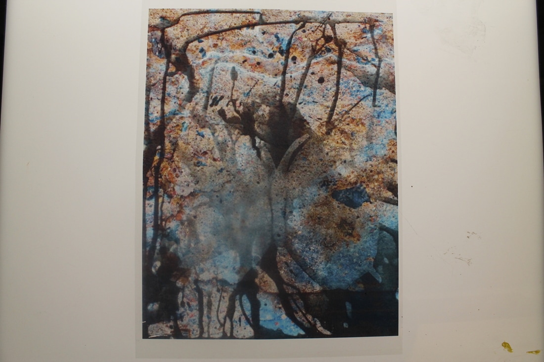
In this photograph I see what seems to look like a piece of land or maybe a beach because there is light strip of the photograph which contrasts with the dark parts, I assume that this is meant to be the ocean. This is photograph is really destructive with harsh random patterns, makes sense as with is what Seilder was trying to convey. I do not recognise anything specific in this photograph due to the chemical distorting. I think this photograph is a cross-over between naturalistic and abstract because Seilder took photographs of the the natural world, however, he made it abstract by adding the hard chemicals to it. This method of adding the chemical made it abstract because now I cannot tell what the photograph is actually of, also I can't tell where something starts and where it ends.
To create this effect the photographer used a DSL camera to take photographs of the landscapes in his town that have been contaminated with the toxic spills or. Over some time, Seilder experimented with the same chemicals that damaged the sites, the results of this is truly outstanding. Seilder was so able to replicate the chemical makeup of specific spills. Light is represent really well in this photograph, the chemical move from a really dark tone to a light tone. The way the colours flow together in a really swift way, elegant way looks like they are in a solution of a sort. Through research I have learnt that Seilder was inspired to create these series of photographs because of the environmental issues in his town. Understanding this, it makes sense as to why the photographs look destructed and destroyed. The chemical created an effect of making the circular shapes slowly ''dissolve'' down the paper.
What is really effective of this photograph is definitely how all the colours blend together, and the dynamics of them. They are just so vibrant and luminous. On the other hand, what does not work so well with the photograph is what it is actually of. For example I think the landscapes that Seilder was taking photographs of were quite dull, however, it makes sense why he chose them due to the reasoning behind them. In my opinion, people will always refer to the colours and patterns in this photograph and that it what they will remember because that it what stands out the most to people even before they have processes what it is. What I have learnt from this photograph is to try new things when it comes to photography, and not to just repeat something you've done in the past.
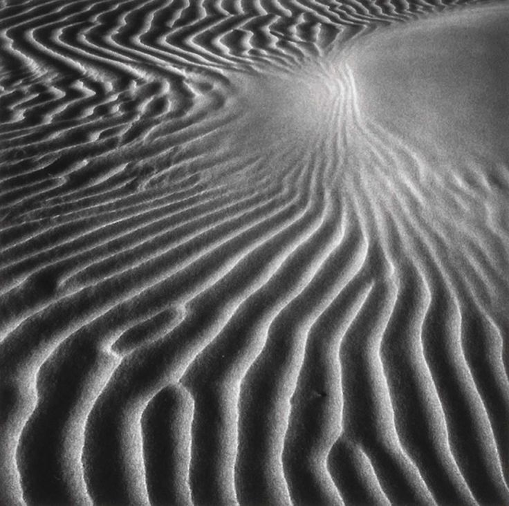
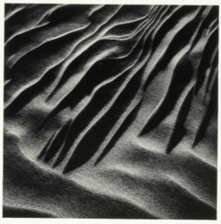
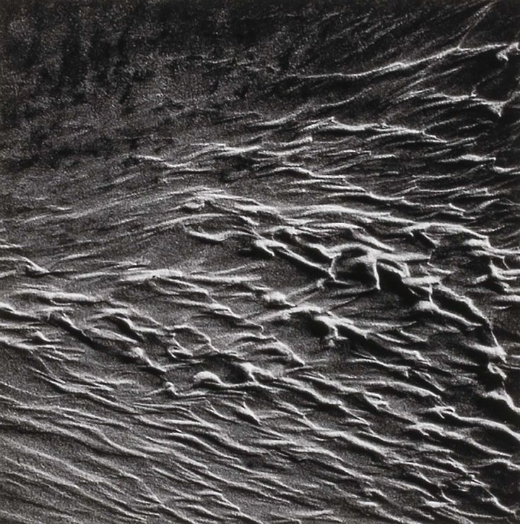
Henry Troup
Henry Troup's photographs mainly consisted of abstract detail in the sand and beaches. His work is really interesting because the first that came to my mind when I looked certain photographs of his is not beaches and sands, it took my a while to process what was really going on in his photographs. The way the light reflects off of some of the sand and dents and the stone like texture of it, is what made me think Troup was just photographing the ground. The shapes, lines and shadows in his photographs make up for the lack of colour because these features are so strong anyways. The contrast is really high so the lines are much more prominent.

Henry Troup response
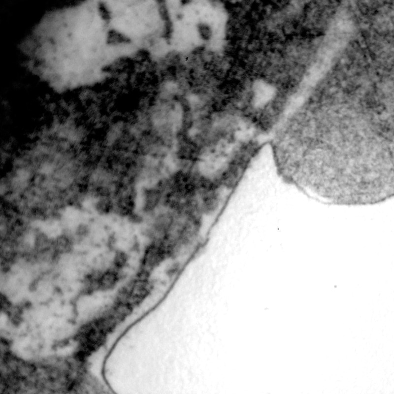
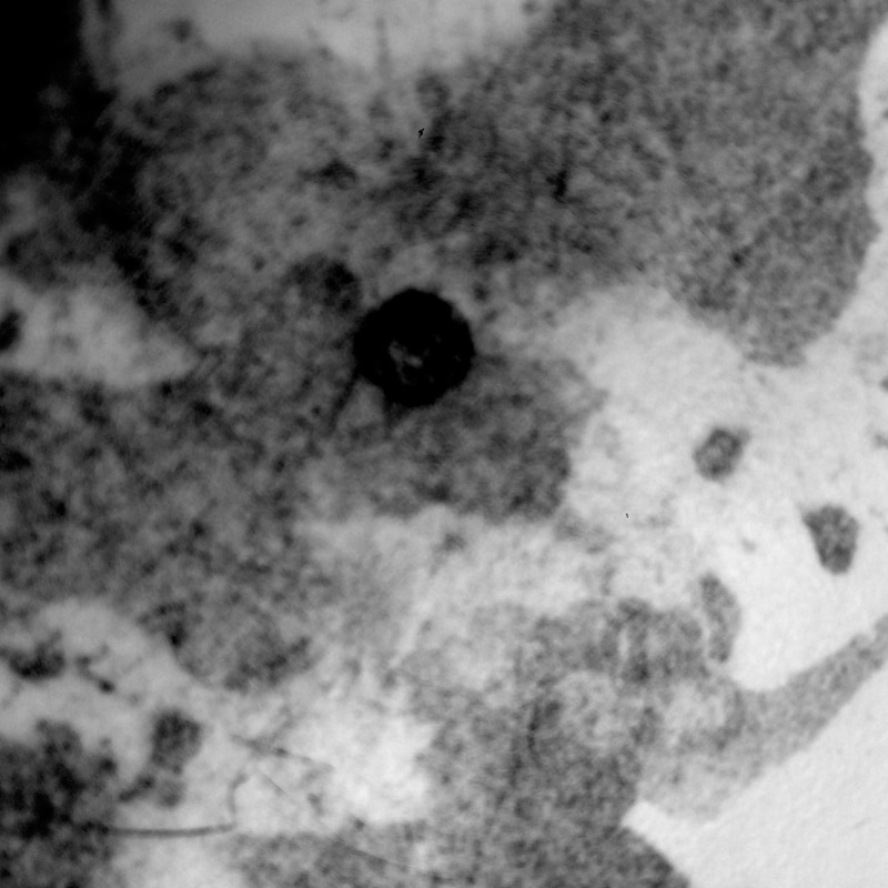
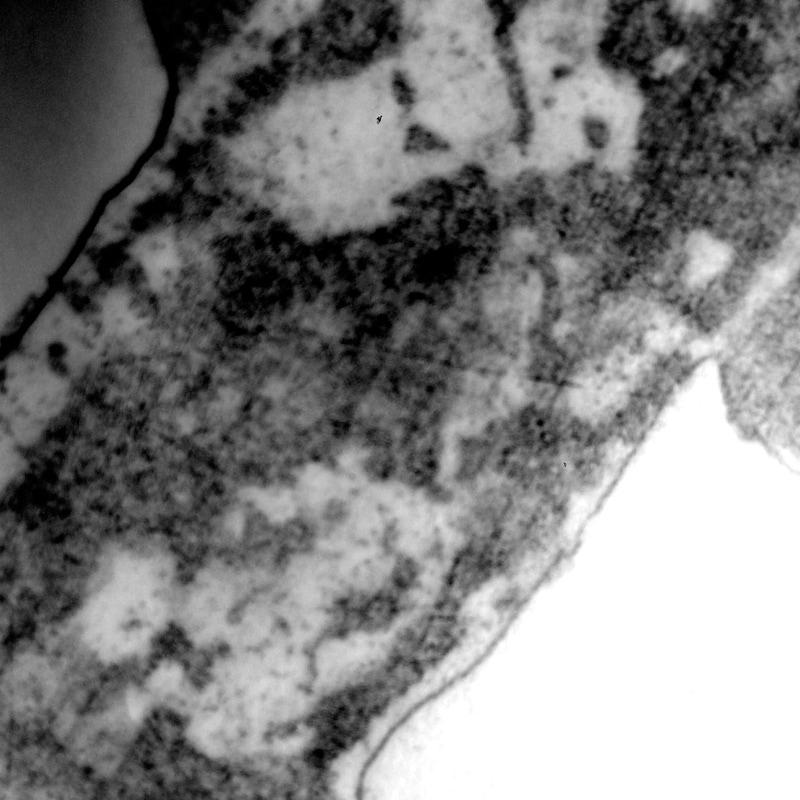
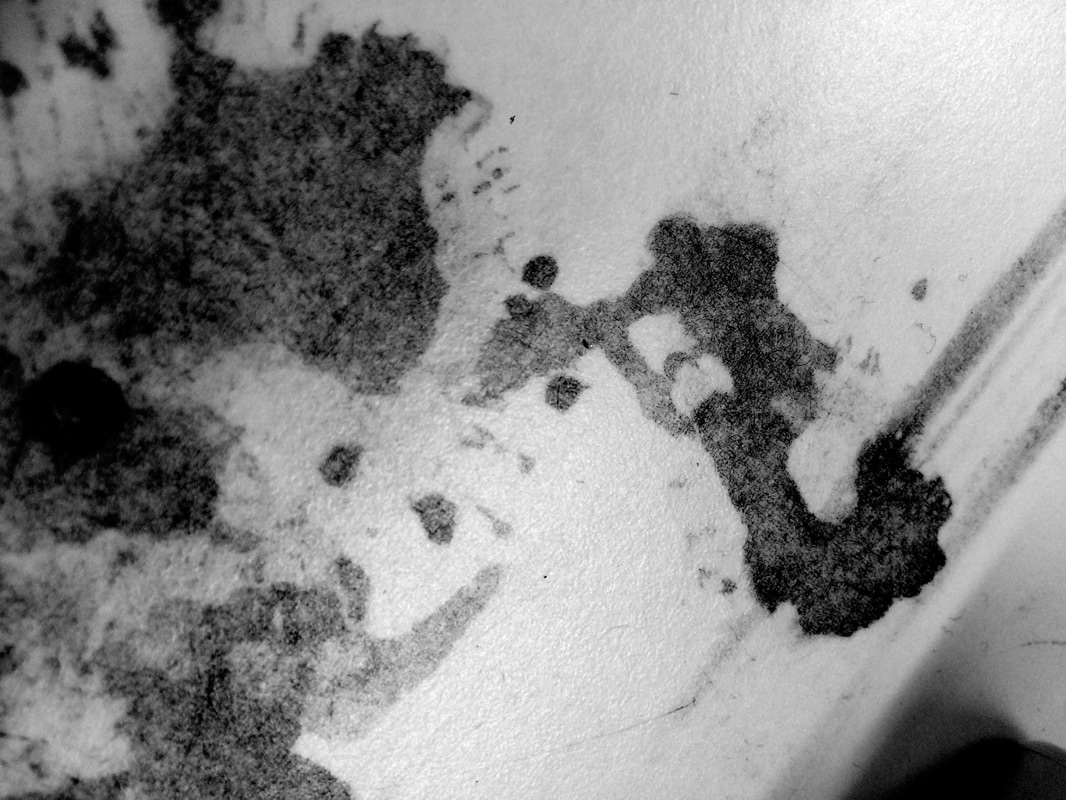
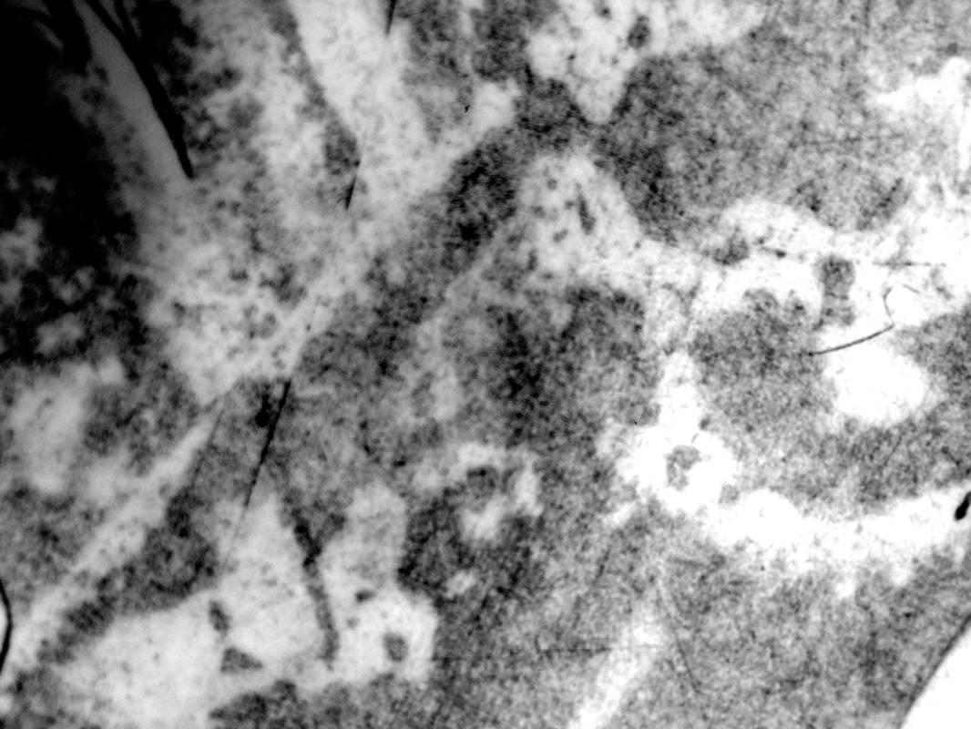
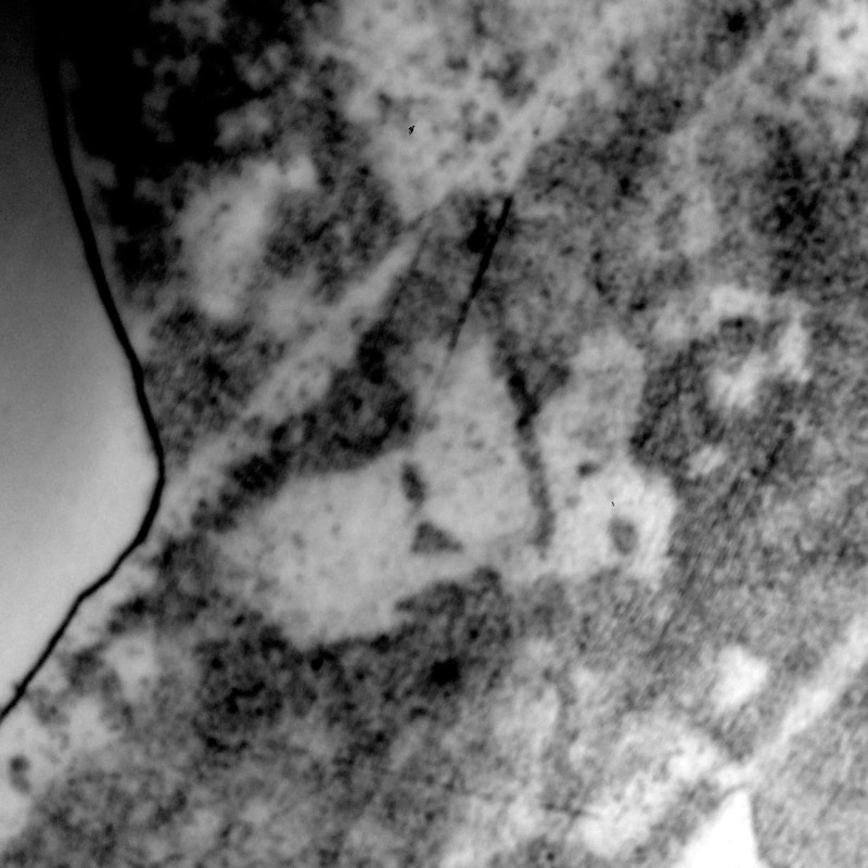
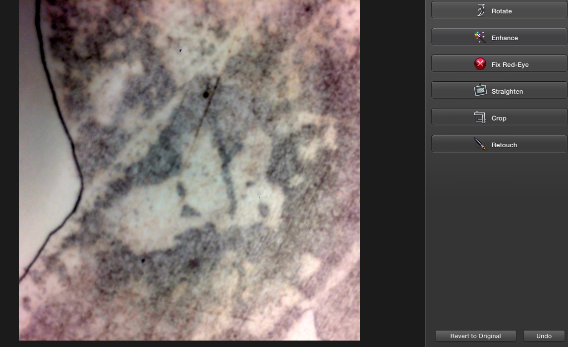
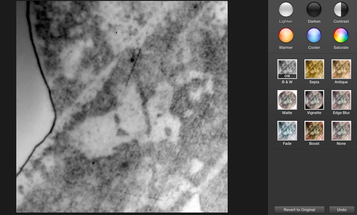
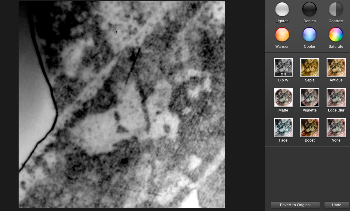
This is my first response to Troup's photographs, I took these photographs in my science classroom, the patterns on the table caught my attention and how distorted they were. It is most likely that they were created by the corrosive chemicals used in experiments. I decided to edit them in iPhotos because I wanted to experiment and to create the same effect Troup does in his photographs. What I first did was enhance the image to further darken the dark areas, I then made the image dark and white. Next I increased the contrast and darkened it a little more. Overall, I am pleased with the outcome, I like the way that there is a clear barrier between the damaged part table and the clear, untouched part if it. Furthermore, I like how you can see the detail of the scratches harsh parts or spill. My favourite image would be the bottom left one because you can sort of see the movement of the spill and how someone might have tried to wipe it before it damaged the table, that motion makes the image seem fast and chaotic. However, I think it would have been better if it was not the a flat surface because the light cannot not get captured in the bumps or crevasse to create shadows like in Troup's photographs.
The process
Stephen Gills
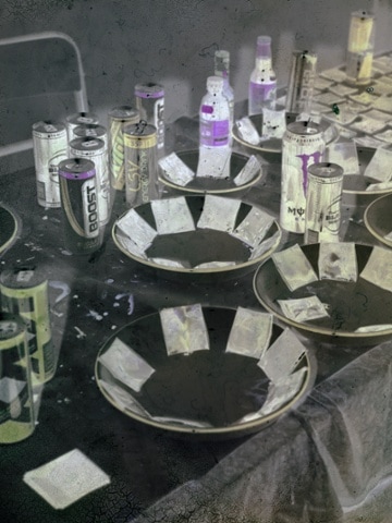
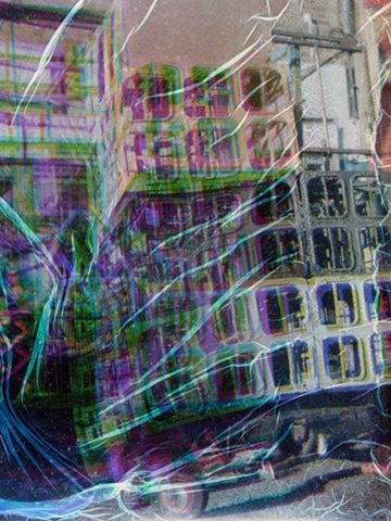
Stephen Gills is another photographer I discovered on whilst on Pinterest. His work slightly reminds of Brandon Seidle's ''Impure Photography'' series because of the harsh and strange patters they have. I did further research to find out exactly how Gills achieved this affect. Gills is knows for doing experimental photography and not letting the traditional aspects of photography restrict him. He has experimented burying his photographs in the dirt and also hiding objects inside his camera to distort the scale of photographs. However, in his experiments Gills has used energy drinks such as, Red bull and Rockstar to develop his photographs. He combined this technique with hiding objects inside of his camera, which resulted in twisty photos of destruction below. He relates to my theme because the lines, patterns and colours created are very detail and 'out there' when put together. The fact that his work has a lot going in them is what gives it that aspect of detail, there a lot of depth in his photographs. I plan to take as many risks and try out lots of different techniques with my final idea.
Stephen Gills is another photographer I discovered on whilst on Pinterest. His work slightly reminds of Brandon Seidle's ''Impure Photography'' series because of the harsh and strange patters they have. I did further research to find out exactly how Gills achieved this affect. Gills is knows for doing experimental photography and not letting the traditional aspects of photography restrict him. He has experimented burying his photographs in the dirt and also hiding objects inside his camera to distort the scale of photographs. However, in his experiments Gills has used energy drinks such as, Red bull and Rockstar to develop his photographs. He combined this technique with hiding objects inside of his camera, which resulted in twisty photos of destruction below. He relates to my theme because the lines, patterns and colours created are very detail and 'out there' when put together. The fact that his work has a lot going in them is what gives it that aspect of detail, there a lot of depth in his photographs. I plan to take as many risks and try out lots of different techniques with my final idea.
Shirley Faktor
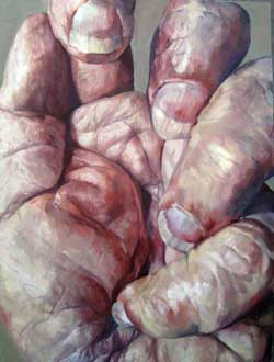
Shirley Faktor
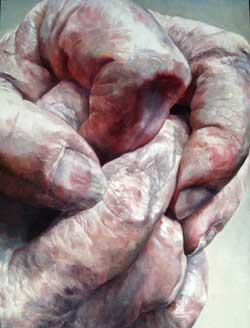
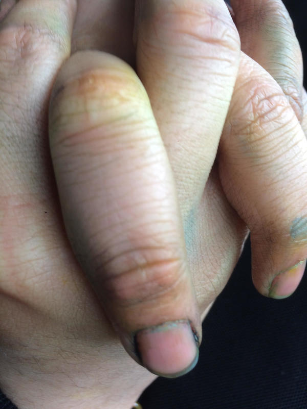
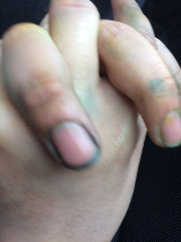
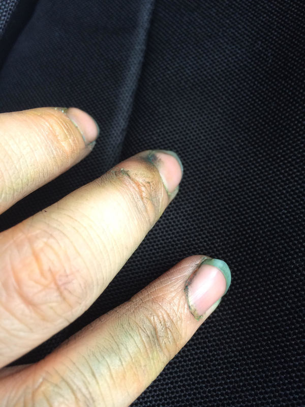
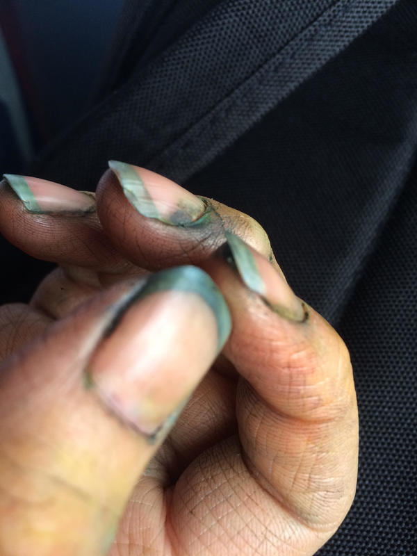
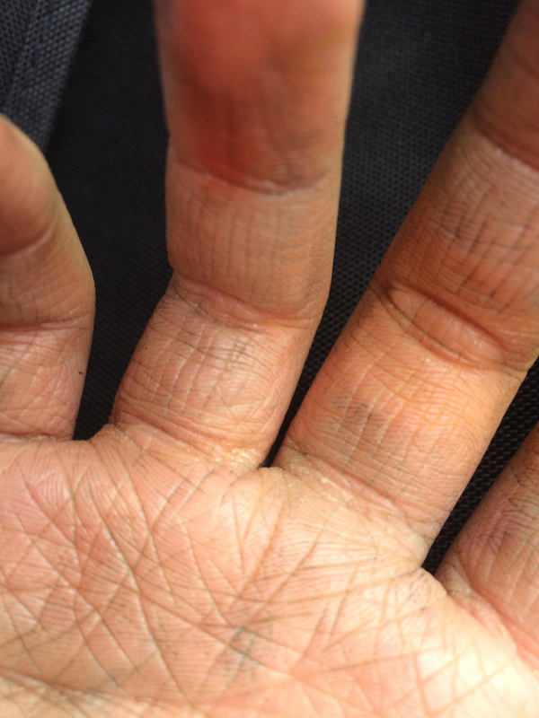
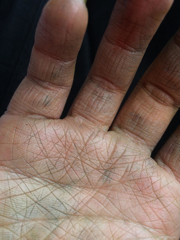
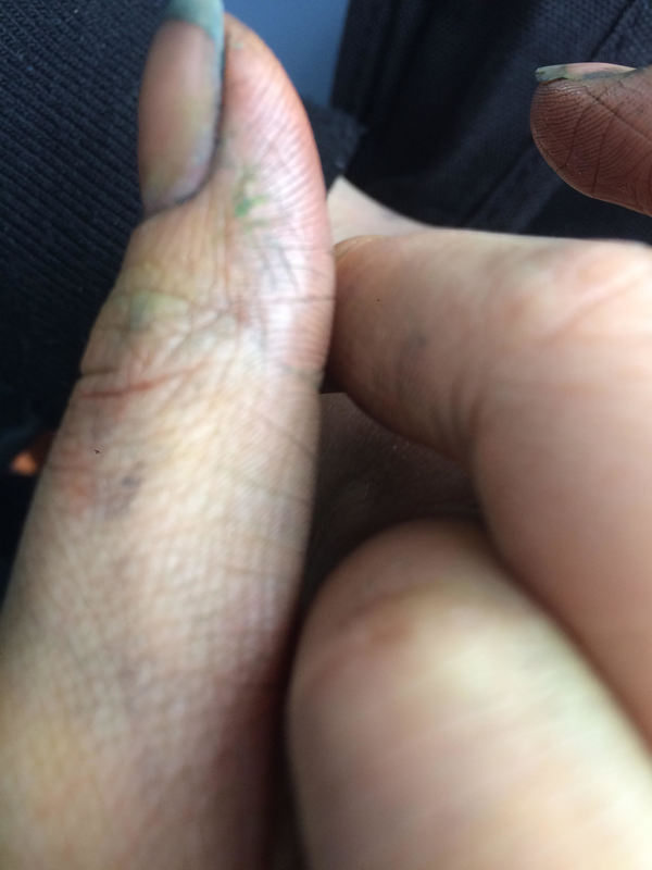
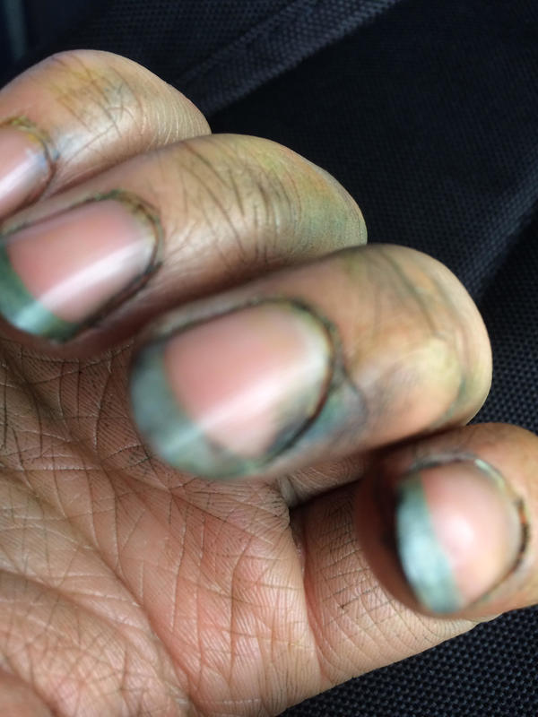
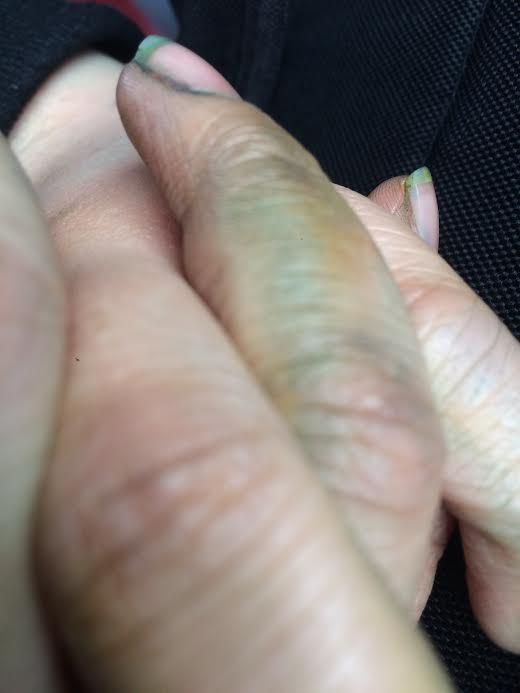
Shirley Faktor is an artist I discovered on Pinterest. Her oil painting work of hands really fascinated me because they are so life-like and precise. The dents and folds in the in hands are so prominent and exact. In response to her work, I photographed a friends hands that looked a messy and dirty, she has oil paint her nails and the cracks of her hands which made me want to photograph then in the first place. I then decided to edit them using a the Snapchat app, which I discovered had some features that I had not noticed before. I did this because I wanted them to have the effect of being drawn like Faktor, instead of them just being normal. I liked how this filter in particular really darkened they dirt in her nail On the other, it would have been better if I had used a variety of filters so show a range, also the filter got rid of all the other light colours that were on her hands.
Shirley Faktor is an artist I discovered on Pinterest. Her oil painting work of hands really fascinated me because they are so life-like and precise. The dents and folds in the in hands are so prominent and exact. In response to her work, I photographed a friends hands that looked a messy and dirty, she has oil paint her nails and the cracks of her hands which made me want to photograph then in the first place. I then decided to edit them using a the Snapchat app, which I discovered had some features that I had not noticed before. I did this because I wanted them to have the effect of being drawn like Faktor, instead of them just being normal. I liked how this filter in particular really darkened they dirt in her nail On the other, it would have been better if I had used a variety of filters so show a range, also the filter got rid of all the other light colours that were on her hands.
Edited
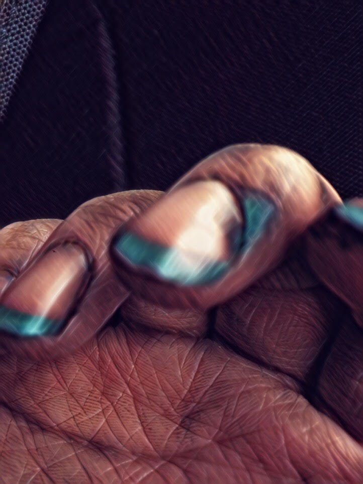

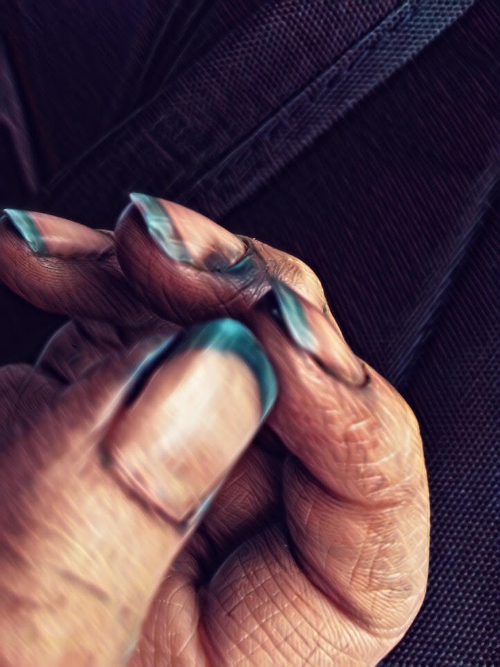
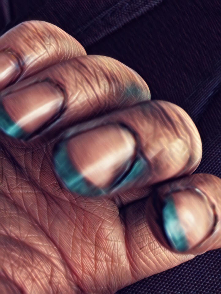
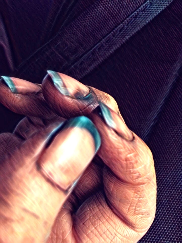
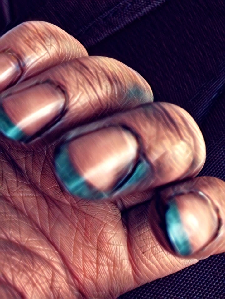
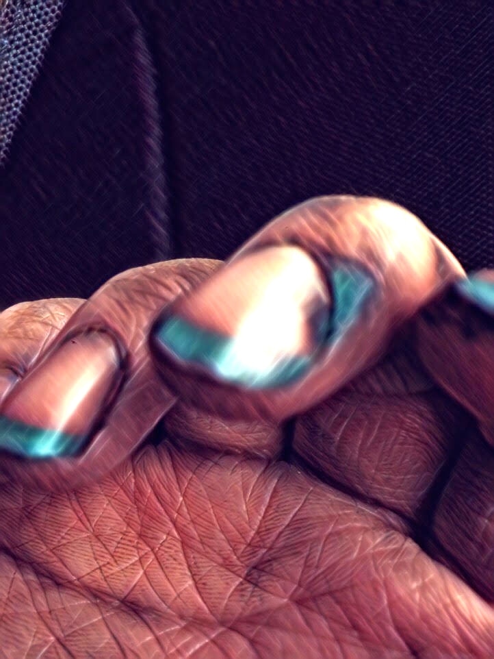
Photo Fanzines
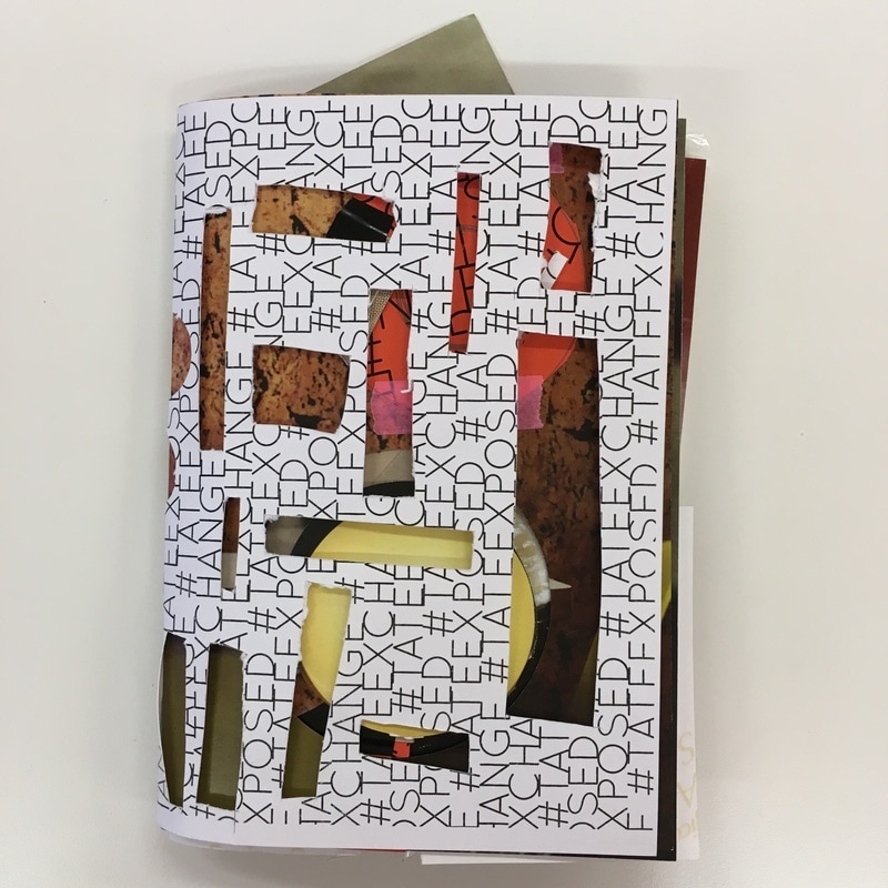
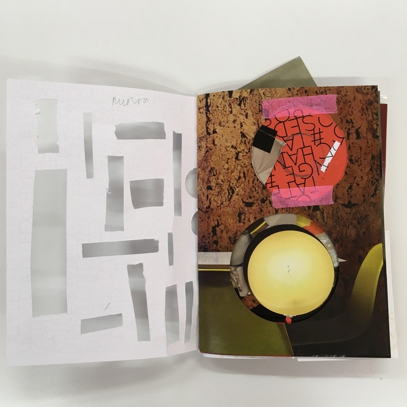
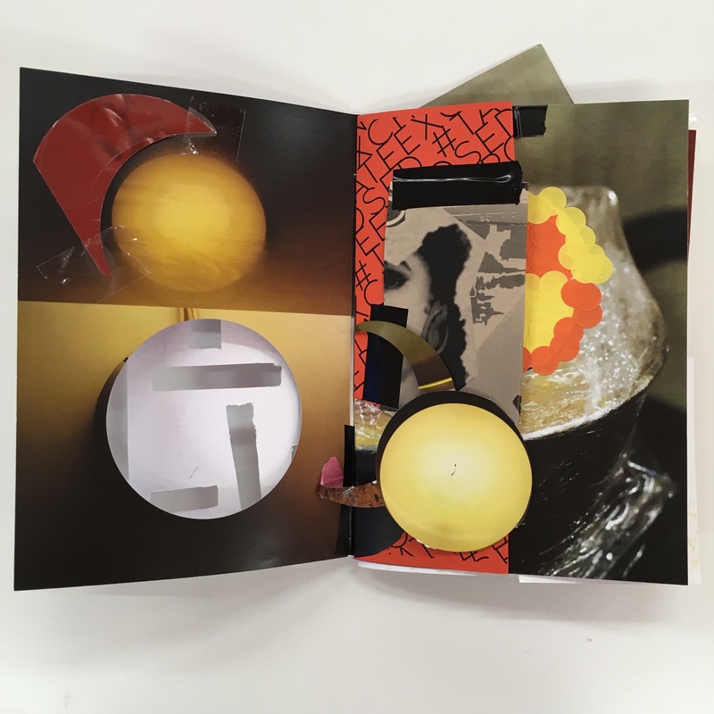
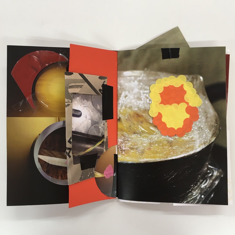
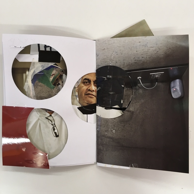
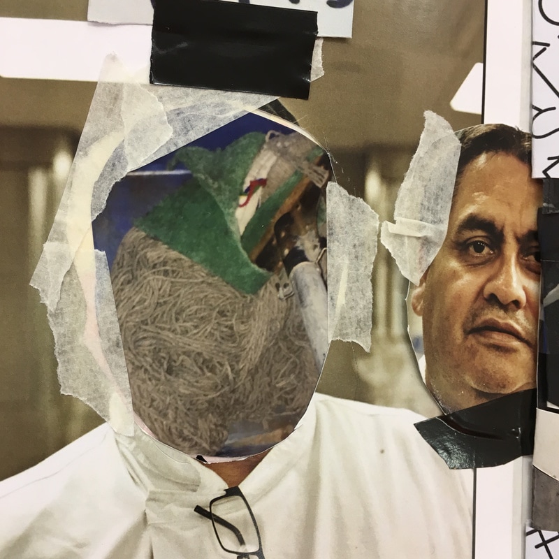
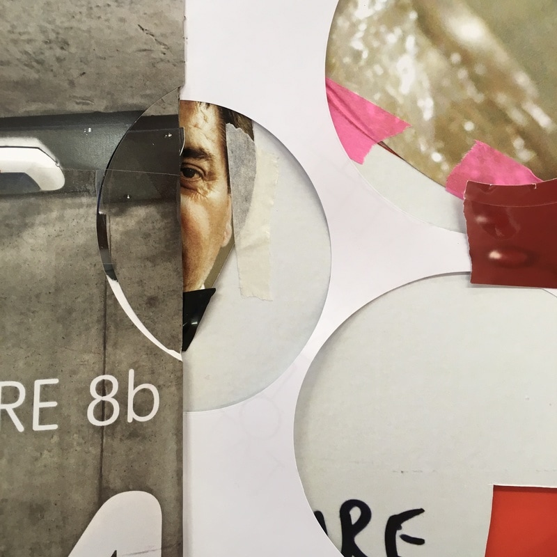
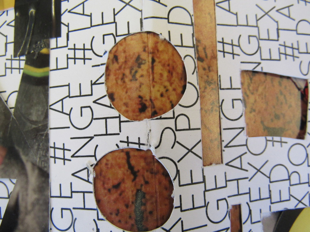
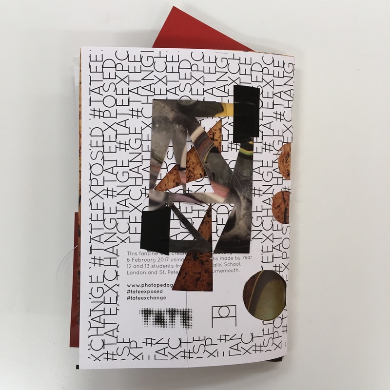
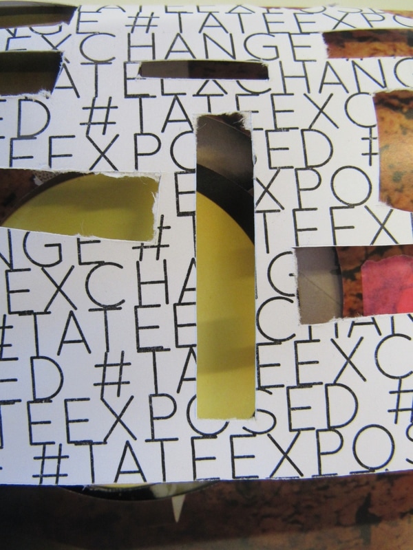
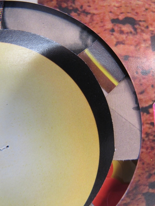
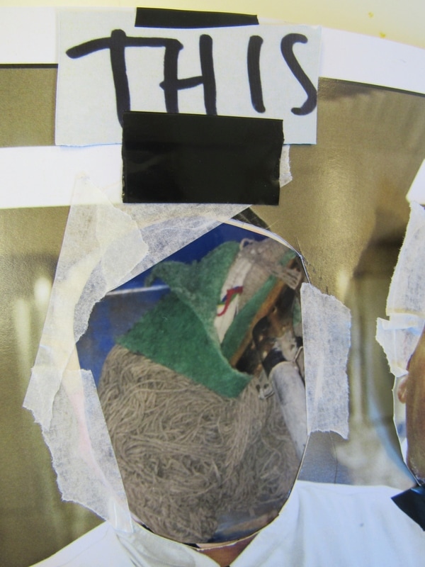
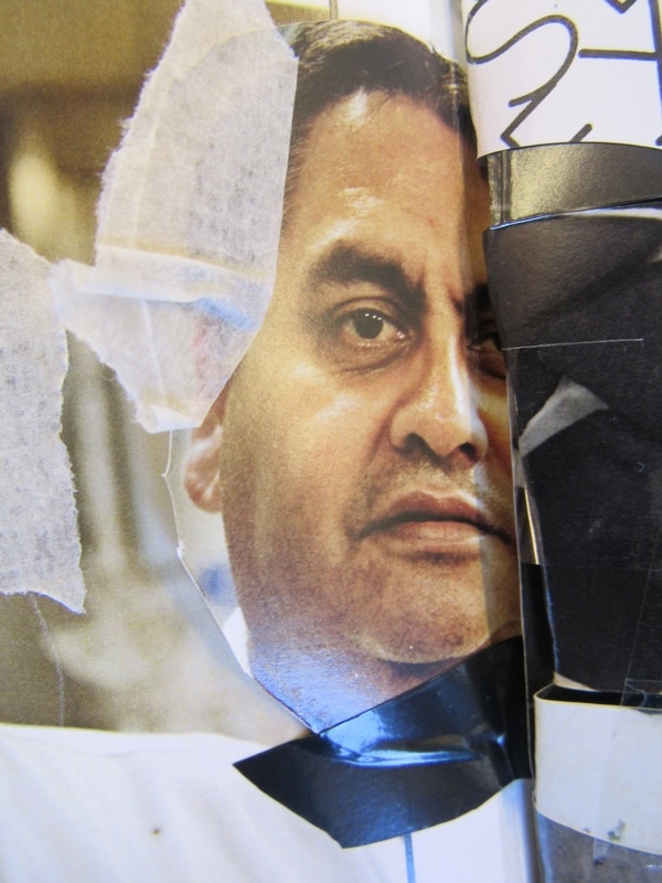
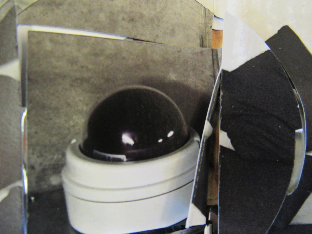
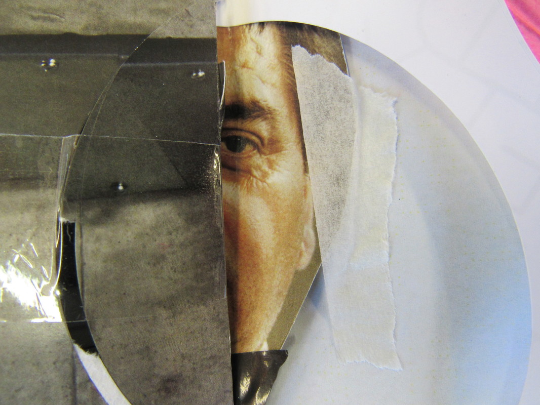
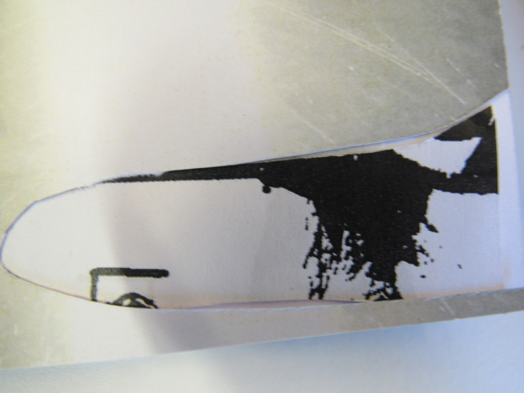
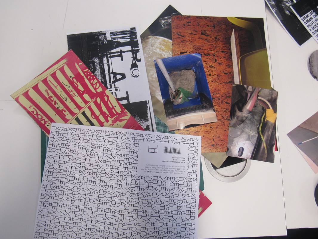
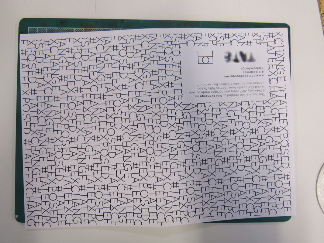
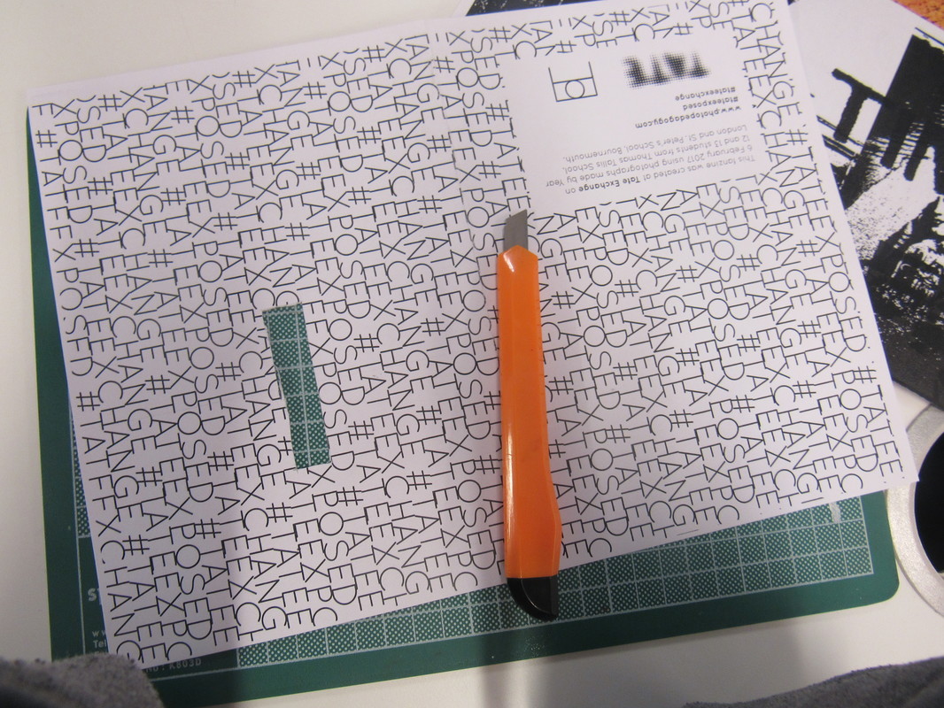
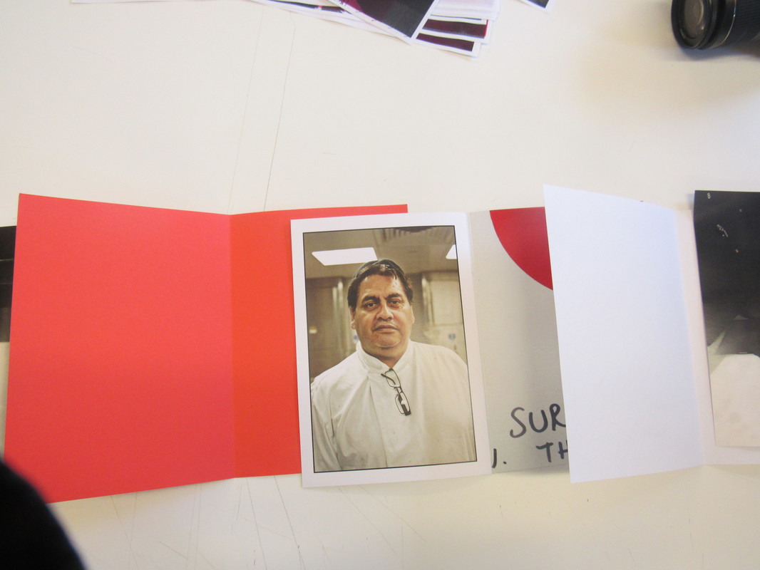
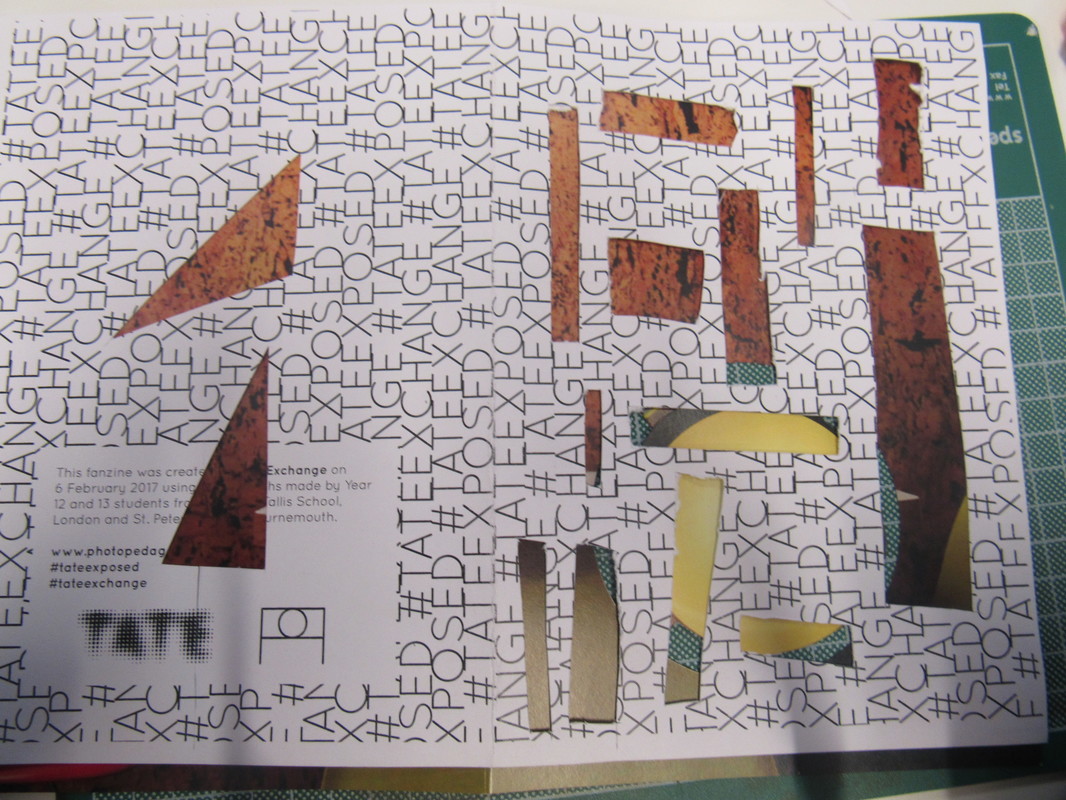
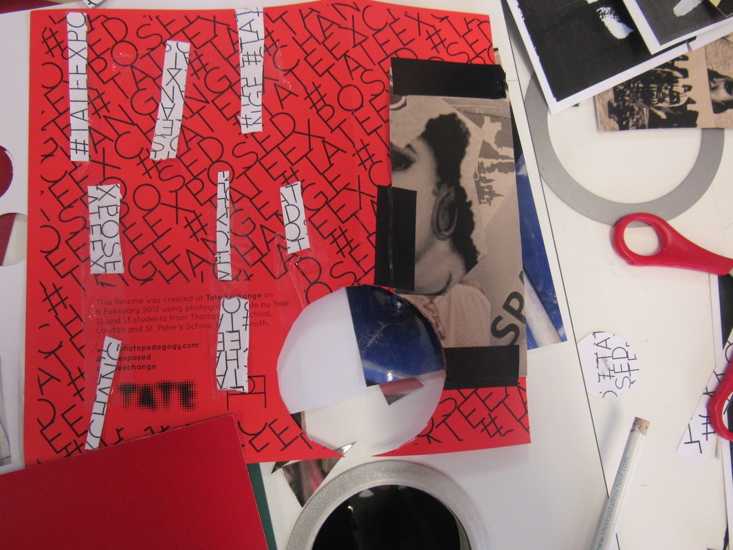
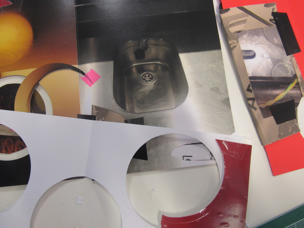
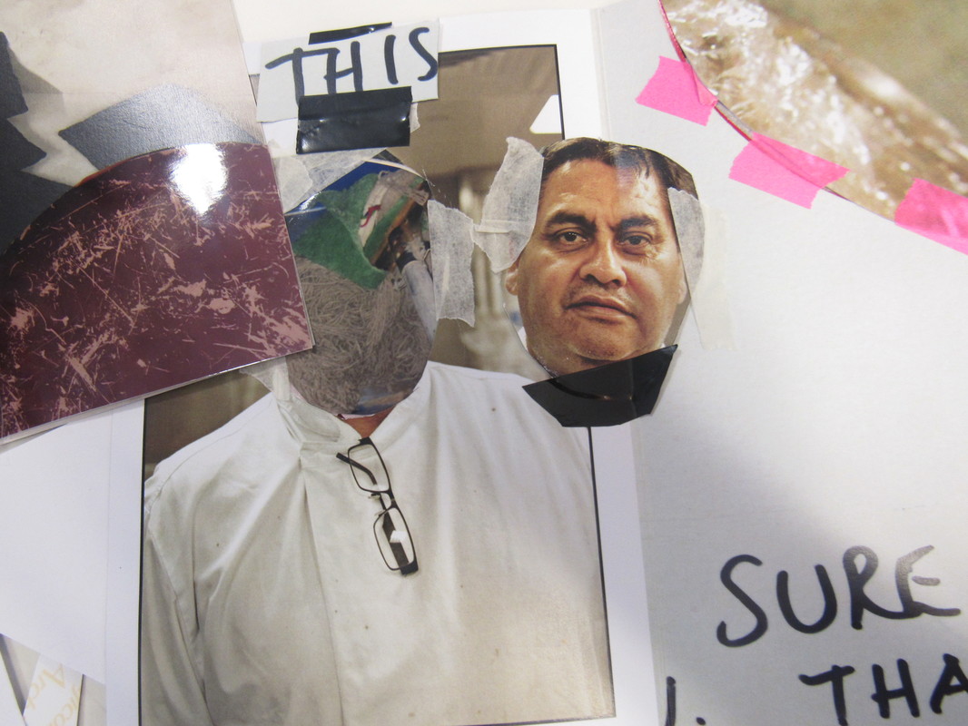
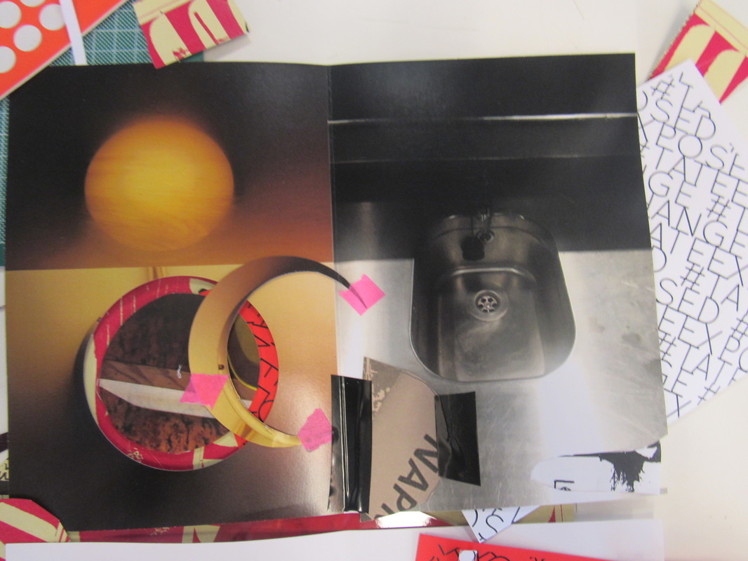
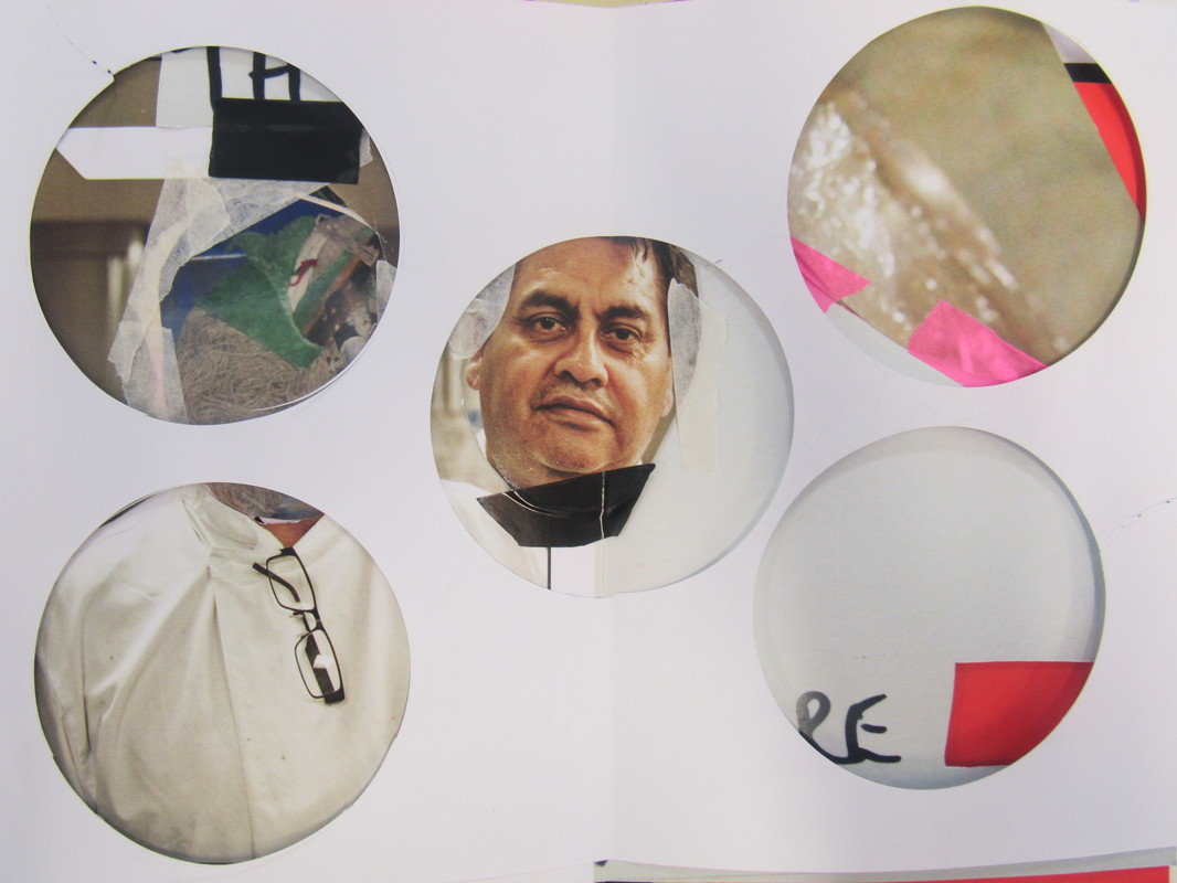
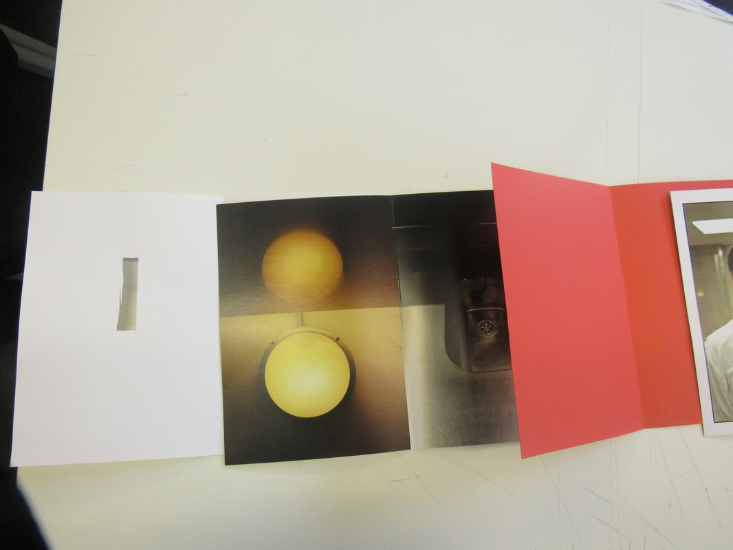
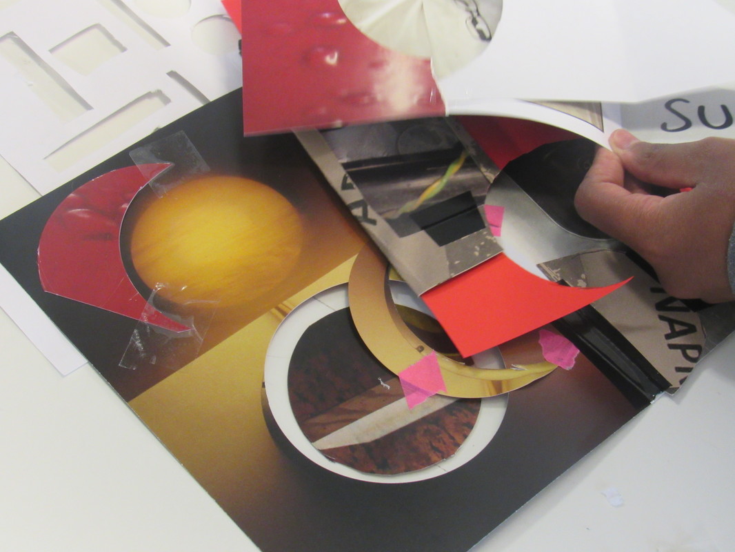
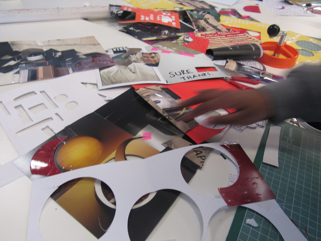
In one of my lessons we made photo fanzines, which is a book made of a range of different images that are cut taped or stapled together, however, we were not allowed to stick anything down with glue. We were given a range of pictures that were taken in the Tate Museum and varies material to create the book. For each page I tried to cut bits and pieces out and over lap them on different pages to create a weird effect. Once I was finished with my book, I decided to take close up images to capture the detail in them because each page had a lot of features and layers in it. In the end the making of the fanzine was really enjoyable, and I got to create some really interesting images and to capture lots of detail.
In one of my lessons we made photo fanzines, which is a book made of a range of different images that are cut taped or stapled together, however, we were not allowed to stick anything down with glue. We were given a range of pictures that were taken in the Tate Museum and varies material to create the book. For each page I tried to cut bits and pieces out and over lap them on different pages to create a weird effect. Once I was finished with my book, I decided to take close up images to capture the detail in them because each page had a lot of features and layers in it. In the end the making of the fanzine was really enjoyable, and I got to create some really interesting images and to capture lots of detail.


Threshold Concepts relating to Detail
Photography is unlike other visual arts in that it begins with a world full of things rather than with a blank slate. Photography is more an art of selection and translation rather than of invention. However, photography is also an art of production, not just reflection. It does things to the subjects it represents.
|

The meanings of photographs are never fixed. They are not only in the photographs themselves and rely on a combination of the viewer's sensitivity, knowledge and understanding and the specific context in which the image is seen.
|
Photoshopped Photograms
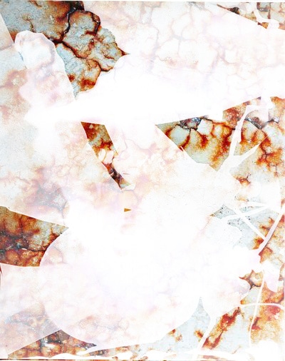

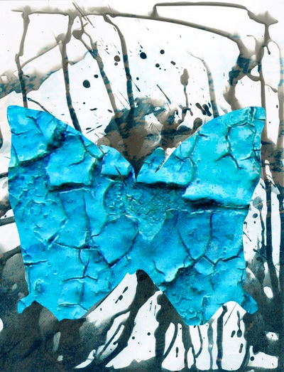
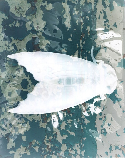
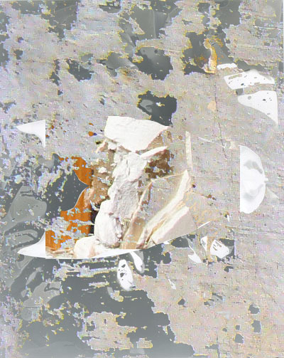
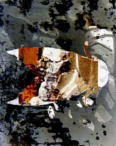
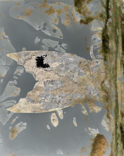
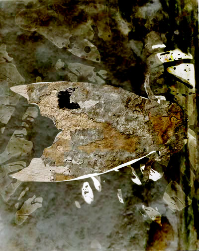
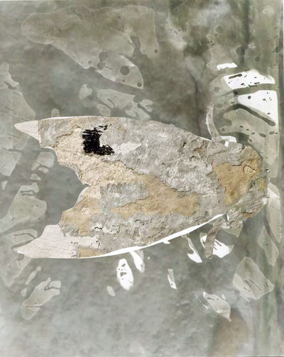
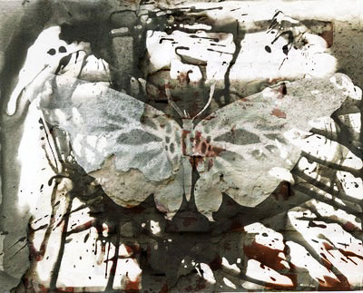
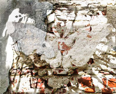
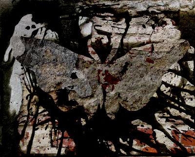
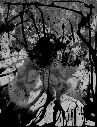

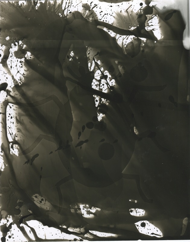
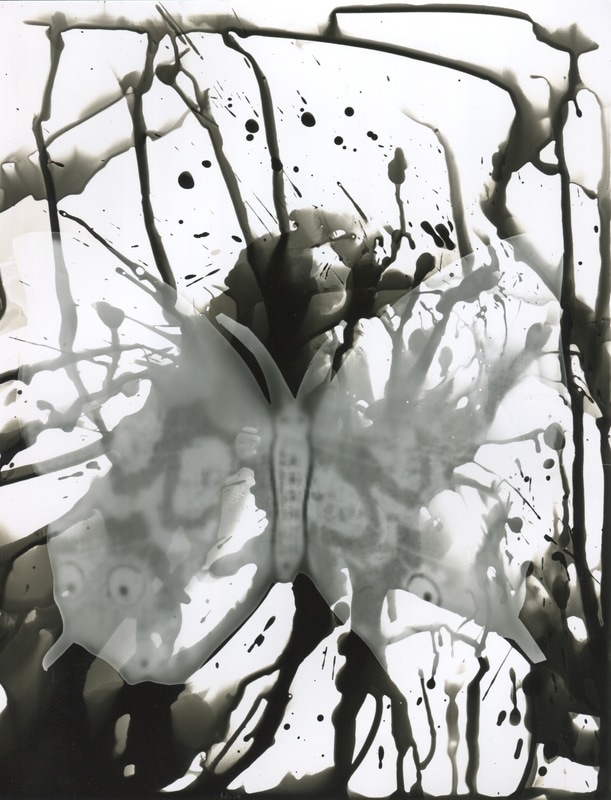
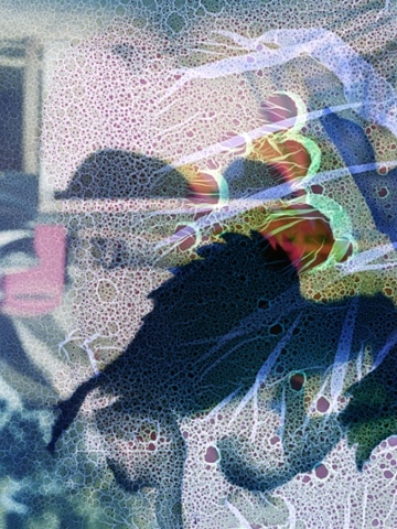
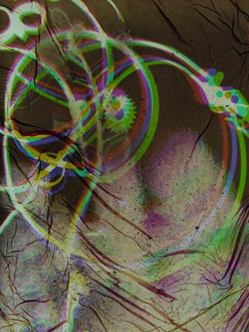
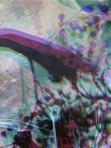
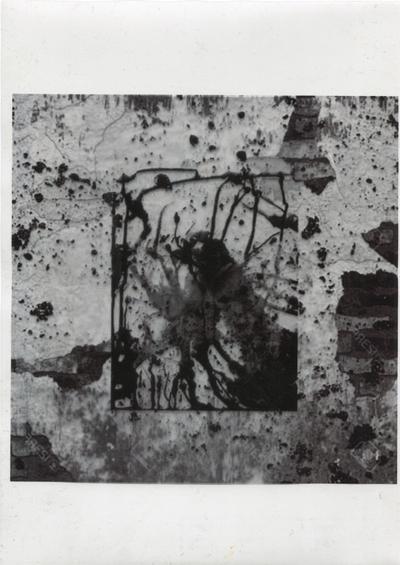
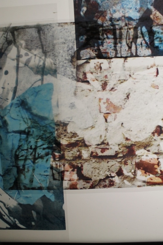
For my individual experimentation I decided to further develop my Jo Whaley's inspired photograms. My initial idea for the photograms was to include ink or watercolour paint in order to mimic her coloured concept. However, I decided against that as I felt it would be better to photoshop them and add layers to create different textures, shapes, patterns and tones. In doing so, this allows me to always go back and change anything if I choose to. For most of my images I experimented with many effects because they all created very interesting tones, some were very dark and contrasted with the light and others were light and blending with all of the tones. In the first image I outlined the insects and copied a second image where the butterfly is defined. I then pasted another image on top of the full photogram. In doing so, I was able to achieve Whaley's method of layering. Overall, using photoshop to complete the photograms was successful as I was able to create a range of abstract images using different methods and layers.
Process
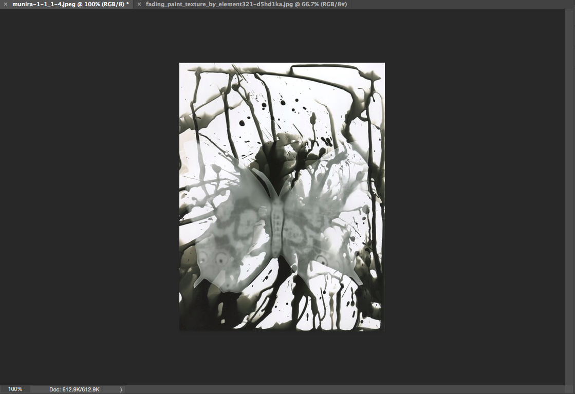
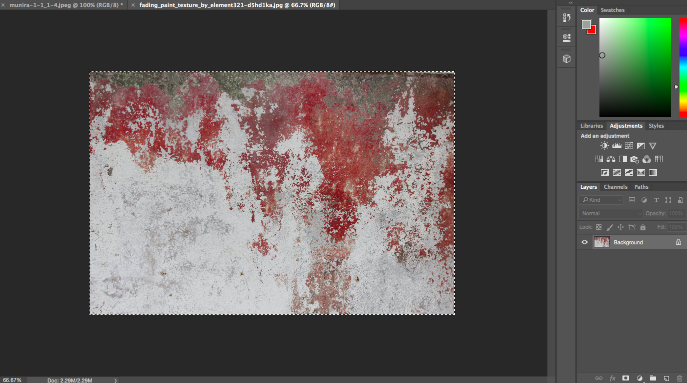
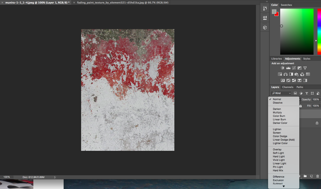
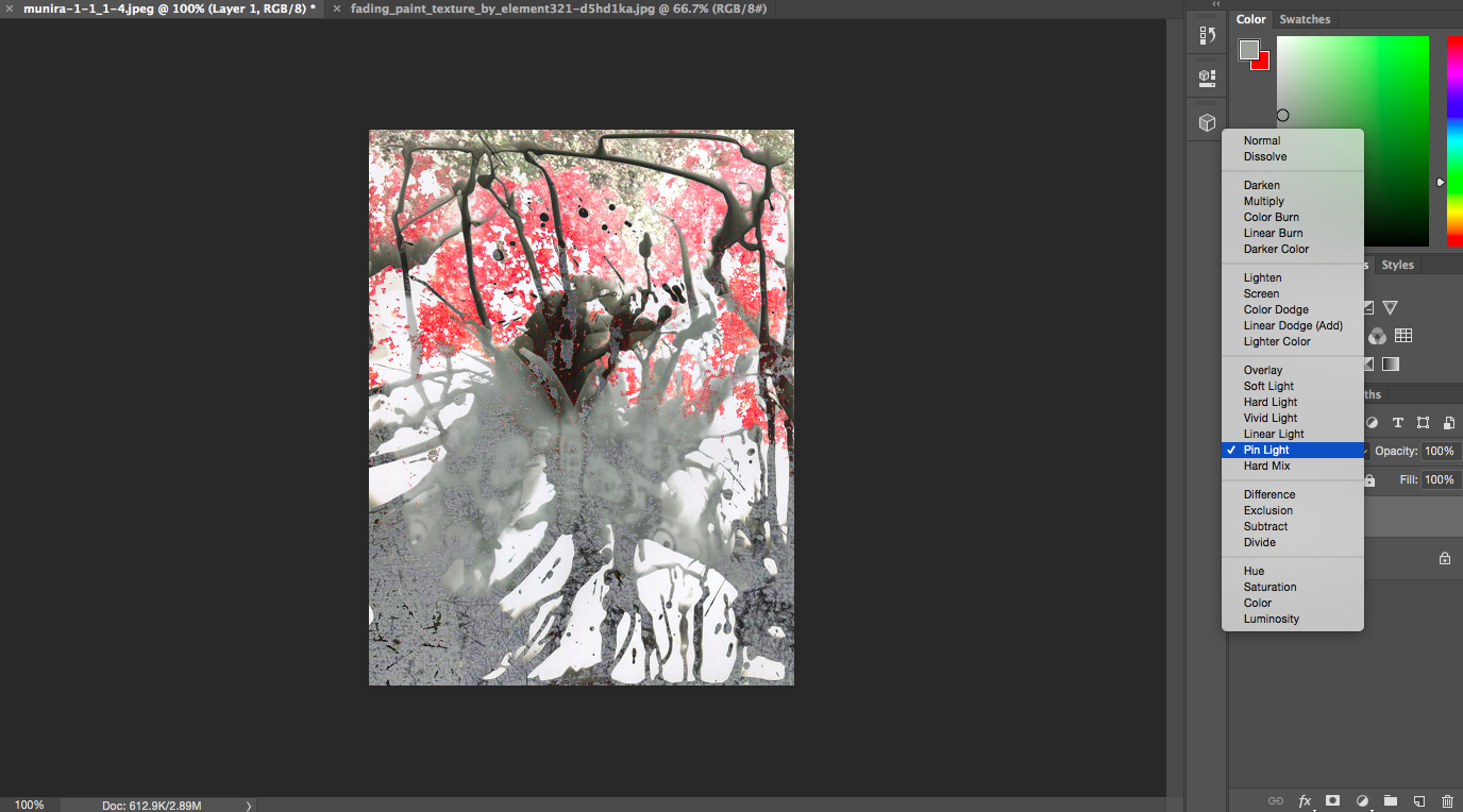
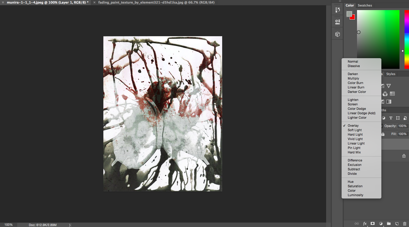
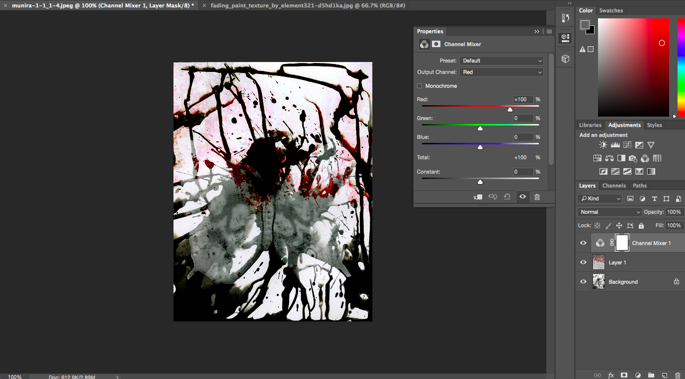
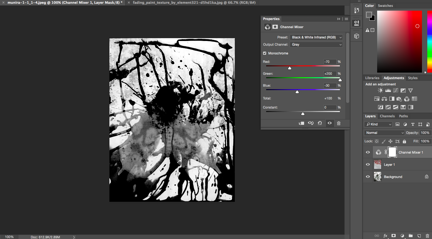
The process of creating the photoshopped images was very simple. First I dragged my desired photogram onto photoshop and then inserted the second image which is the background.I then blended the two layers together and chose an effect on photoshop. This process required I press 'CMD A, CMD C' to copy the damaged wall image, and then press 'CMD V' to paste that on top. Following this I blended both images together. The fourth, fifth and sixth images are different modes with the same image. The last image I decided to experiment with the contrast and tones to create a black and white effect.
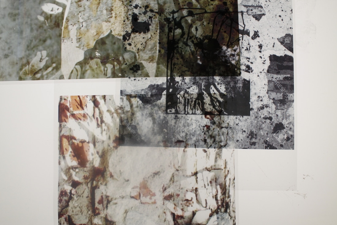
Transparency Paper

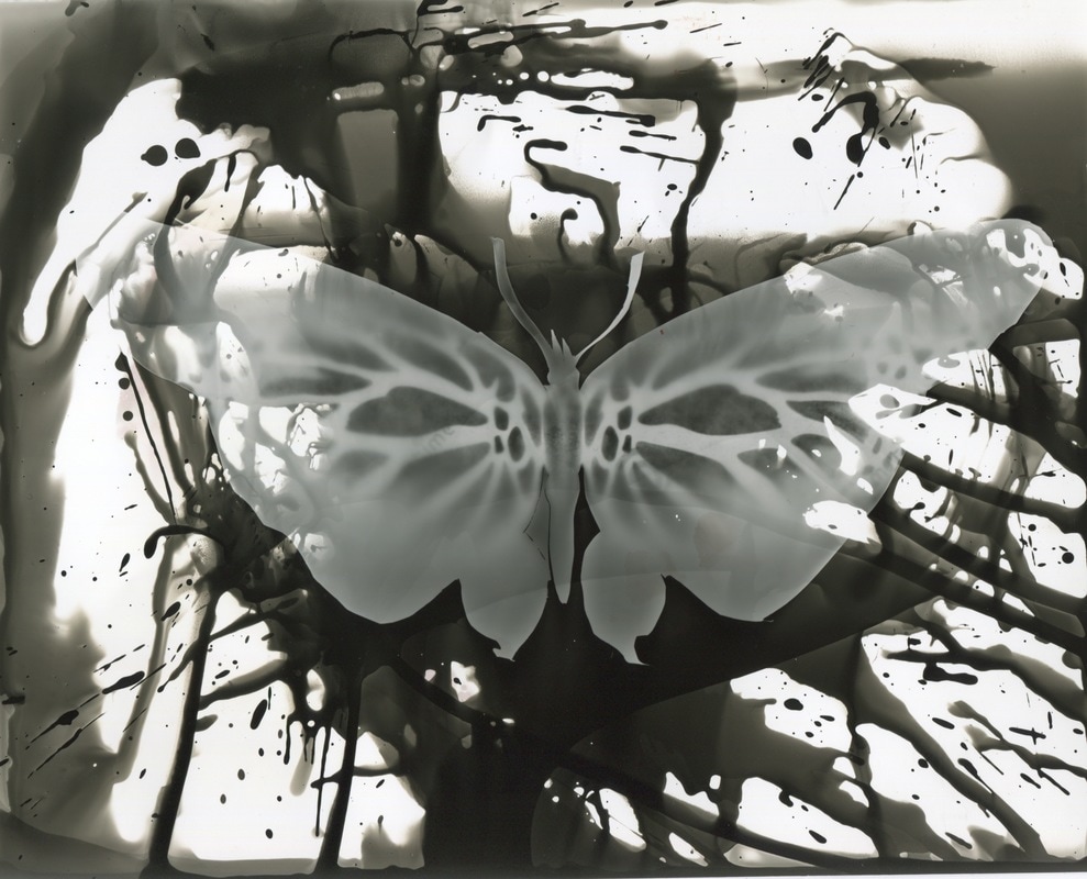
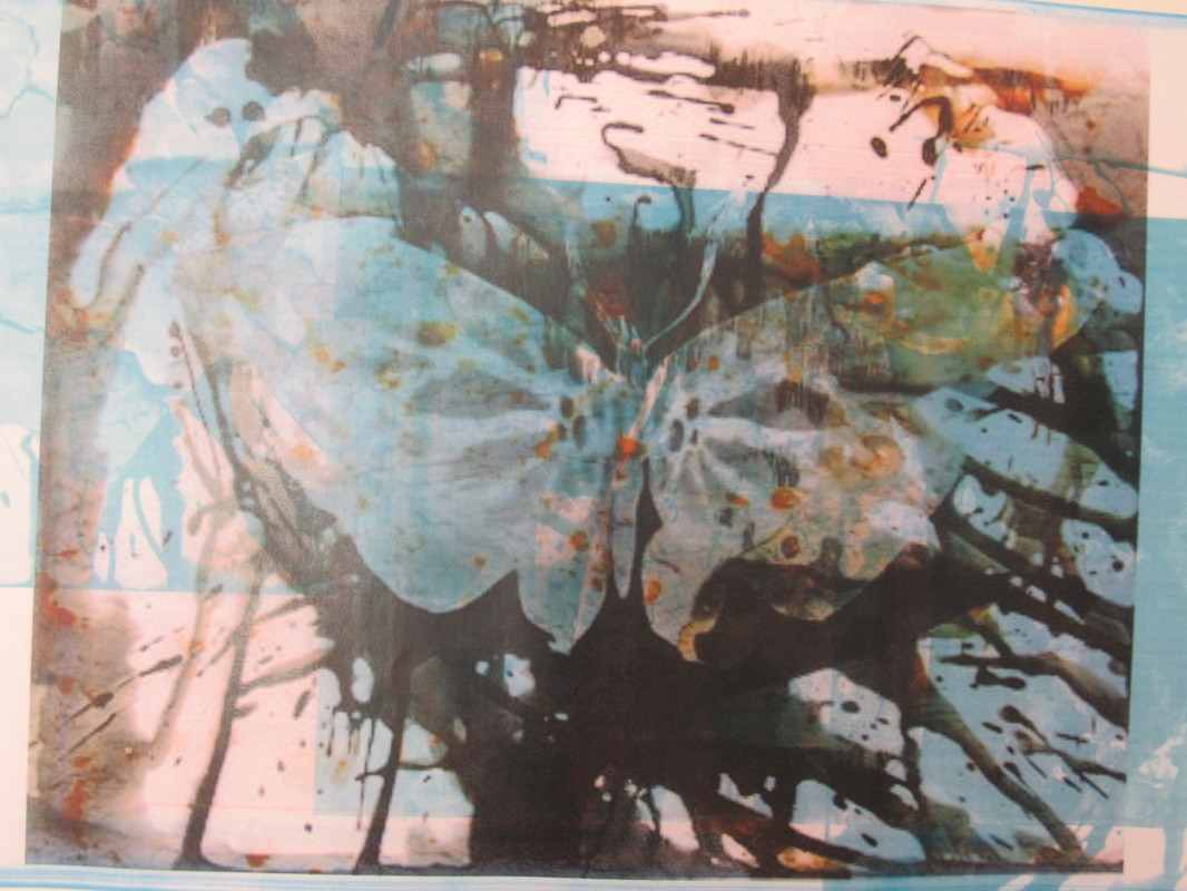
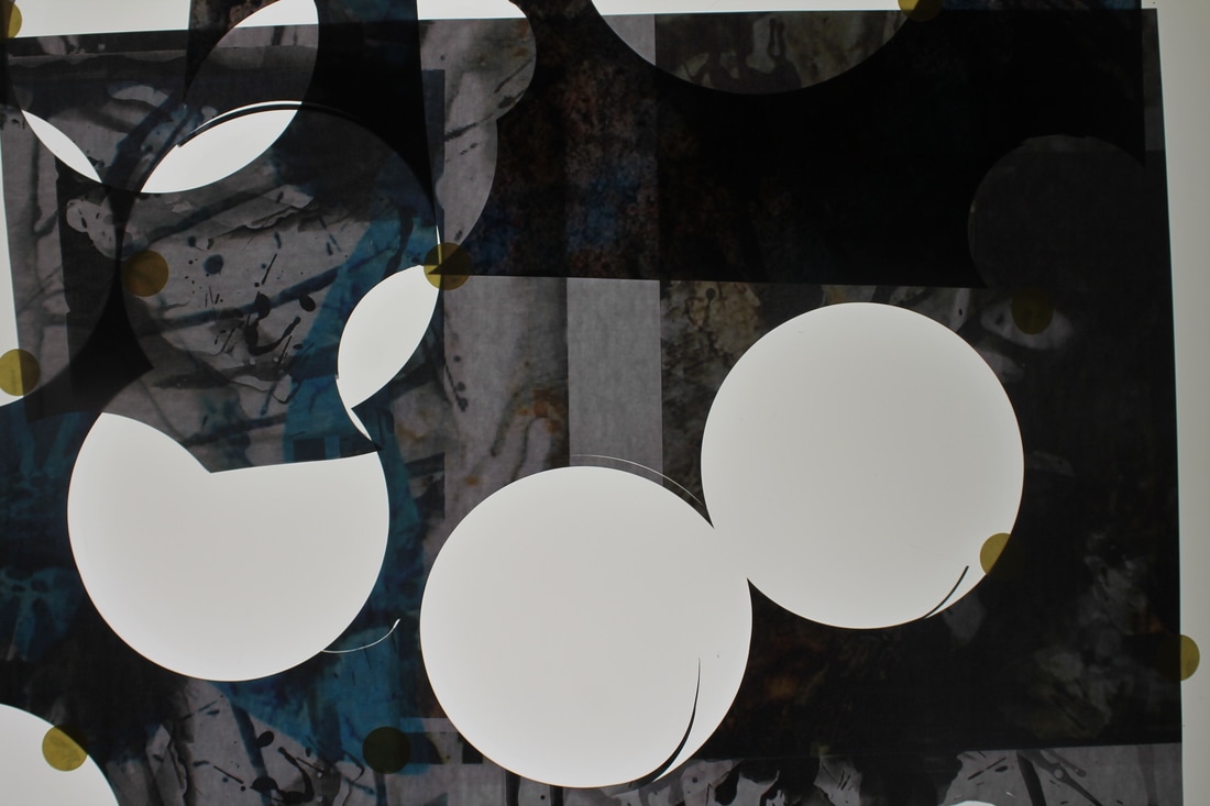
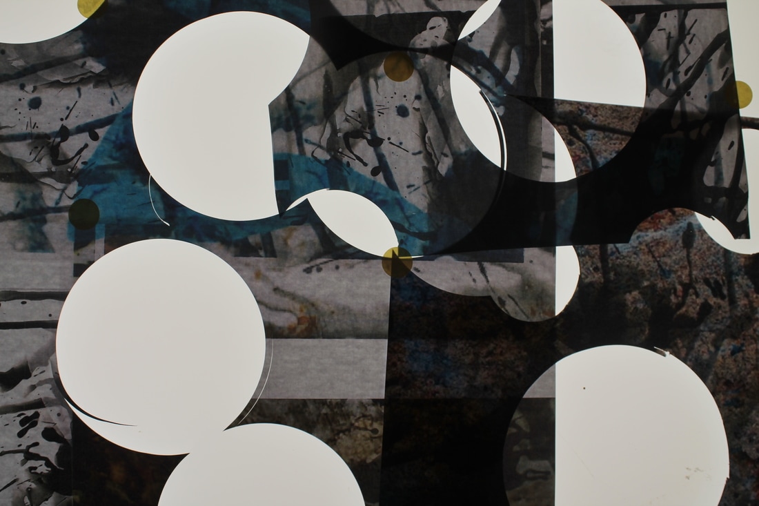
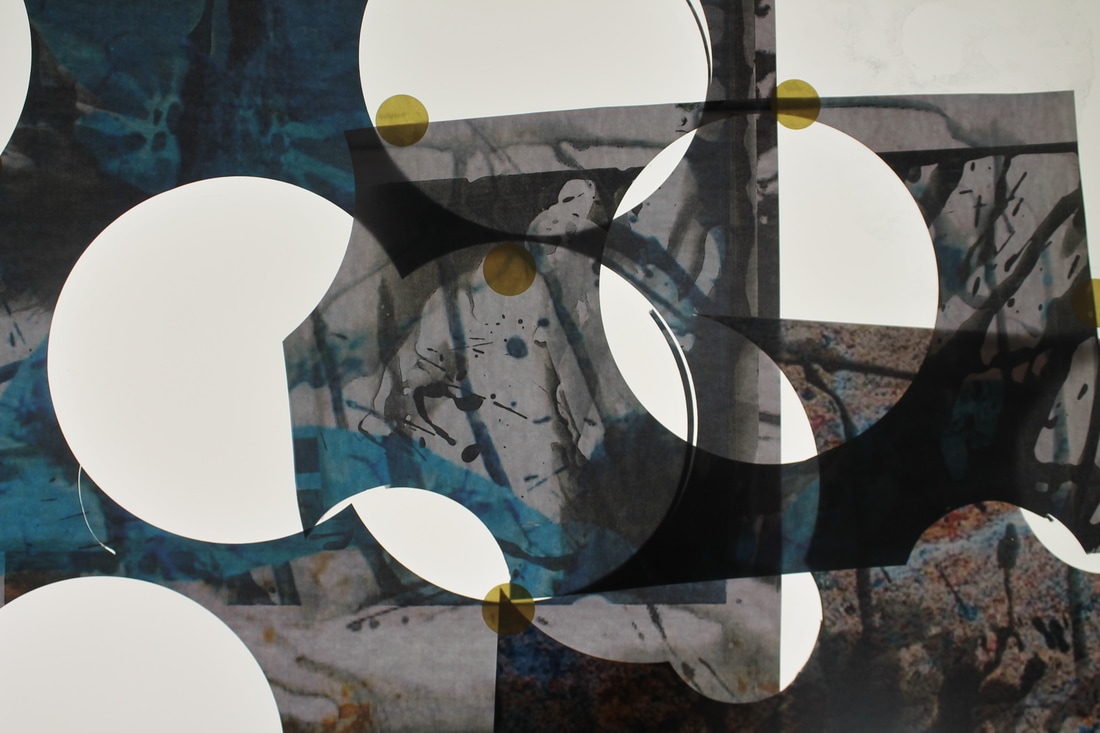
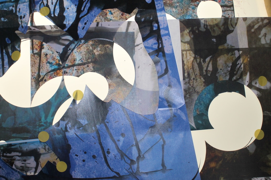
I printed the images above using transparency paper instead of the ordinary white paper. My goal was for the paper to have the glossy effect similar to the original photograms, although, I did achieve what I was aiming for, the outcome was not quite what I expected. I particularly liked what the paper did with the images because I did not expect the image to be so clear. Using transparency paper I could see all of the detail in the image and texture of it really well. The areas that were white in photoshop appeared transparent on the papers which was great because I was able to put other image underneath it and still be able to see it, especially with the light images. However, I think the paper dulls the photographs as they are not as bright and bold as I would have liked. Although, overall I was pleased with how they came out.
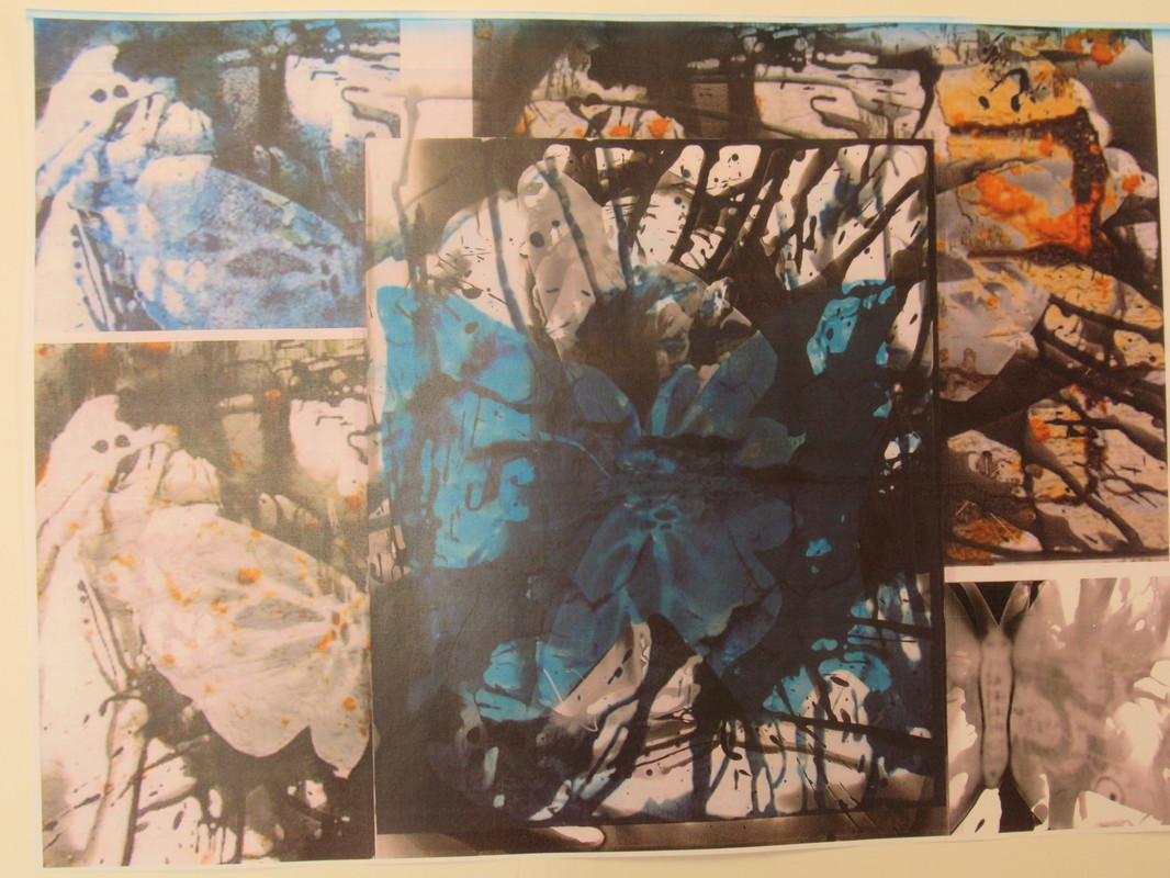
Lightbox
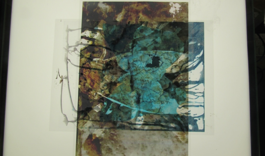
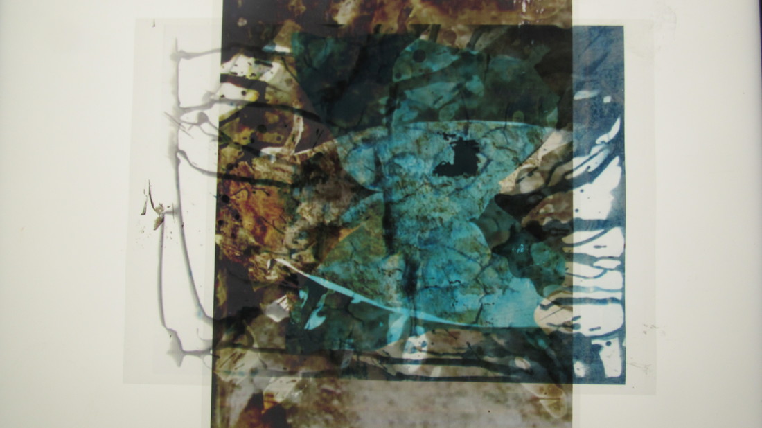

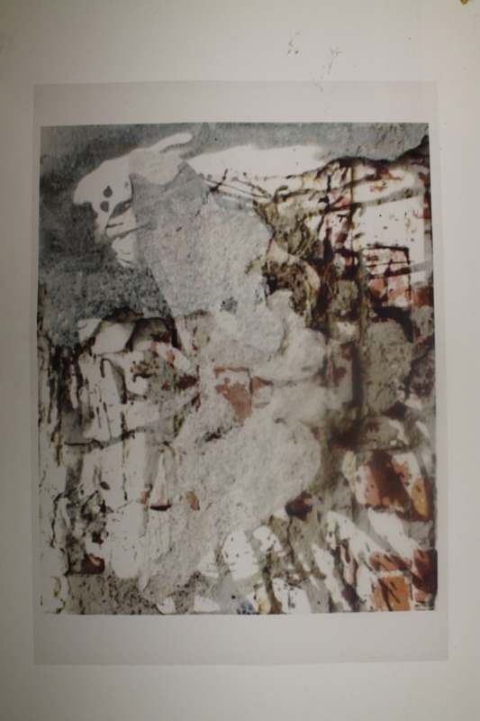
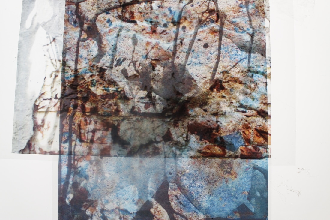
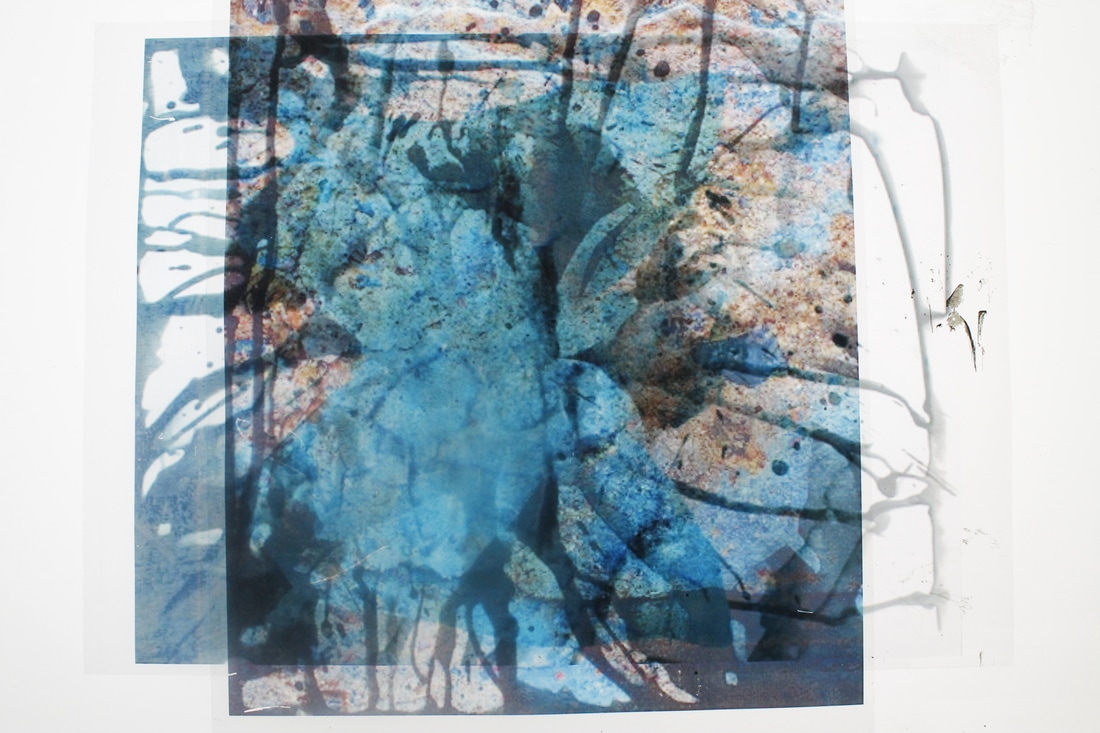
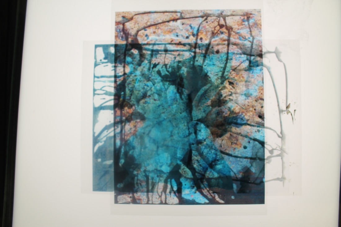
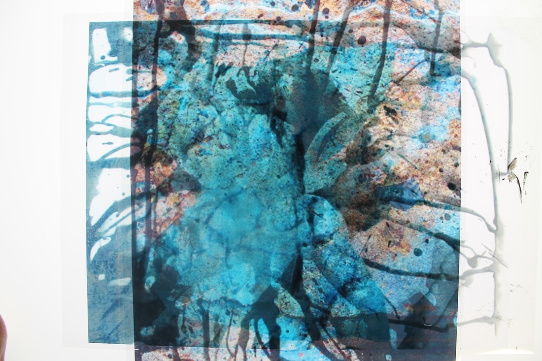
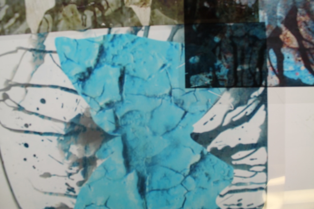

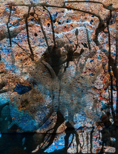
Using transparent paper on top of light-box, my aim was to enhance and brighten the images. I firstly began by just photographing the single images on their own. I then combined some images together and photographed them again in order to see the effects with the light-box. Following this, I also photographed separate sections on the combined images to focus on each individual detail. What I saw was that the lines of each image were very prominent and sharp. The dark and light tones merged together well with the light shining underneath. In addition, the using the light box I found that when the dark tone combined nice shadows were formed. I thought using the light box would solve my problem of the colours on paper being too dull, and it did because it brightened up the whole photograph.
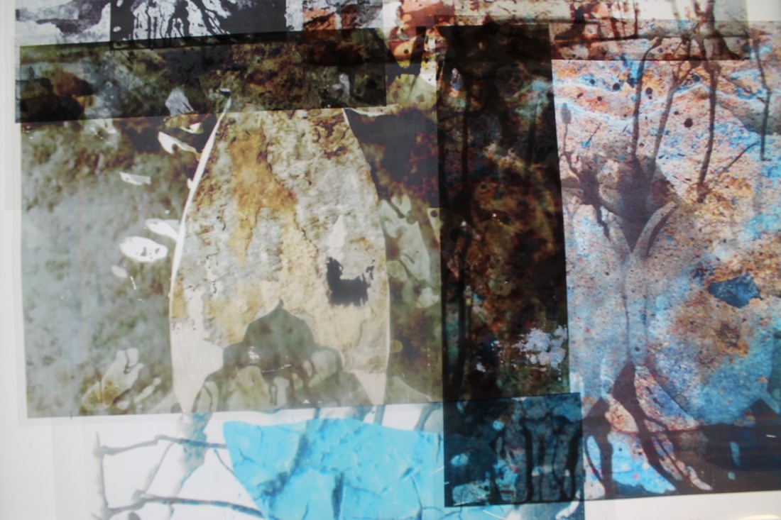
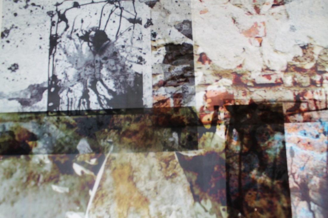
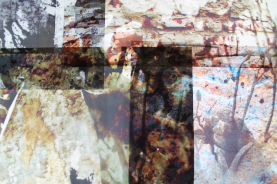
Experimenting with the photocopier
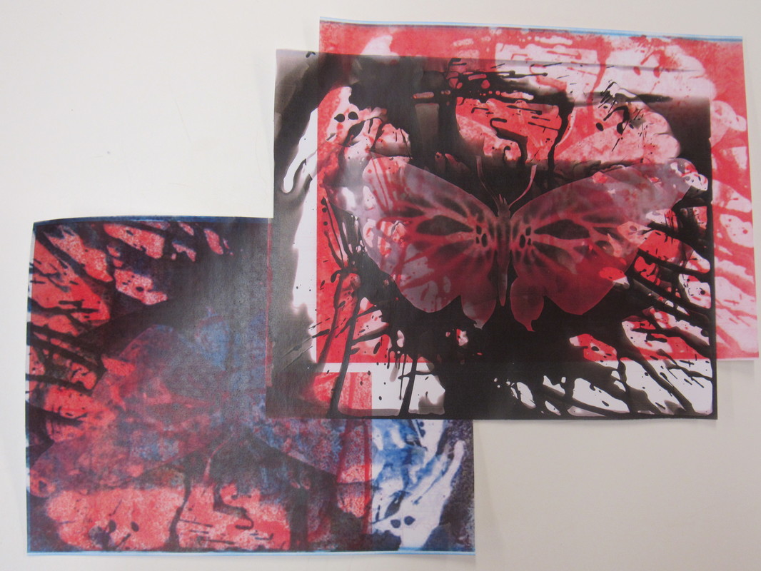
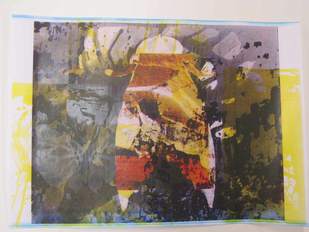

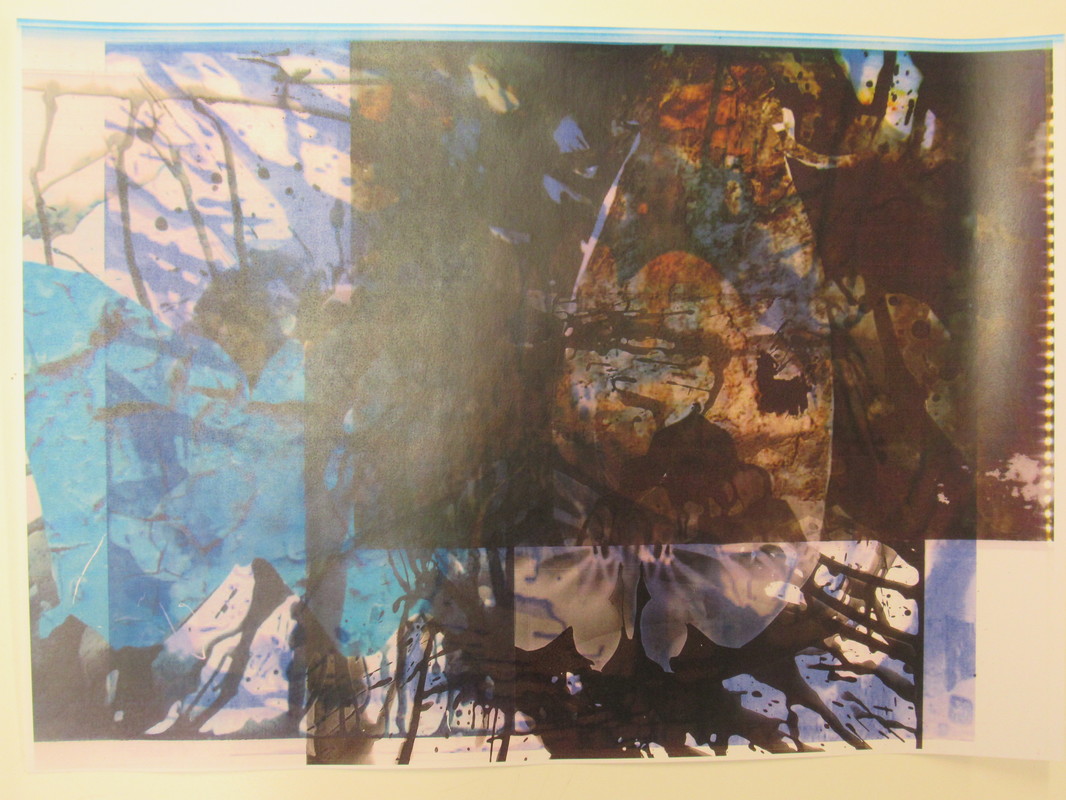
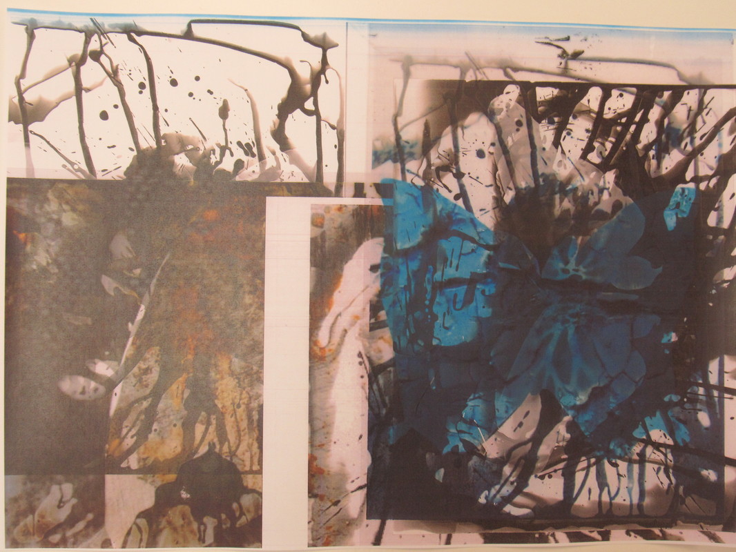
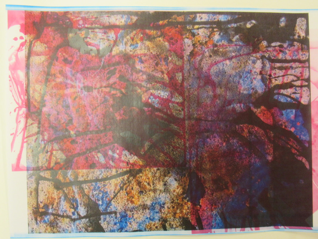
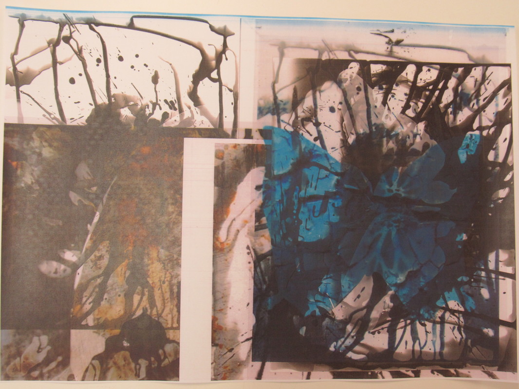
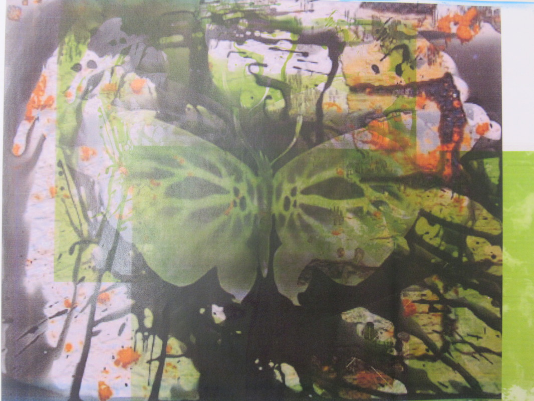
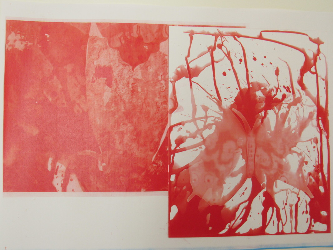

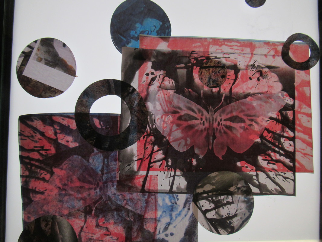
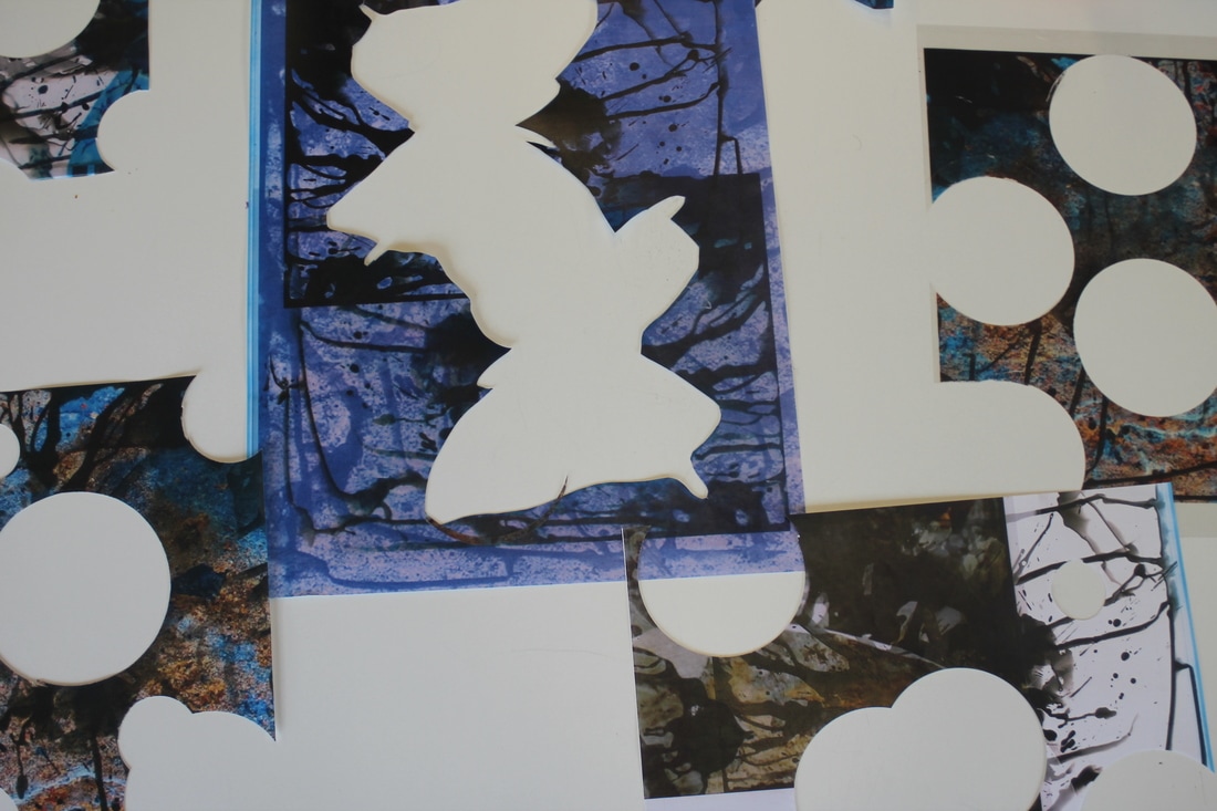
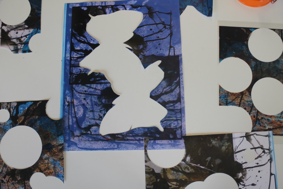
To achieve this development to my images I experimented with the photocopier. First I enlarged the photoshopped images onto A3 paper. I then photo-copied the transparent images and combined them on to A3 paper. The next step was that I printed A3 photocopies of my original photograms and transparent images. Then I printed the enlarged and layered images in different colours to achieve the final effect. Overall, the outcome of this experiment was fantastic as the results of the image was what I had imagined. The colours also mixed well and did not fill up the whole page. In addition, the way the multiple images layered together to create one whole image demonstrated Whaley's style of layering.
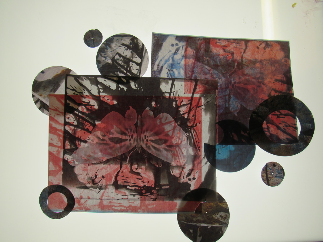
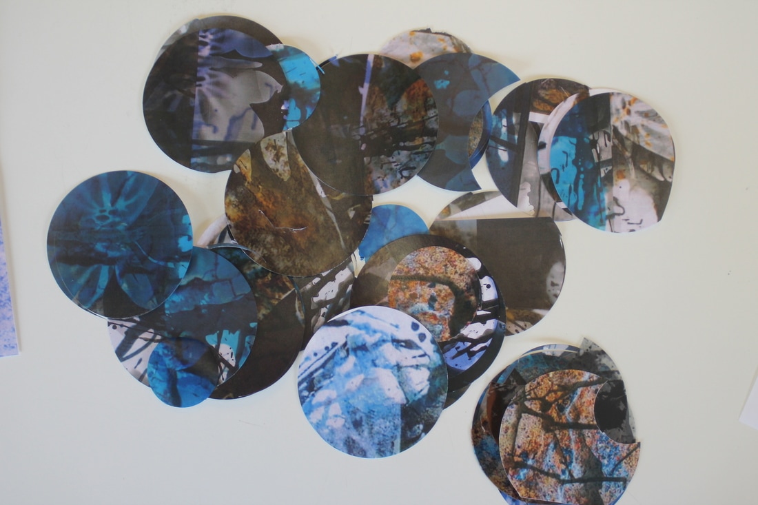
These are scrapes that I decided not to use for my final piece as. I created these circles by using a circle cutter.
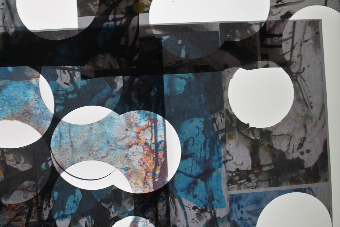
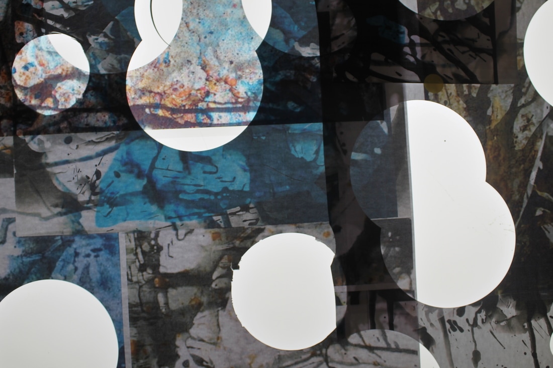
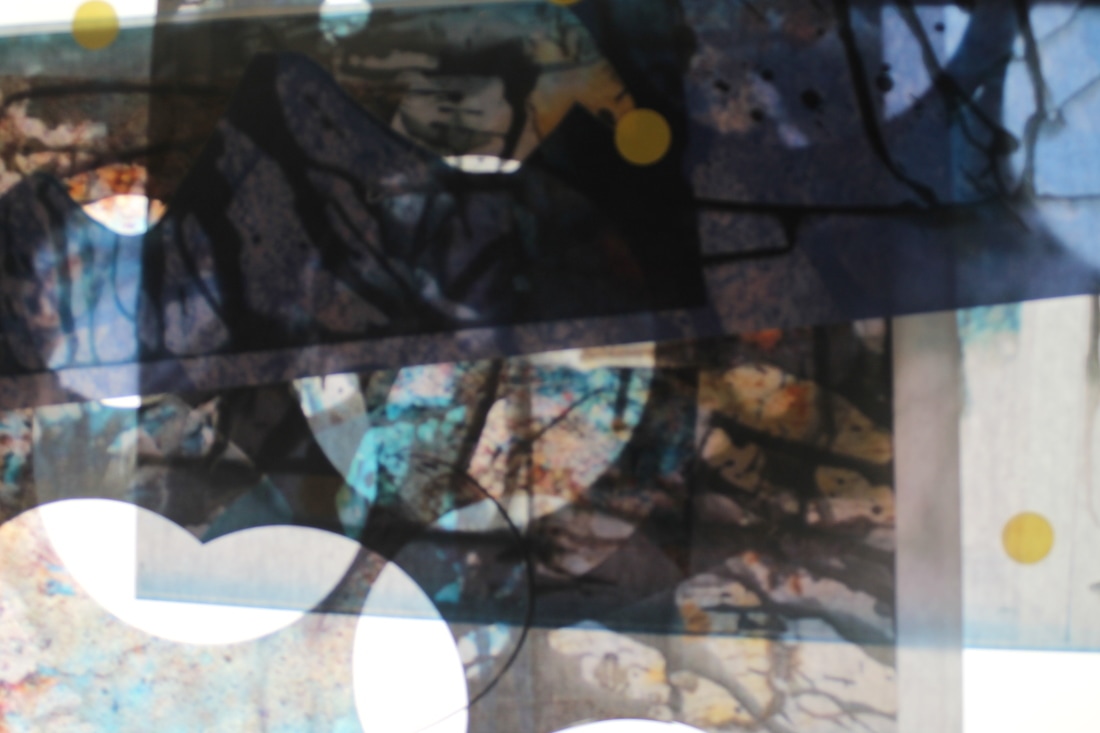
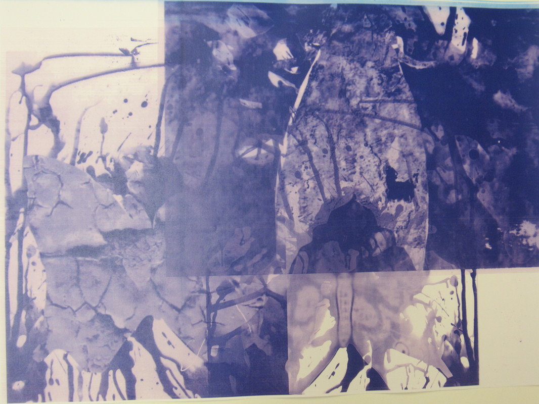
The images above was also not used for my final piece, however, I did create these series of photographs in order to not waste them. I was intrigued to see how this would turn out when a similar approach was applied. The result was pleasing and interesting on how the light box was shining light under the images, yet there was still a sense of dark tones surrounding them.
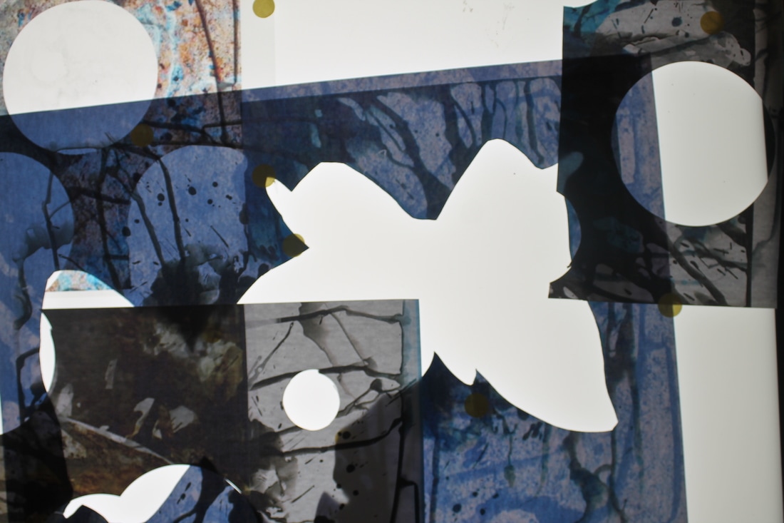
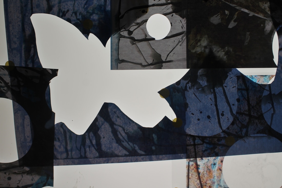
FINAL OUTCOME
FINAL EVALUATION
For Unit 2 I chose to do the theme Detail because I thought it would an fascinating theme to explore. Detail is a such a wide spread theme and within it there is a lot to explore. The concept itself is very fascinating and can be experimented with in many different ways.
To begin developing my ideas in unit two, I began researching a range of artist and photographers that would influence my work. The photographer that I chose to base my final piece on was Jo Whaley. I was largely influenced by her use of light, colour, and layering. I chose to develop my final piece based on my first response to her photographs which can be seen in my photograms. I was inspired by Whaley as her photographs are bold and energetic and have a metallic look. Jo Whaley's work very much relates to my theme because she has small but subtle details surrounding her photographs.
Other artist and photographers that I researched in unit two was Henry Troup. Troup's work involved taking dark toned images with high contrast of the beach. His photographs demonstrated the use of prominent line and smooth surface to create an image that did not resemble the beach at first glance. Another photographer I researched was Brandon Seilder, who used chemicals on film to convey the environmental effect they have on landscapes. In particular his collection of images titled 'Impure Photographs' was very appealing. The chemicals in this piece created such a fascinating mixture of colours that blended together nicely. The fourth photographer I researched was Stephen Gill.Gill experiments with developing photos using energy drinks which creates detailed lines and effects on the paper. What drew me to Gill was how his image almost appear to be moving.
In the beginning of my experimentation I began responding to Whaley, Troup and Faktor. I did this to develop some inspiration from the these artists and to have a solid idea that I would be able to refine over the course of unit two. My first response was Whaley's images which can be seen in my photograms. Creating and adapting Whaley's response proved easier than my other two responses. To begin with the photograms, I began refining them in photoshop in order to achieve the textured and detail background that can be seen in Whaley's work. The next step was to print the photograms onto transparent paper and experiment with them on top of the light-box. from looking at the photogram through light-box I was able to see the detail of the rough surfaces that I had photoshopped which came out quite clearly. To further improve my idea I decided to enlarge the photoshopped images and photocopy them. Using my original photograms and the images I had printed on transparent paper, I decided to layer them onto a photocopier to create new A3 images. I put these all into the paper tray and printed them using different colours and tones. For my final outcome I combined all of my experimentation into one piece. With the pieces left over, I arranged them on the light box and photograph them.
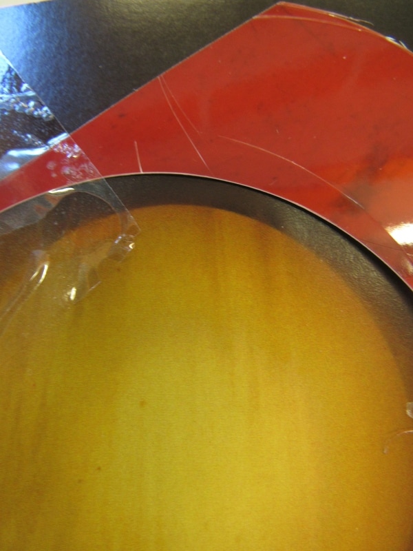
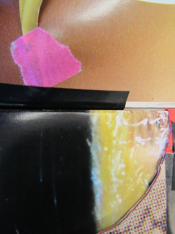
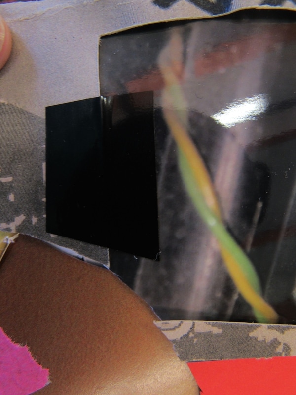
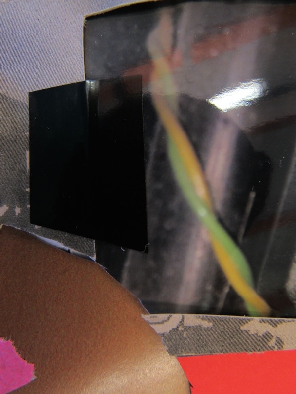
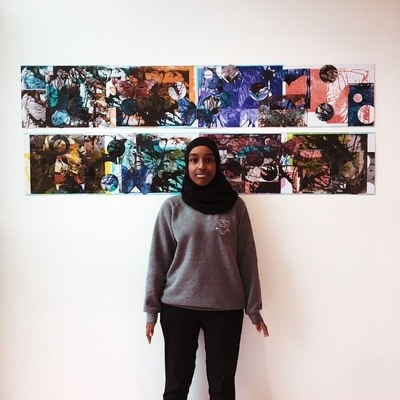
For my final outcome I chose to join all of my experimentation into one piece. I mounted eight of the A3 sheets of photocopied images onto long pieces of card. I then cut out holes and the outlined of the insects onto to the rest of the sheet into to layer them on top of the card. Throughout, I used random pieces of cut out insects and circles that worked well together and stuck them on to the card to create layers. The final outcome demonstrates Whaley's techniques of layering and her use of dynamic colours. I believe it is personal and meaningful as it shows how I have clearly developed one idea into many different stages. I was able to highlight new techniques and processes to perfect the final outcome. My final piece aimed to convey my understanding of my chosen theme using inspired photographs and ultimately create a piece of work based on my own perception of detail . Throughout this process, I have realised that detail is not just about the "mundane'' things in our surroundings but primarily to do with the individuals own interpretation of detail. To conclude, I am a very pleased on the outcome of my piece and have throughly enjoyed this unit.
For Unit 2 I chose to do the theme Detail because I thought it would an fascinating theme to explore. Detail is a such a wide spread theme and within it there is a lot to explore. The concept itself is very fascinating and can be experimented with in many different ways.
To begin developing my ideas in unit two, I began researching a range of artist and photographers that would influence my work. The photographer that I chose to base my final piece on was Jo Whaley. I was largely influenced by her use of light, colour, and layering. I chose to develop my final piece based on my first response to her photographs which can be seen in my photograms. I was inspired by Whaley as her photographs are bold and energetic and have a metallic look. Jo Whaley's work very much relates to my theme because she has small but subtle details surrounding her photographs.
Other artist and photographers that I researched in unit two was Henry Troup. Troup's work involved taking dark toned images with high contrast of the beach. His photographs demonstrated the use of prominent line and smooth surface to create an image that did not resemble the beach at first glance. Another photographer I researched was Brandon Seilder, who used chemicals on film to convey the environmental effect they have on landscapes. In particular his collection of images titled 'Impure Photographs' was very appealing. The chemicals in this piece created such a fascinating mixture of colours that blended together nicely. The fourth photographer I researched was Stephen Gill.Gill experiments with developing photos using energy drinks which creates detailed lines and effects on the paper. What drew me to Gill was how his image almost appear to be moving.
In the beginning of my experimentation I began responding to Whaley, Troup and Faktor. I did this to develop some inspiration from the these artists and to have a solid idea that I would be able to refine over the course of unit two. My first response was Whaley's images which can be seen in my photograms. Creating and adapting Whaley's response proved easier than my other two responses. To begin with the photograms, I began refining them in photoshop in order to achieve the textured and detail background that can be seen in Whaley's work. The next step was to print the photograms onto transparent paper and experiment with them on top of the light-box. from looking at the photogram through light-box I was able to see the detail of the rough surfaces that I had photoshopped which came out quite clearly. To further improve my idea I decided to enlarge the photoshopped images and photocopy them. Using my original photograms and the images I had printed on transparent paper, I decided to layer them onto a photocopier to create new A3 images. I put these all into the paper tray and printed them using different colours and tones. For my final outcome I combined all of my experimentation into one piece. With the pieces left over, I arranged them on the light box and photograph them.
For my final outcome I chose to join all of my experimentation into one piece. I mounted eight of the A3 sheets of photocopied images onto long pieces of card. I then cut out holes and the outlined of the insects onto to the rest of the sheet into to layer them on top of the card. Throughout, I used random pieces of cut out insects and circles that worked well together and stuck them on to the card to create layers. The final outcome demonstrates Whaley's techniques of layering and her use of dynamic colours. I believe it is personal and meaningful as it shows how I have clearly developed one idea into many different stages. I was able to highlight new techniques and processes to perfect the final outcome. My final piece aimed to convey my understanding of my chosen theme using inspired photographs and ultimately create a piece of work based on my own perception of detail . Throughout this process, I have realised that detail is not just about the "mundane'' things in our surroundings but primarily to do with the individuals own interpretation of detail. To conclude, I am a very pleased on the outcome of my piece and have throughly enjoyed this unit.
