Personal project: Abstraction
Introduction
'Existing in thought or as an idea but not having a physical or concrete existence'. This is the definition of abstract however, I think when something is abstract it involves shapes, patterns, tone, light, shadow and lines.
When something is abstract it is sometimes hard to define also when something is abstract it can be anything as long as its unique.
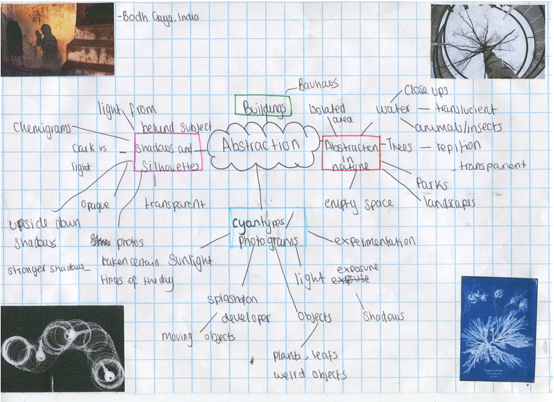
Mind map of Abstraction
First Response
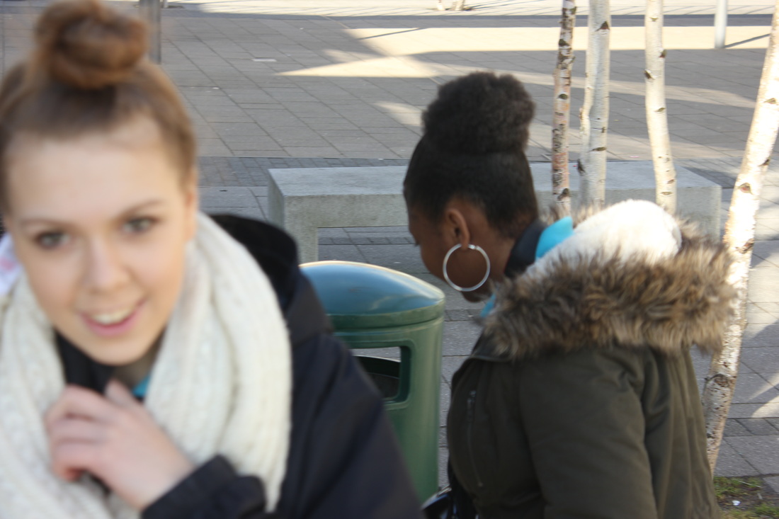
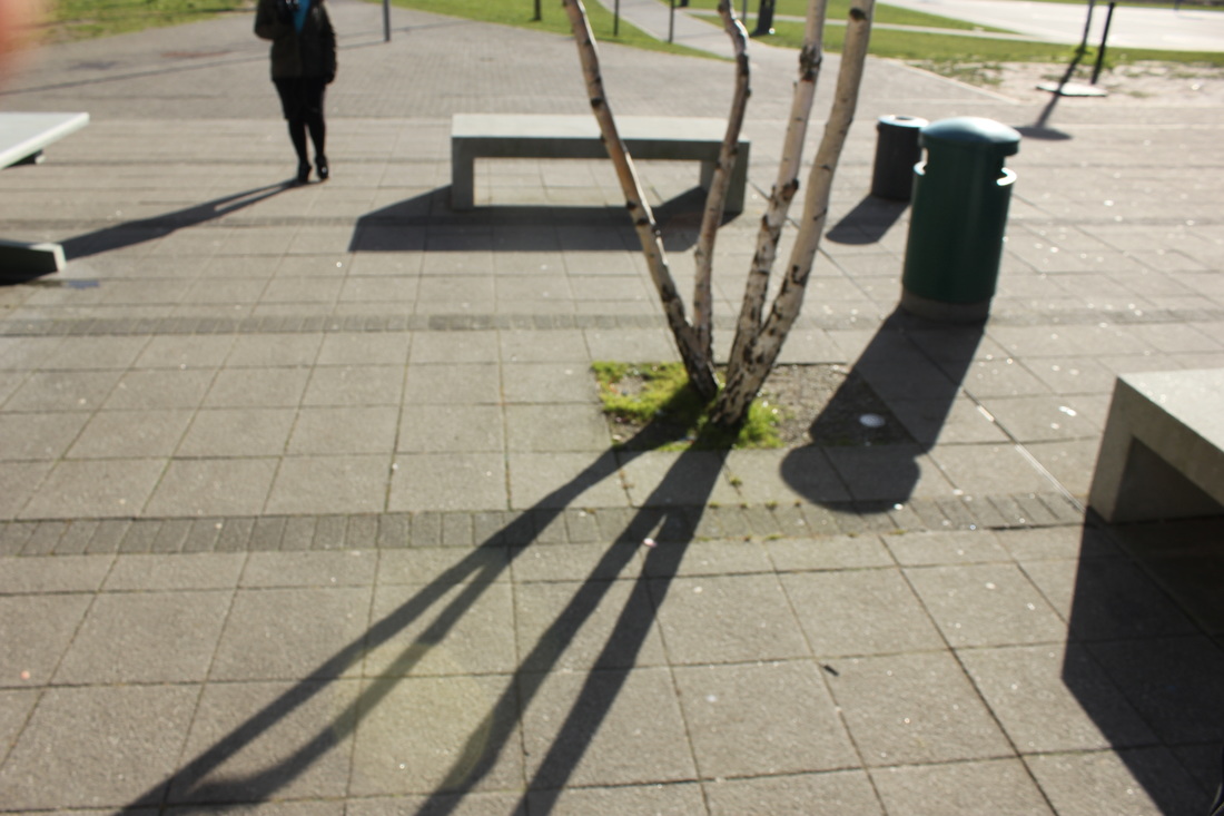
In my own time:
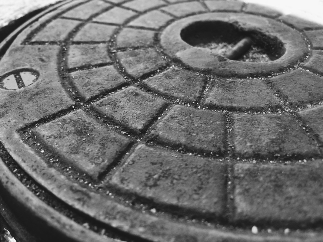
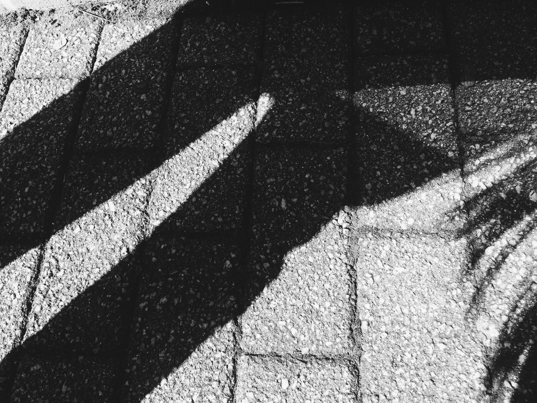
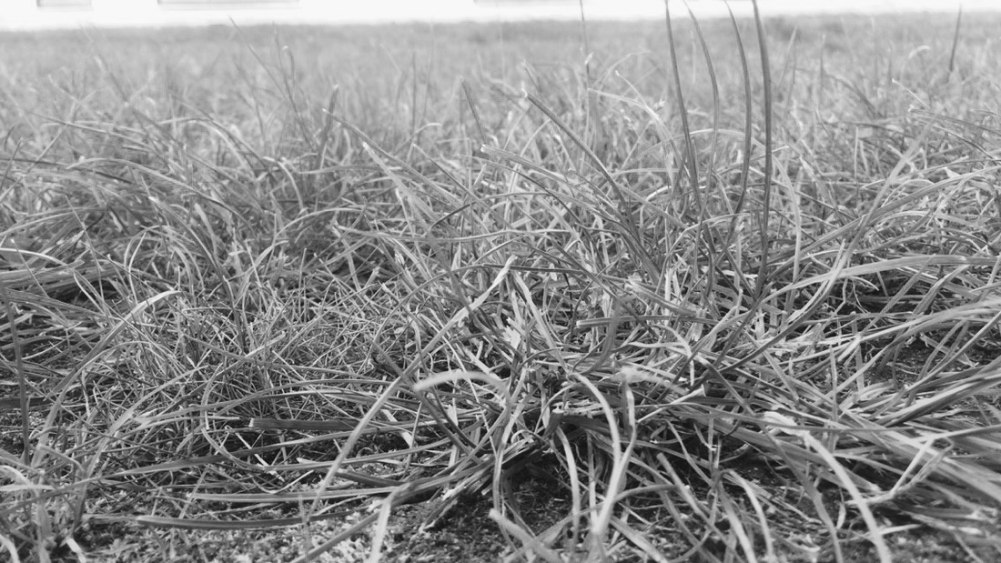
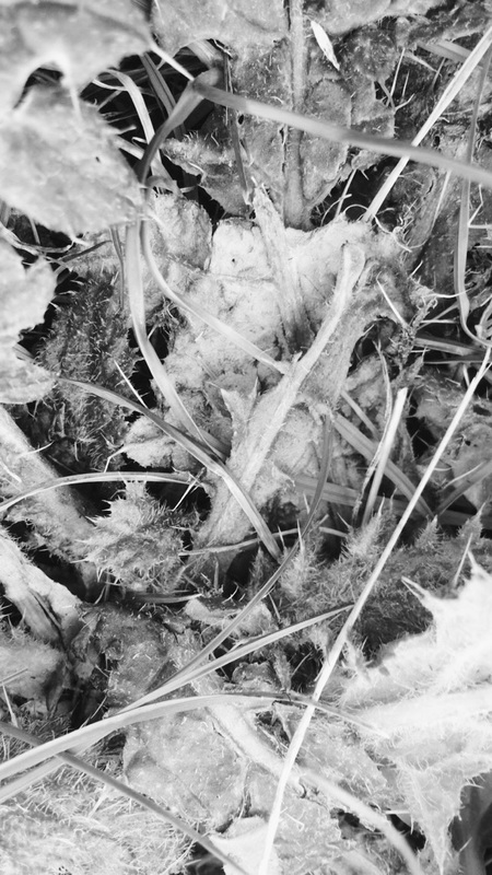
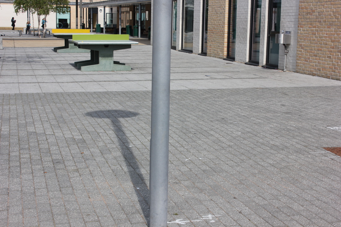
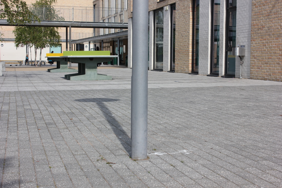
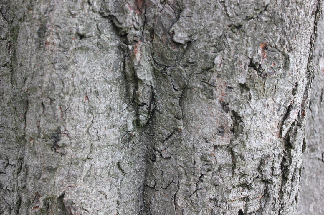
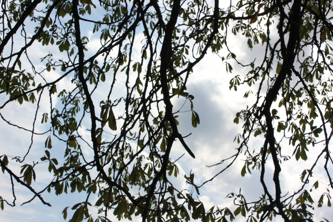
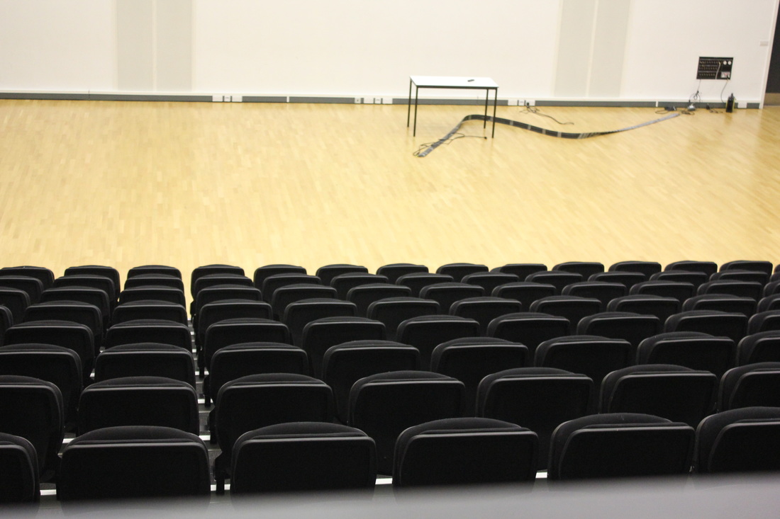
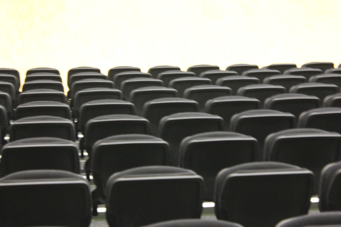
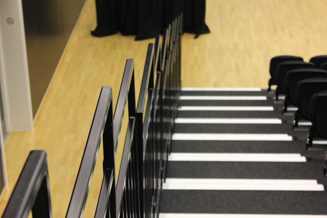
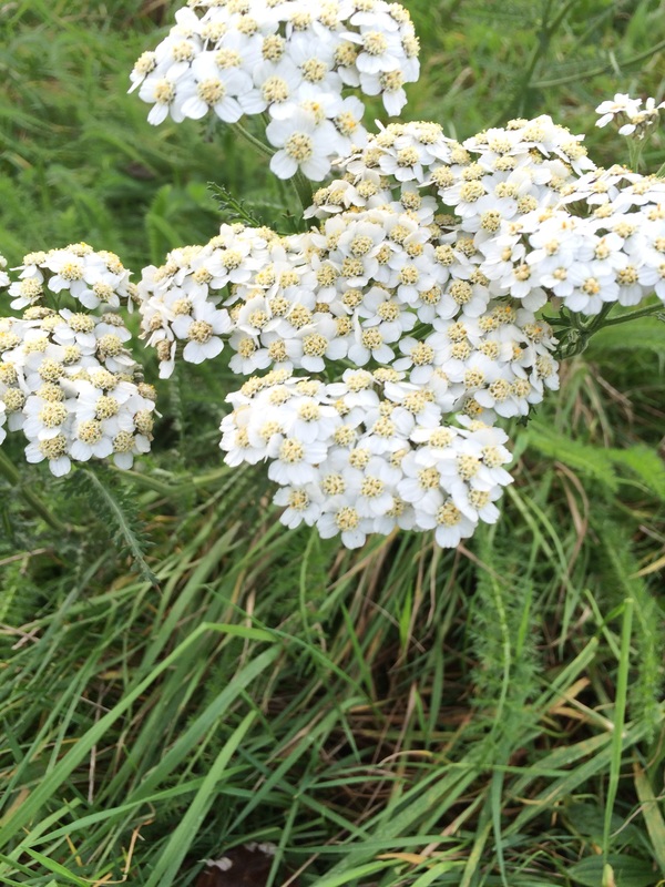
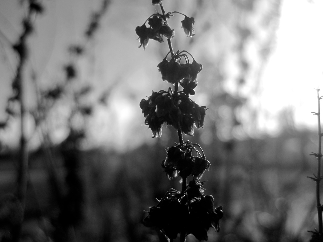
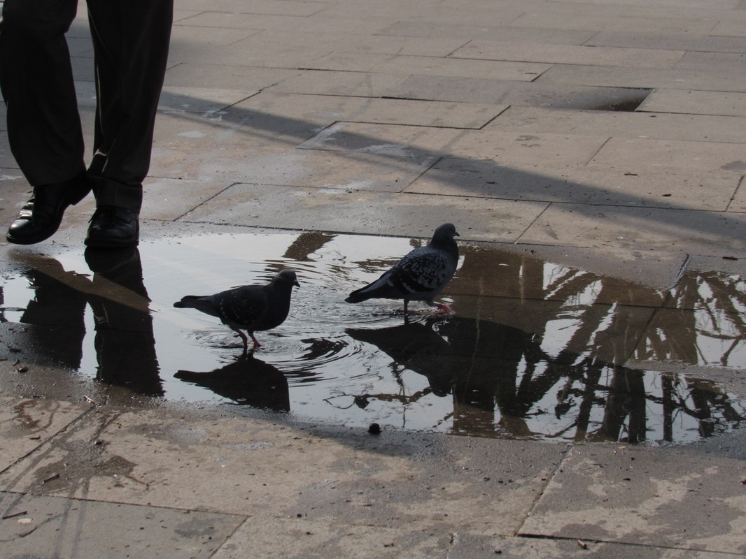
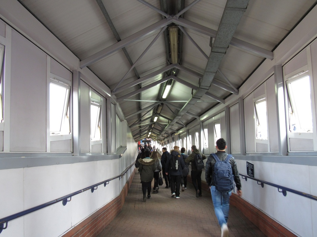
The photographs above show my first attempt at taking abstract image, this response is before any initial research on artist and they demonstrate my interpretation of the theme. Overall, I feel that my photos are some what abstract is. However, I could always improve on them. I believe they are abstract as they all have shadows, light, shapes and patterns. I also find them abstract because of the angles I took some with. Some of the angles work with certain images and others don't.
The Formal Elements
|
Focus:
Light: Line: Repetition: Shape: Space: Texture: Value/Tone: |
Which areas appear clearest or sharpest in the photograph? Which do not?
Which areas of the photograph are brightest? Are there any shadows? Does the photograph allow you to guess the time of day? Is the light natural or artificial? Harsh or soft? Reflected or direct? Are there objects in the photograph that act as lines? Are they straight, curvy, thin, thick? Do the lines create direction in the photograph? Do they outline? Do the lines show movement or energy? Are there any objects, shapes or lines which repeat and create a pattern? Do you see geometric (straight edged) or organic (curvy) shapes? Which are they? Is there depth to the photograph or does it seem shallow? What creates this appearance? Are there important negative (empty) spaces in addition to positive (solid) spaces? Is there depth created by spatial illusions i.e. perspective? If you could touch the surface of the photograph how would it feel? How do the objects in the picture look like they would feel? Is there a range of tones from dark to light? Where is the darkest value? Where is the lightest? |


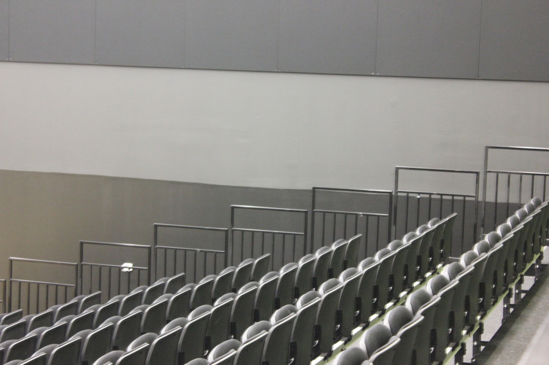
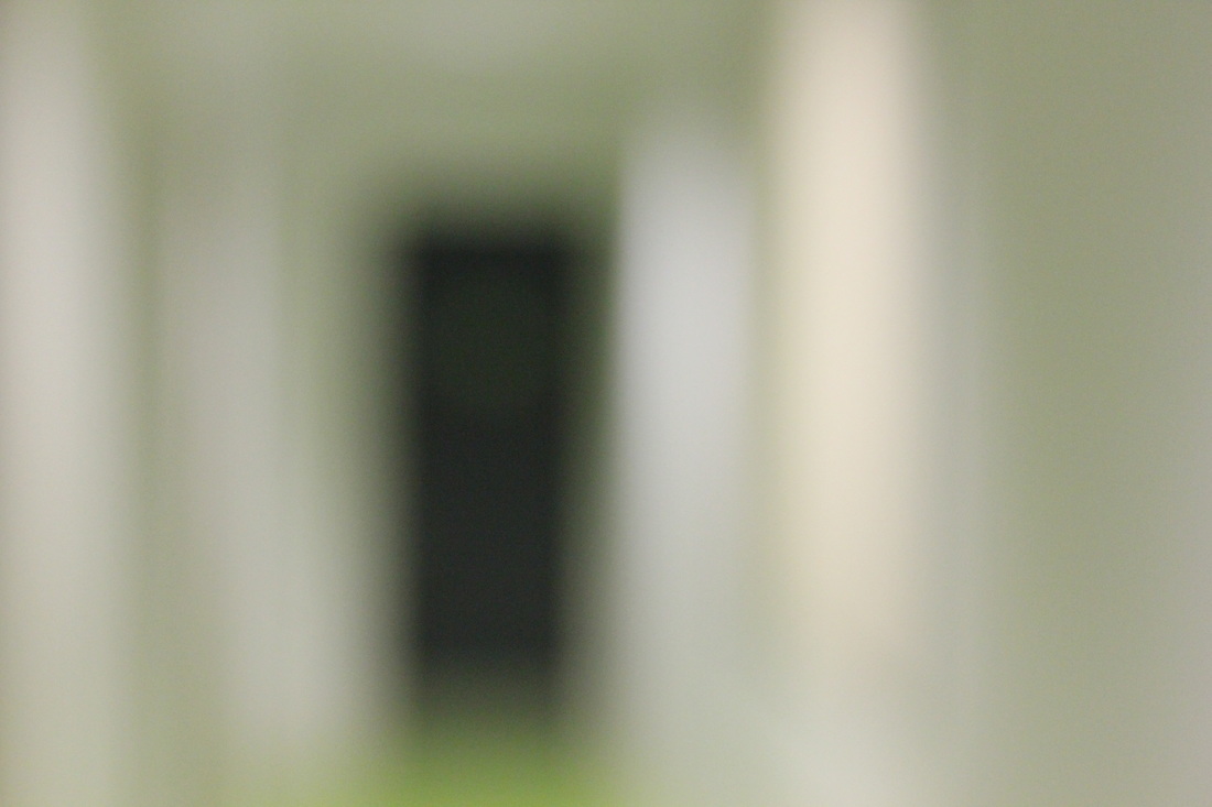
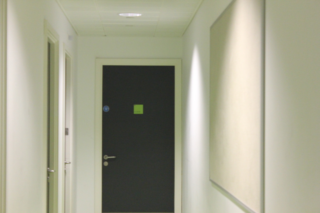

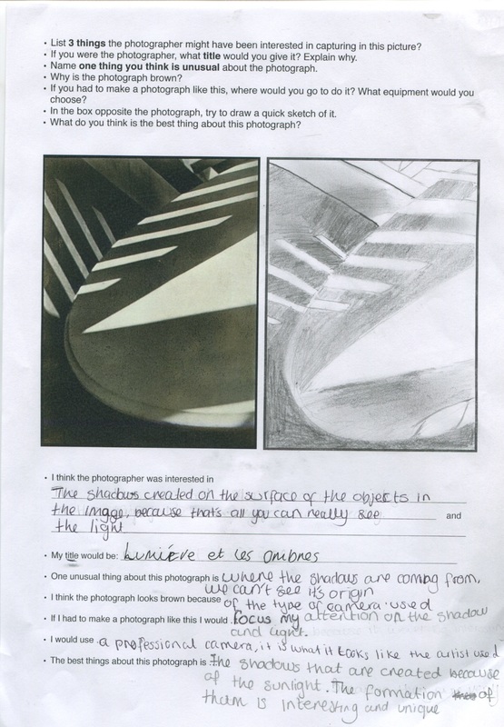
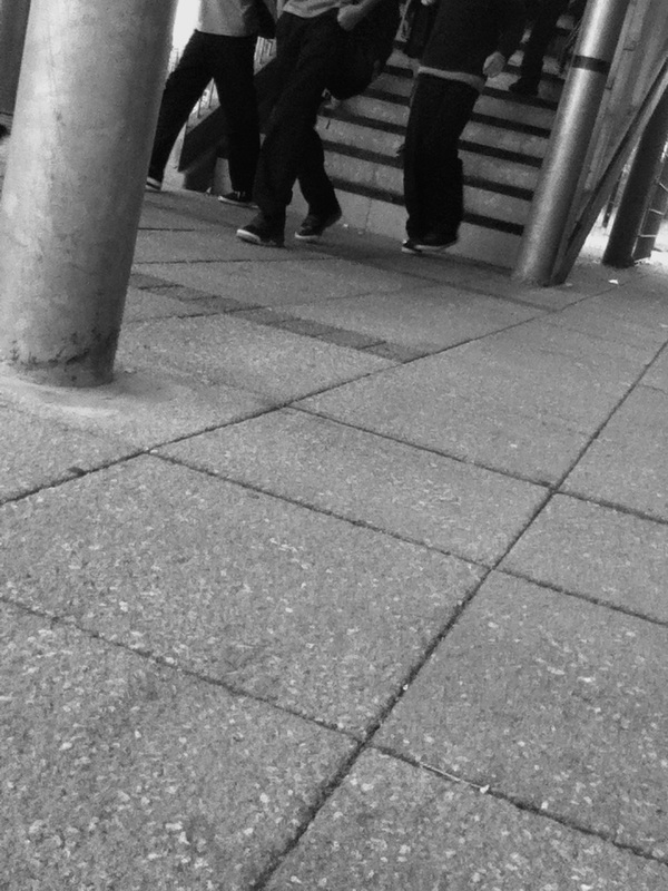
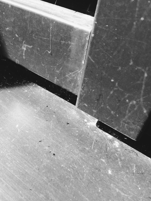
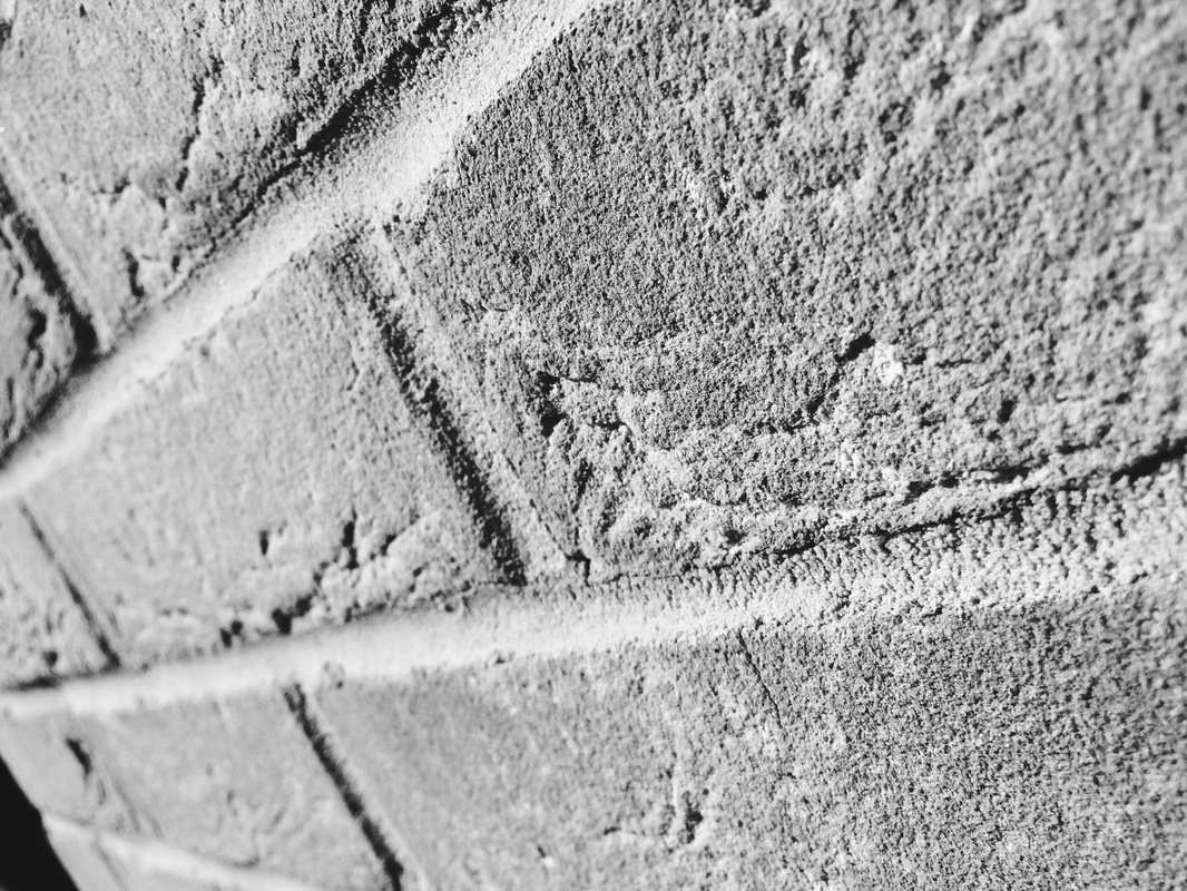
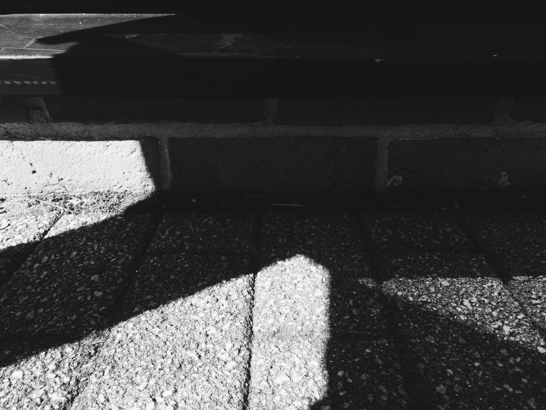
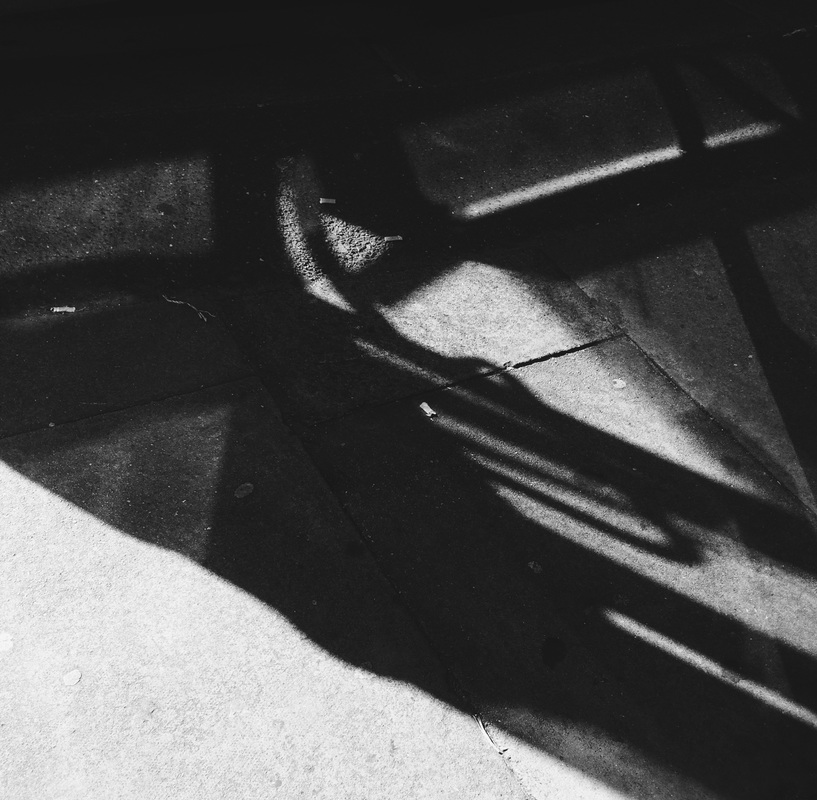
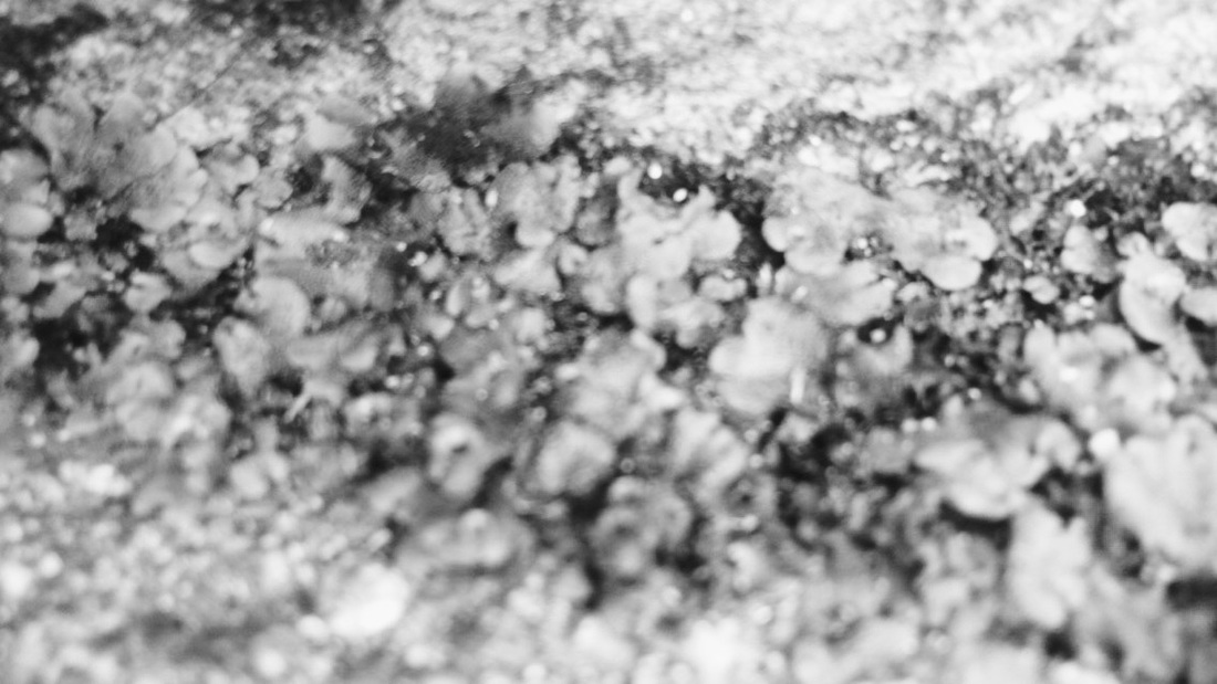
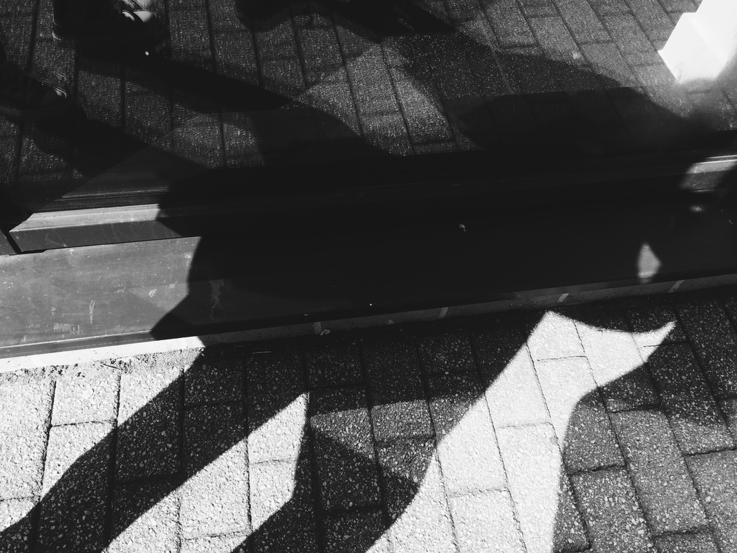
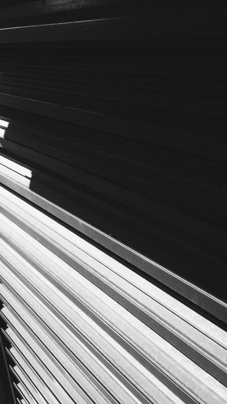
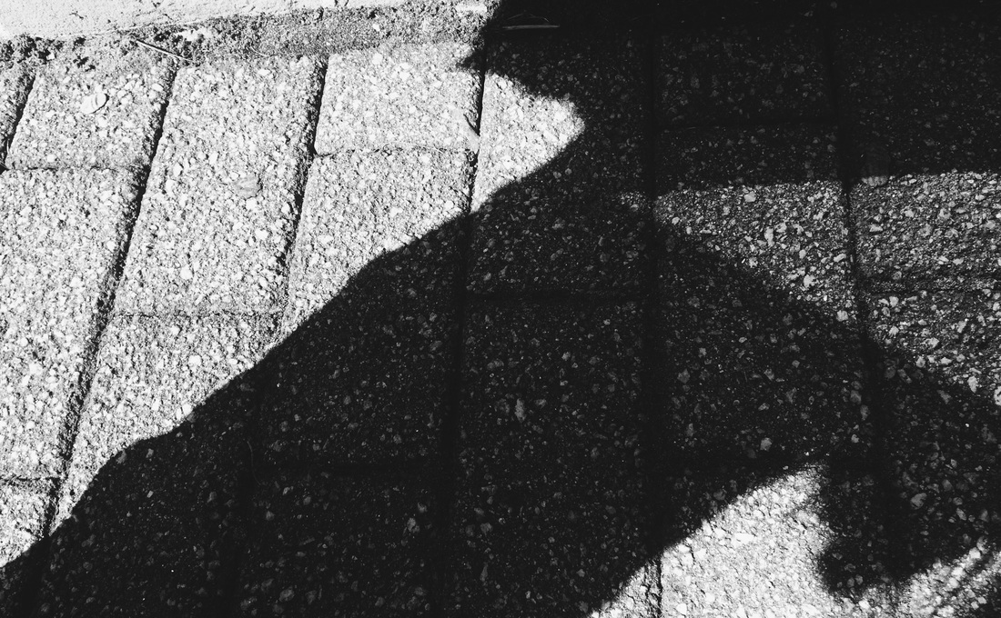
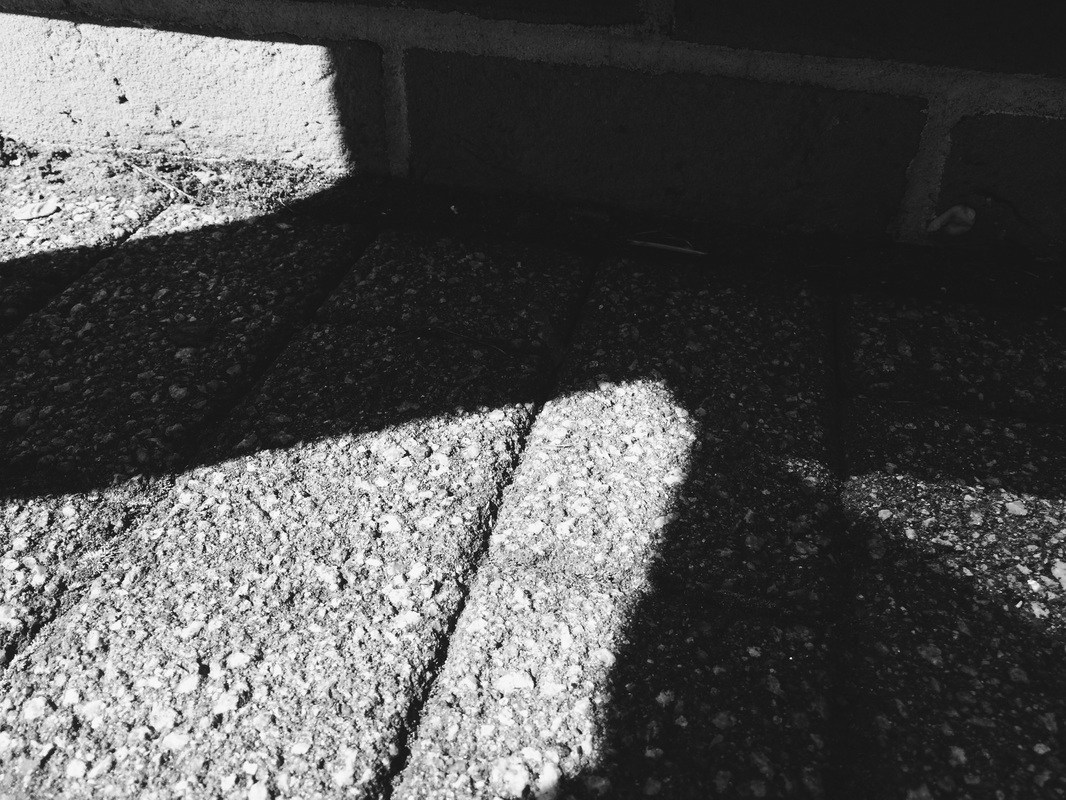
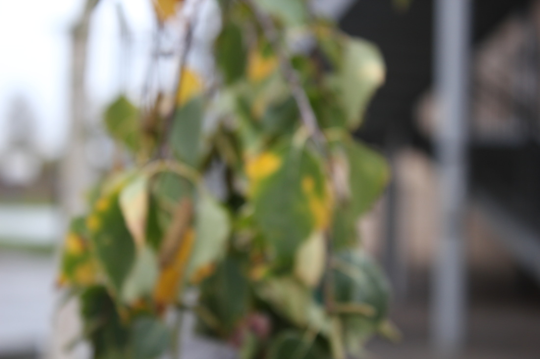
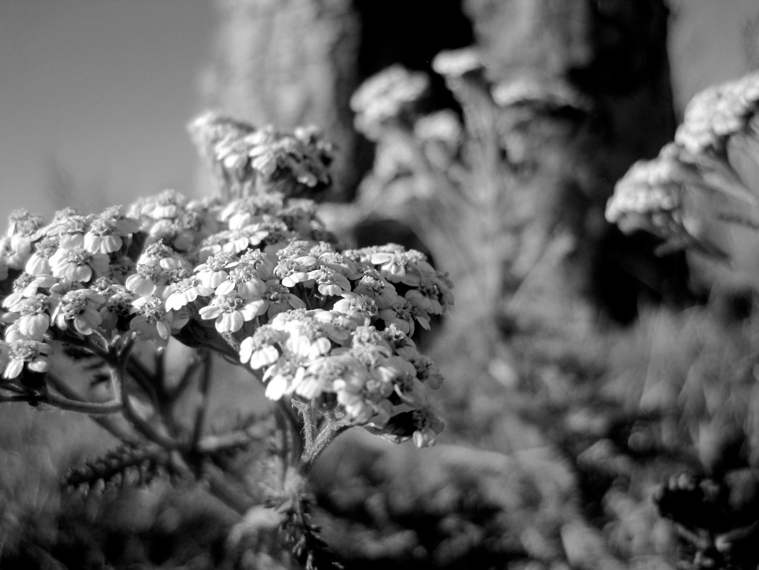
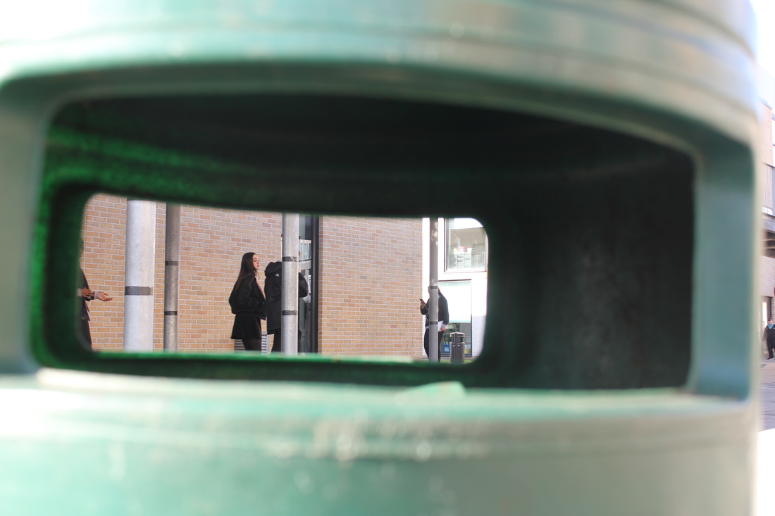
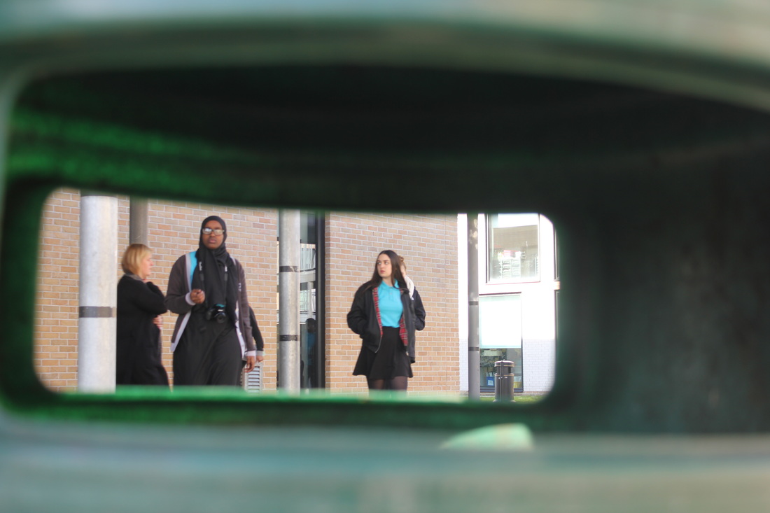
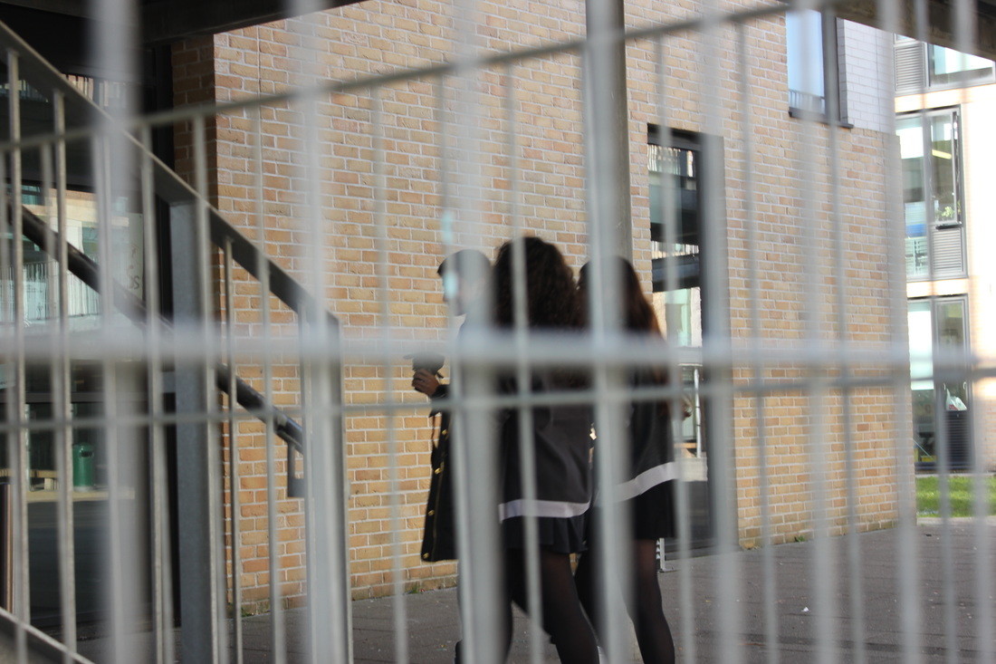
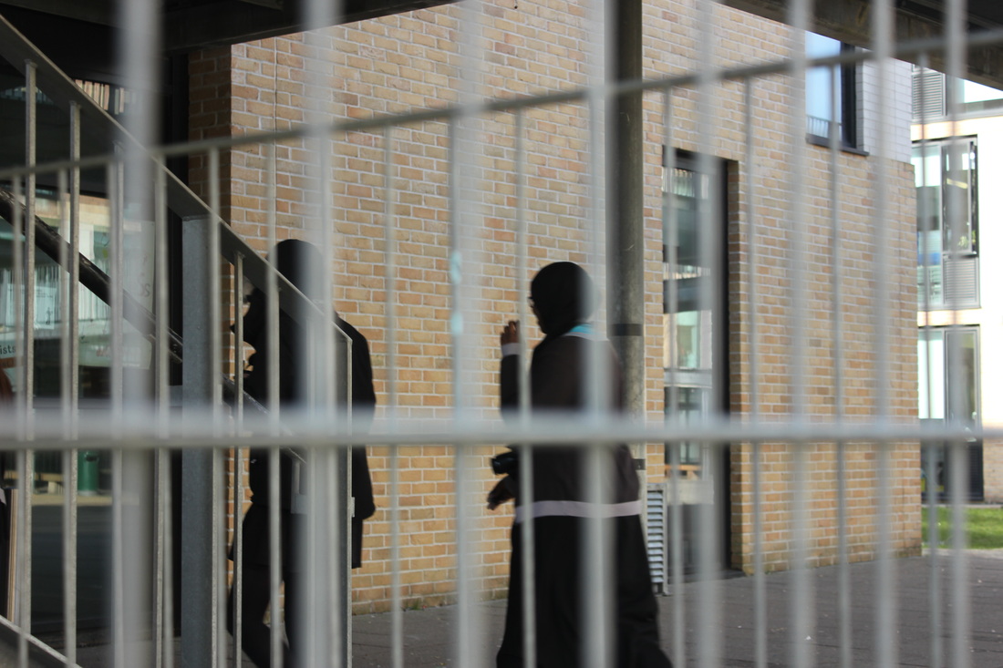
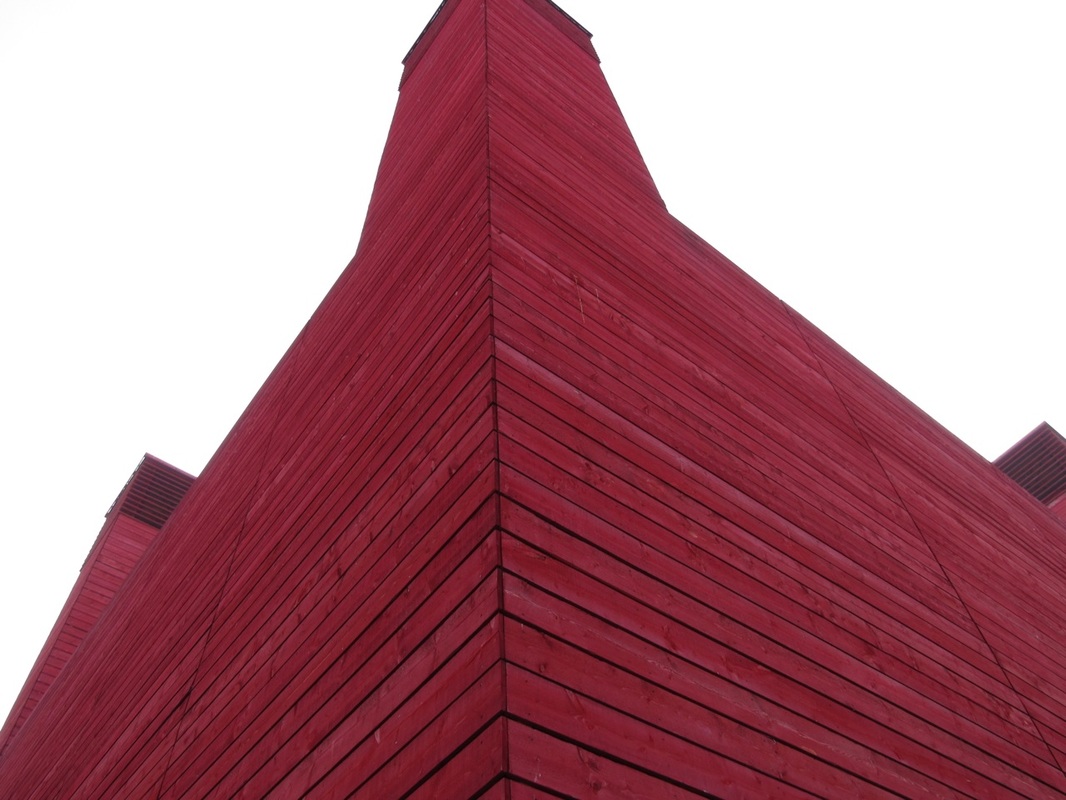
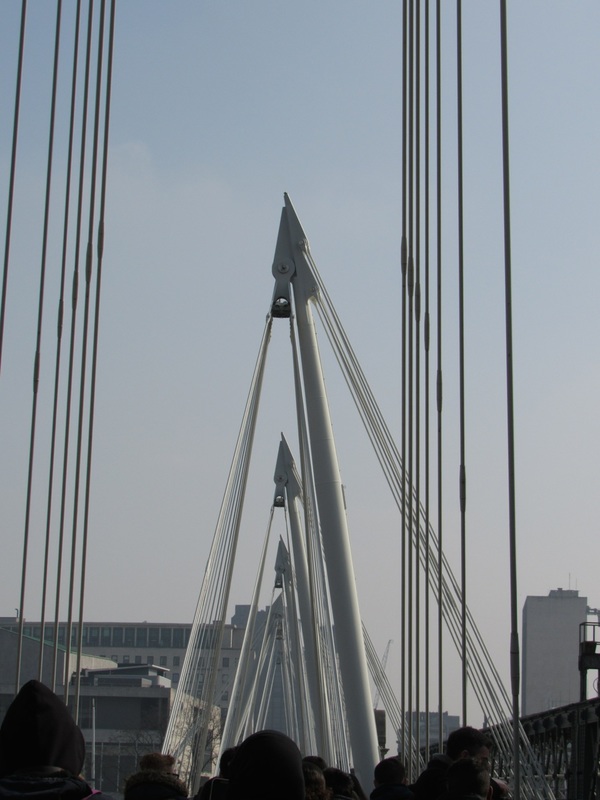
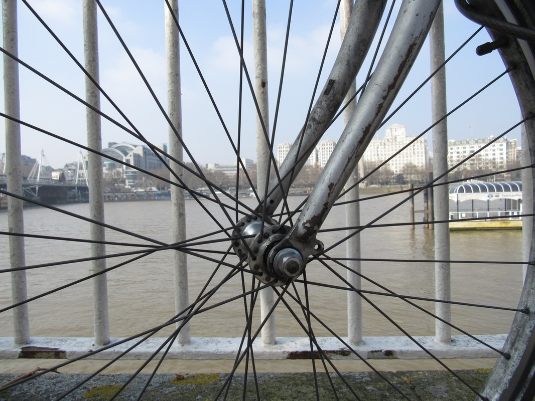
In the images above I was trying to portray a mixture of the Formal Elements, however my main focus for the task was trying to take to images that represented repetition or light and tone. In my opinion the photos below demonstrate these things best.
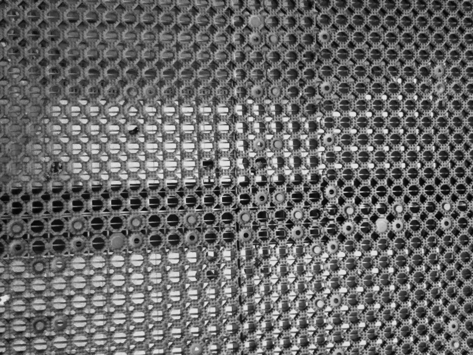
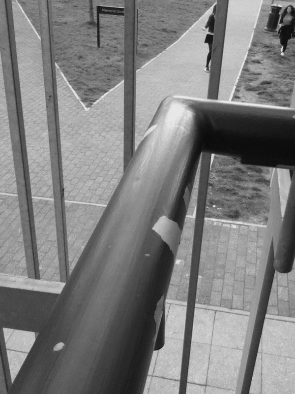
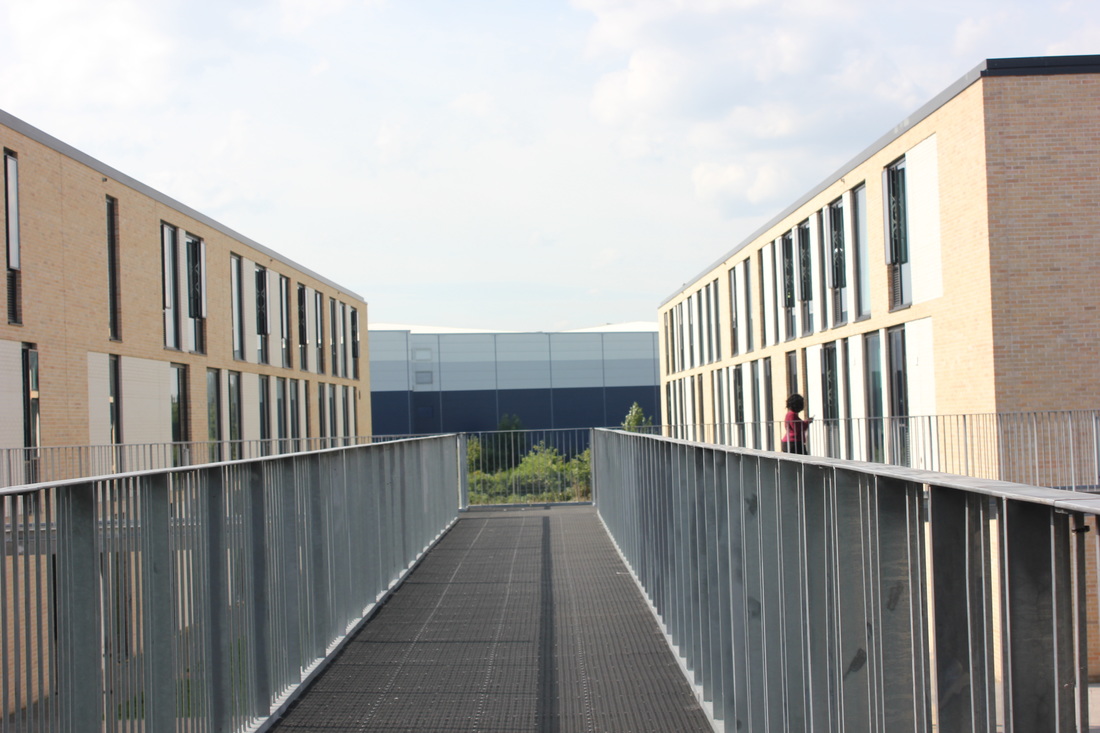
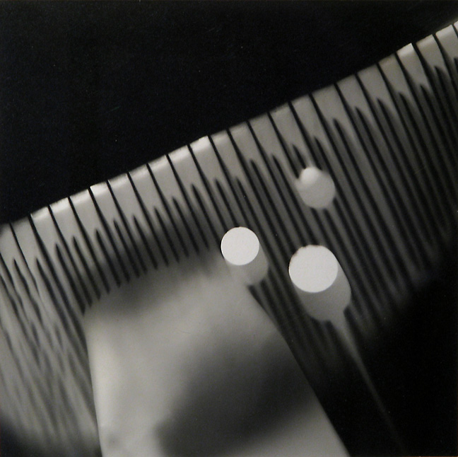
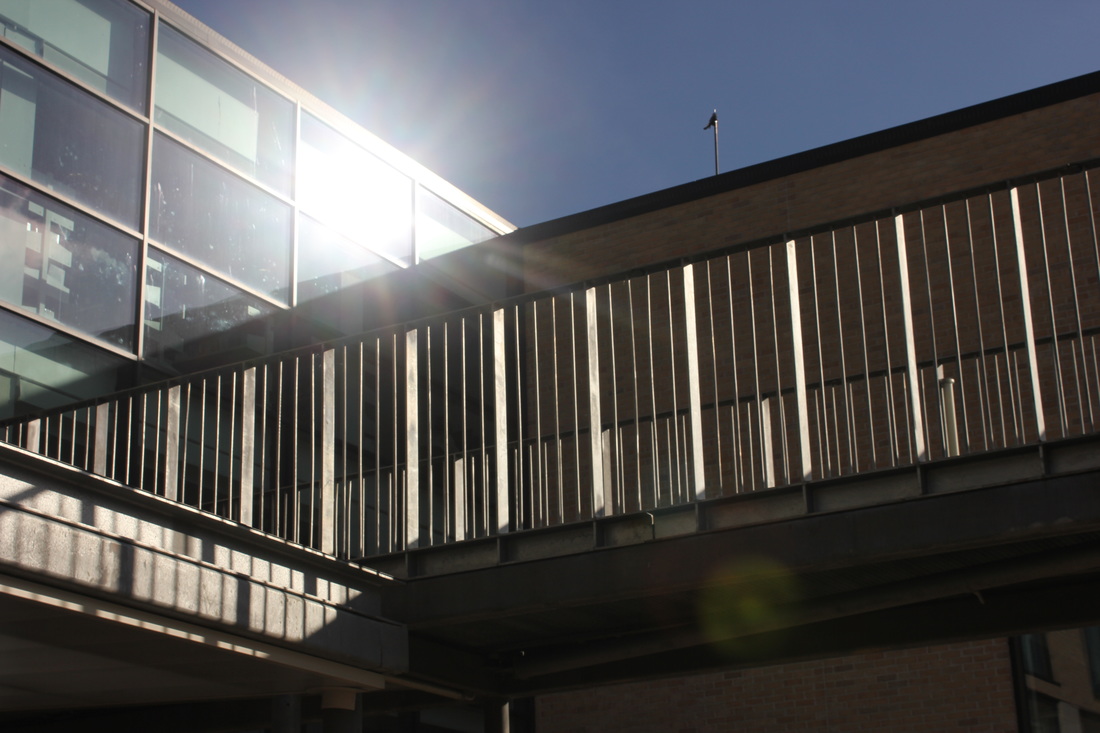
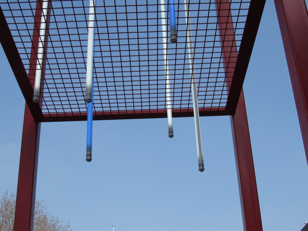
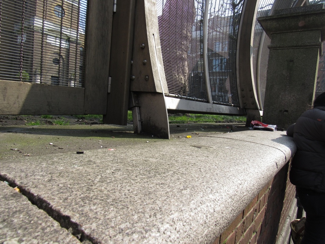
Repetiton and Light
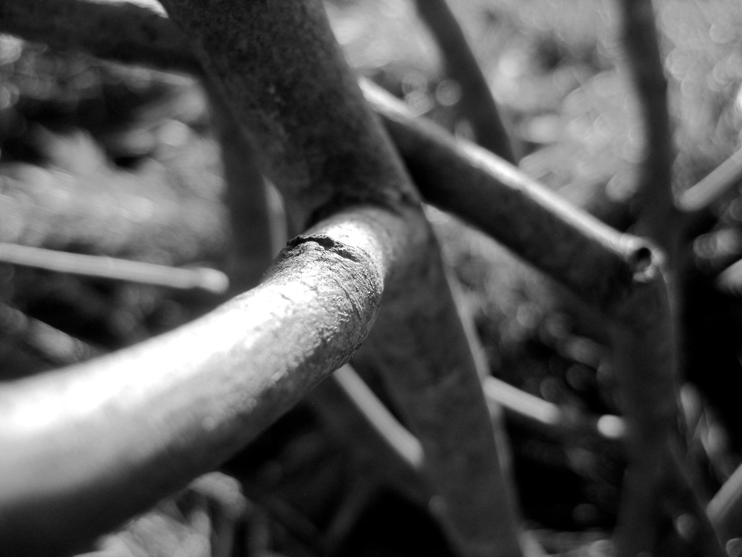
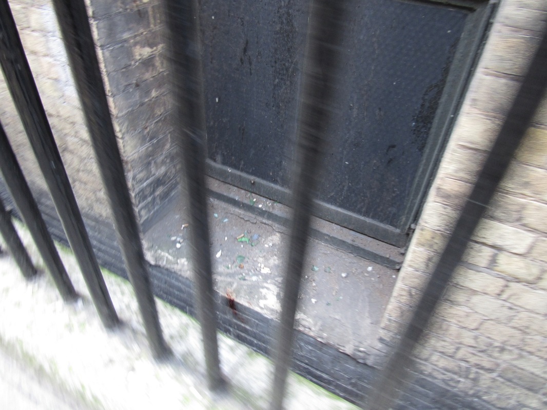
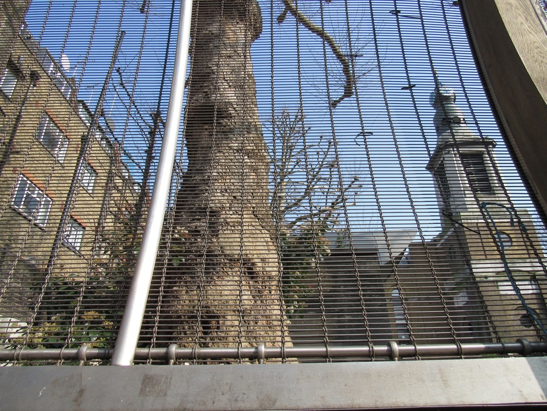
The most important elements of this image is light and repetition. The sunlight light is coming from the right hand side and is creating a shadow of the railings. Futhermore, repetition is important because of how the railing bars repeat over and over again, and also get narrower and there is also the repetition pf the shadows created. |
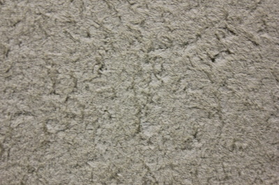
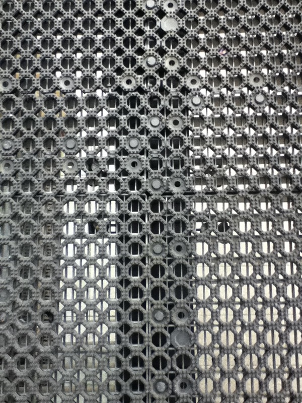
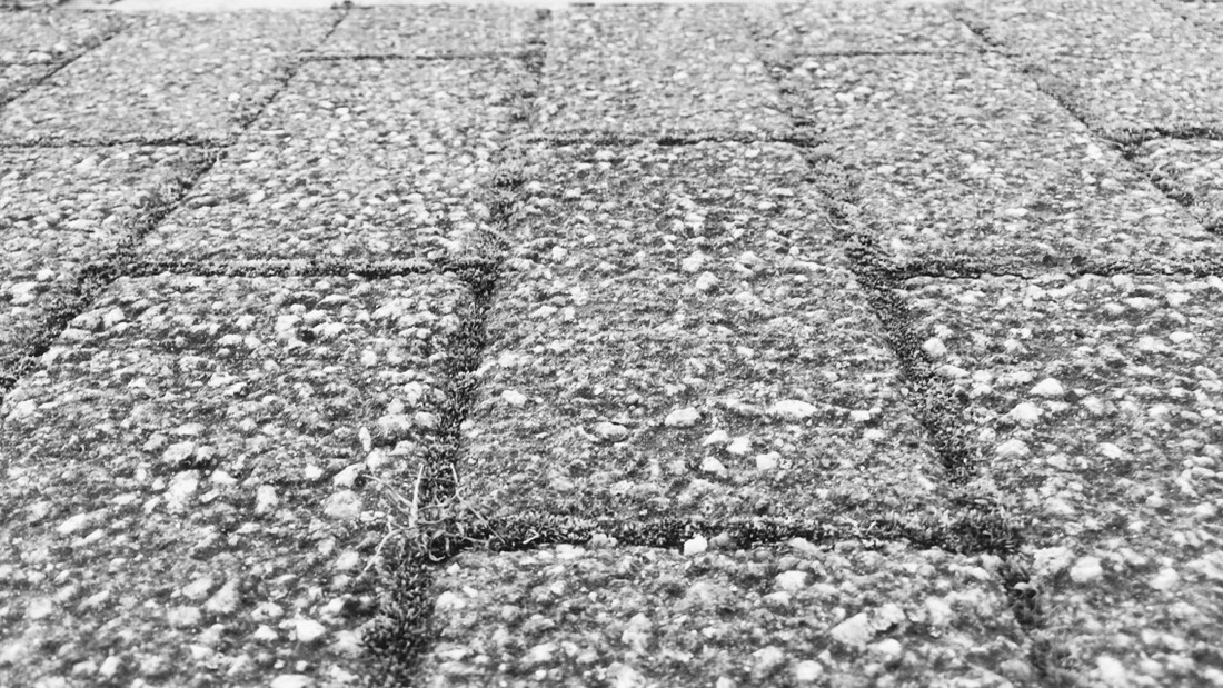
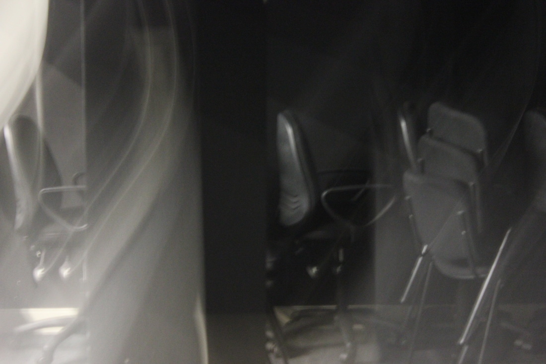
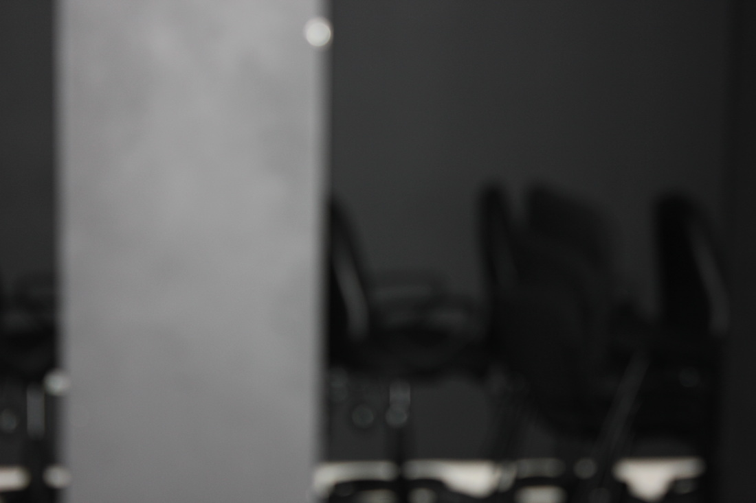
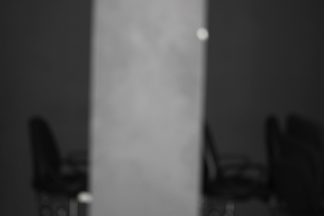
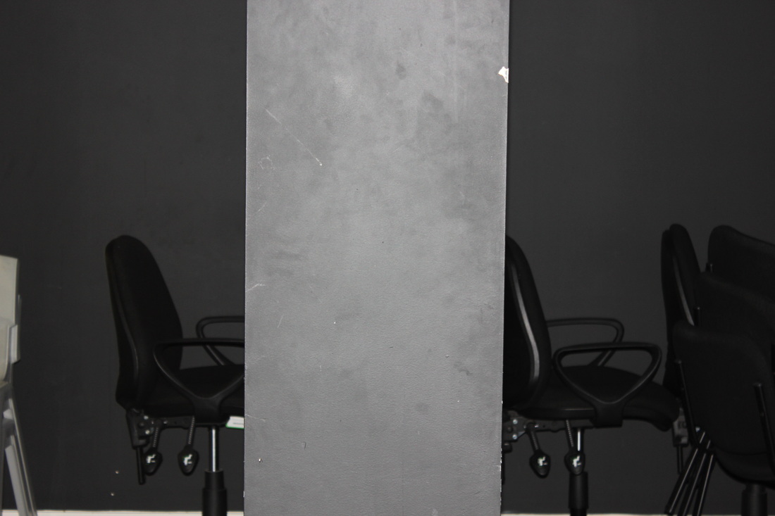
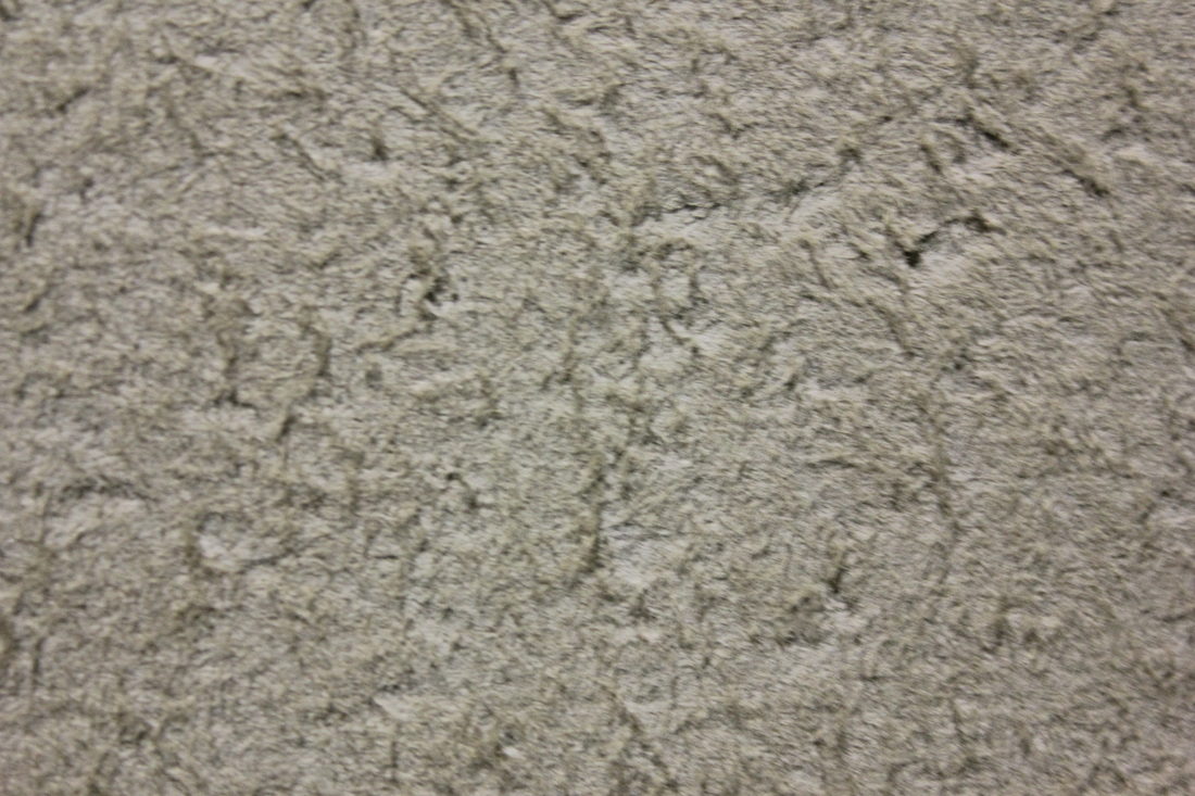
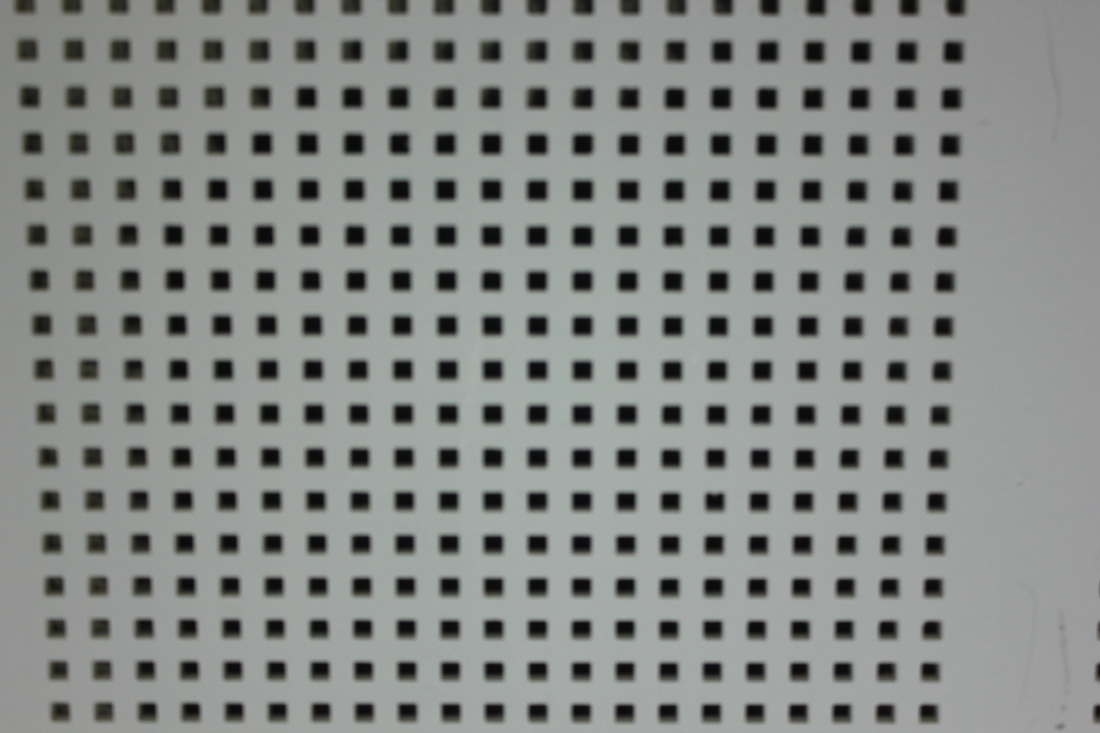
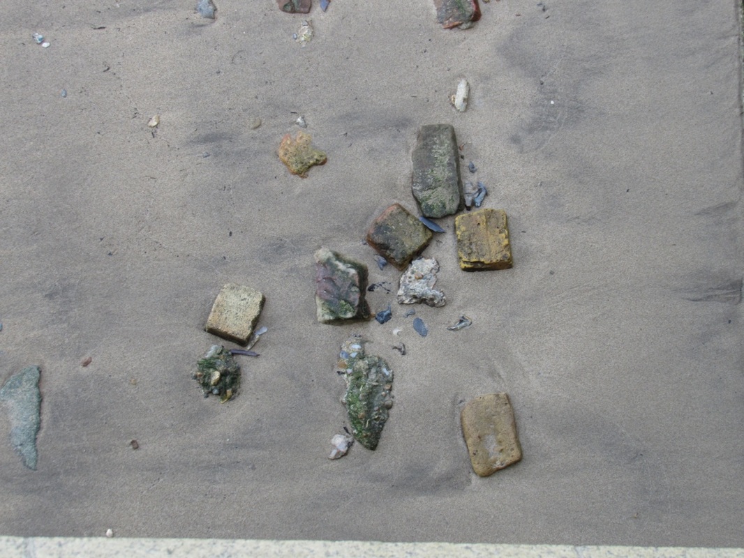
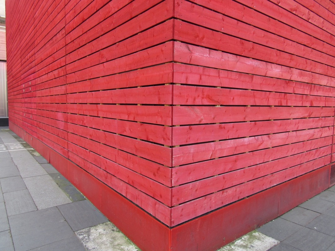
Texture
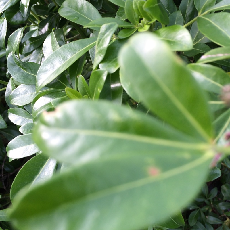
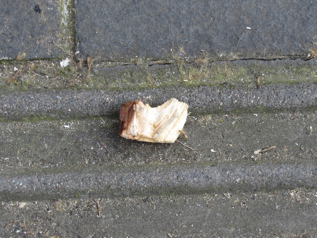
In my opinion, I think the most important element of this images is tone because the surface of the board is very rough textured. However, if you were to feel it I think there would be an element of softness to it. In addition the dents in the surface |
Resesarch
Harry Callahan
Harry Callahan
“The difference between the casual impression and the intensified image is about as great as that separating the average business letter from a poem,” said Harry Callahan in 1964. Callahan discovered photography at 26 years old. He found ways of working and choosing photographic subjects. When taking photographs Harry would chose a subject, photograph it a while. After that he would return to the same photo with a change of perspective. I am interested in Callahan's work because they look very peaceful and serene also I love the patterns in them and the repeition. Some of his photographs do not have much going on in them, but sometimes that isn't necessary, so that the viewer can focus on the main idea.
Post it note Abstraction - Inspired by Ray K Mezker
Ray K Metzker
Ray Metzker was an american photographer and mainly know for is work with landscapes and cityscape. During his time he pushed any idea or technique to the extreme. He discovered any ideas with limits and any thing with potential, consistently changing course. Metzker usually titled his images based on where he took them. On the whole his photos convey an artistic view that is abstract. He relates to this this as his photographs have high contrast that create a sense of unusualness as it is hard to identity the subjects within his photographs.
Ray Metzker was an american photographer and mainly know for is work with landscapes and cityscape. During his time he pushed any idea or technique to the extreme. He discovered any ideas with limits and any thing with potential, consistently changing course. Metzker usually titled his images based on where he took them. On the whole his photos convey an artistic view that is abstract. He relates to this this as his photographs have high contrast that create a sense of unusualness as it is hard to identity the subjects within his photographs.
Mezker inspired


The images above is my response to Metzker, I am extremely pleased with this out-come because it demonstrates my understanding of how Metzker is able to distort is photographs using other materials. My aim was to capture images of objects and surroundings that complimented the colours of the tape.
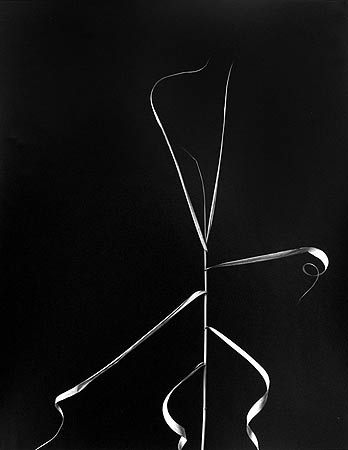
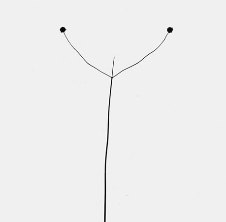
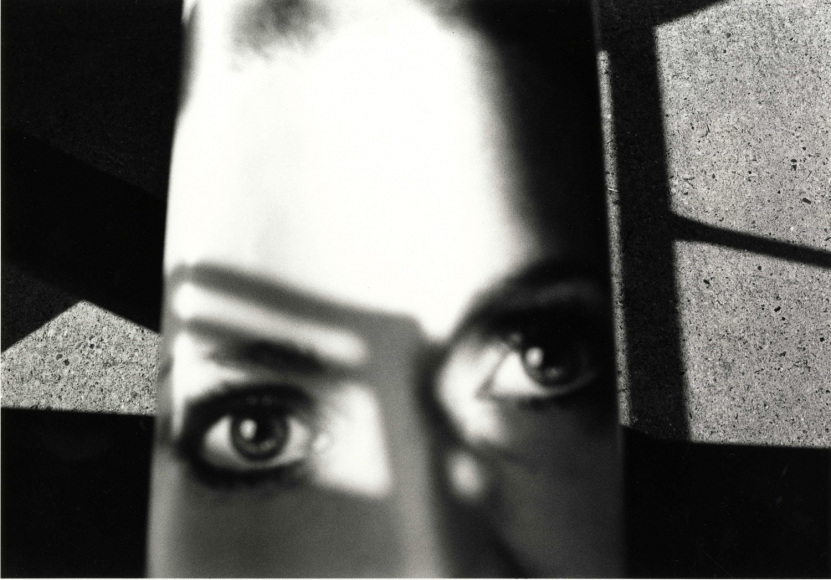
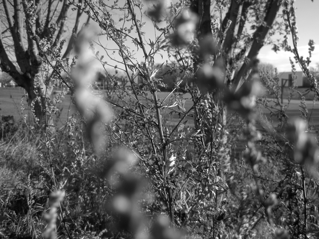
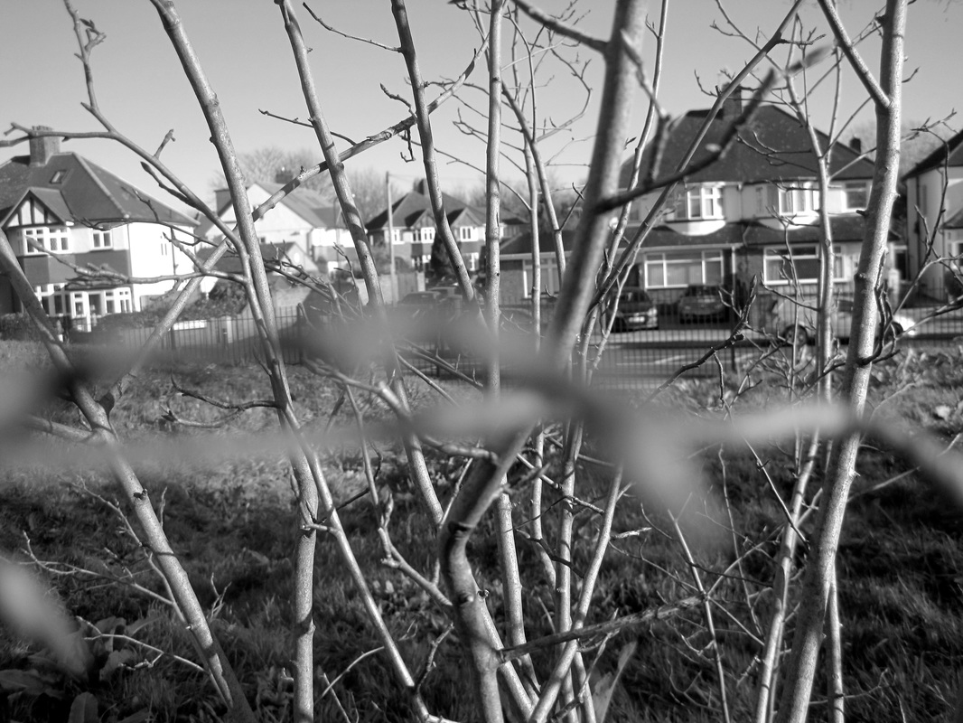
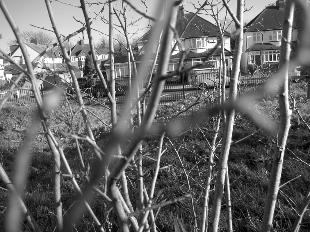
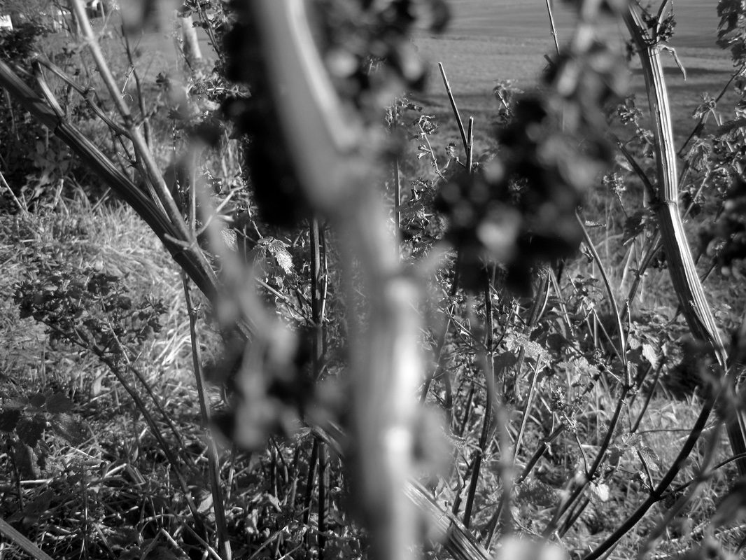
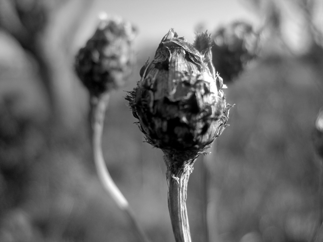
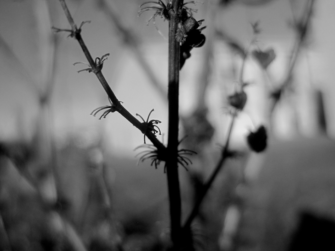
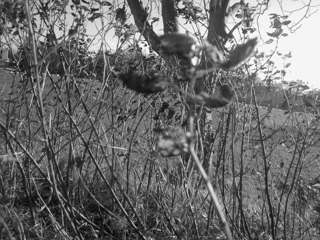
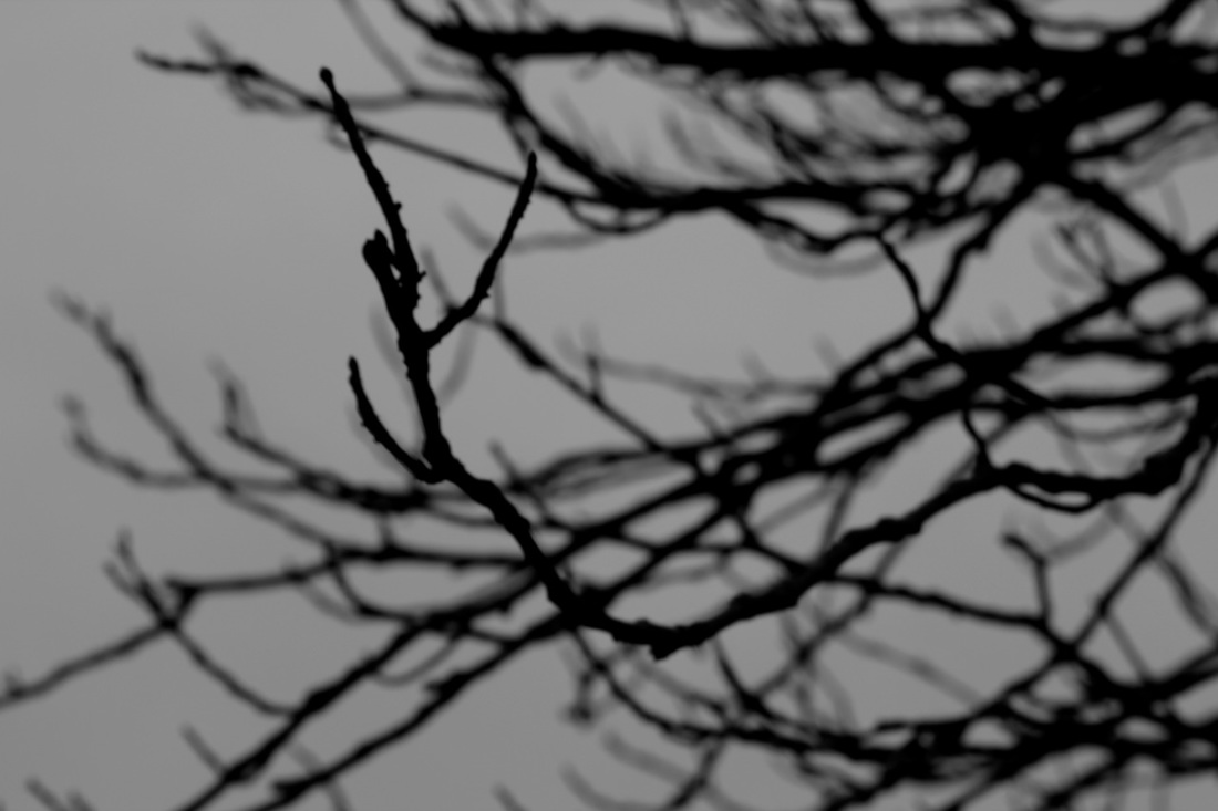
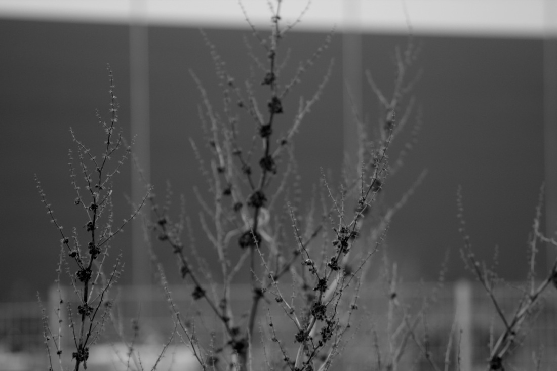
Ralph Eugene Meatyard
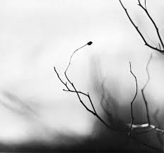
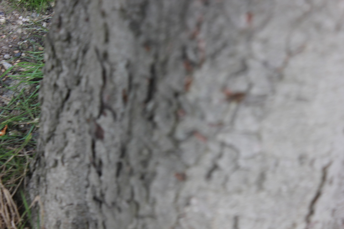
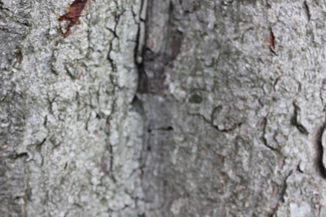
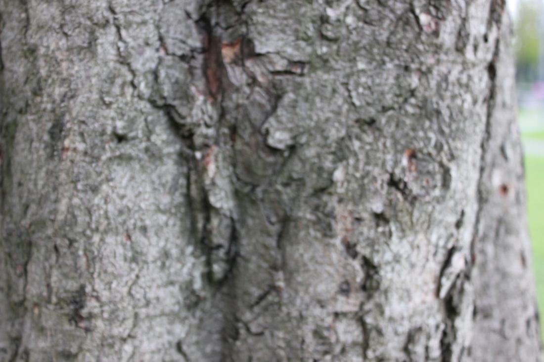
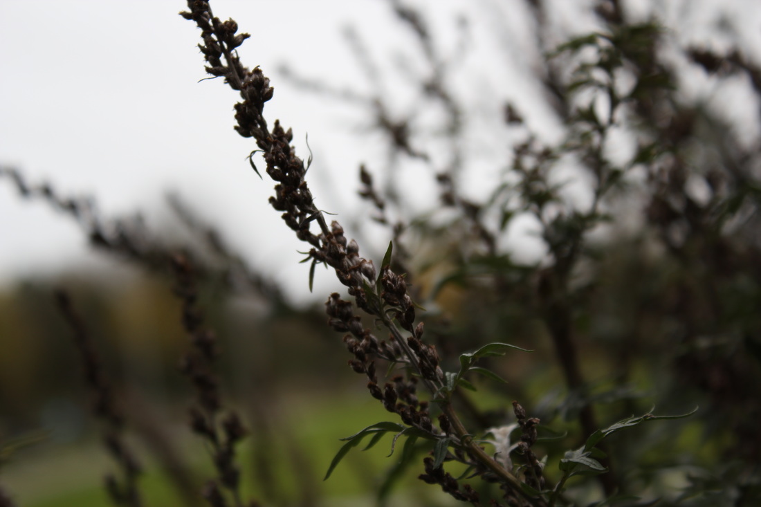
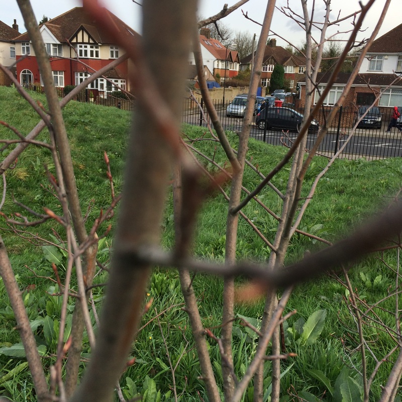
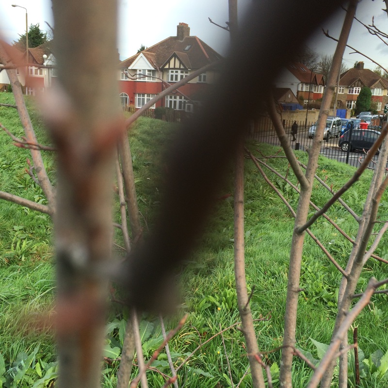
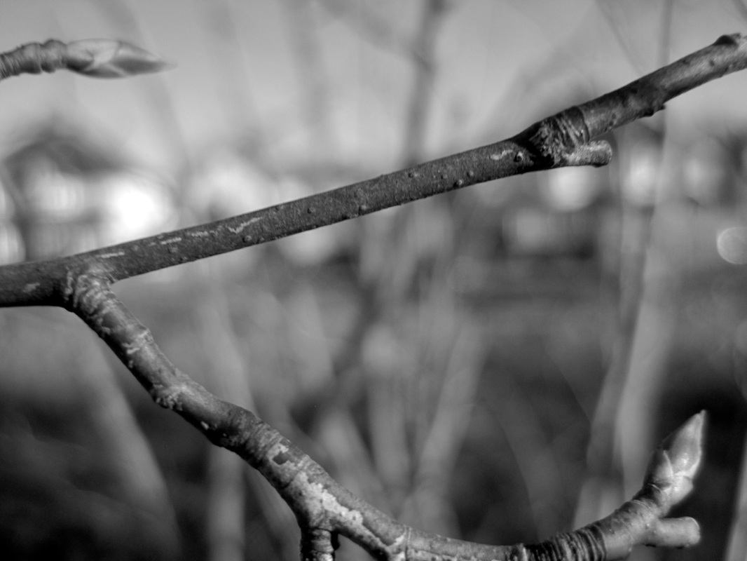
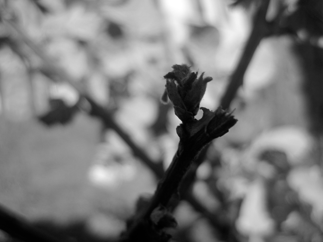
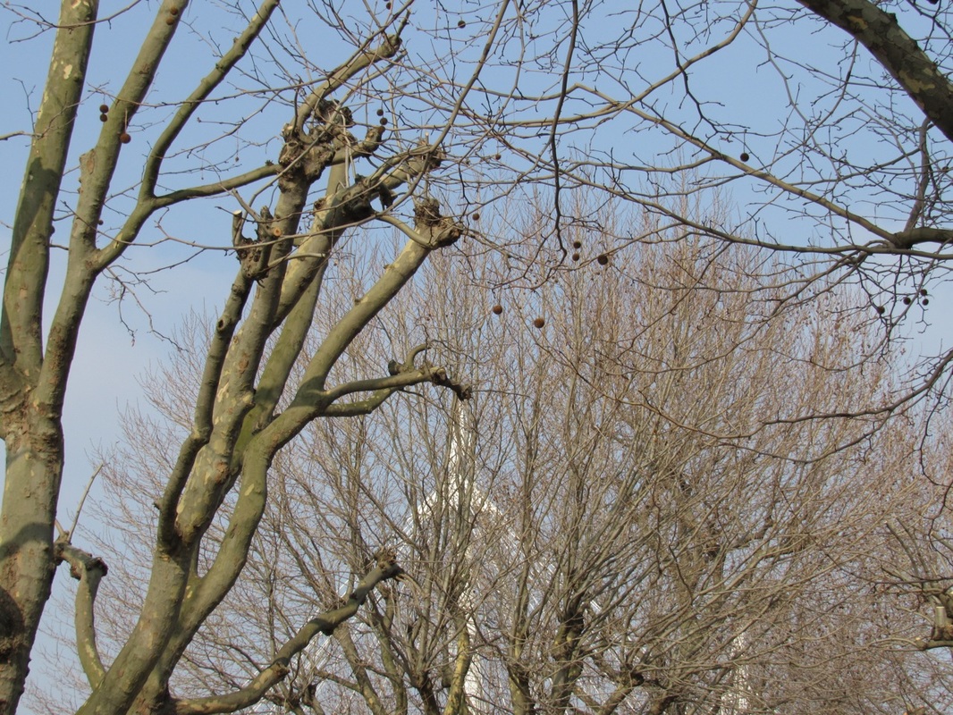
Meatyard used to experiment with multiple exposures, motion blur, and other photographic abstraction. I am interested in his work, especially the series 'Zen Twigs' because the twigs have a very shallow depth of field and are usually isolated and focusing on one particular part of the twig. He was also an optician, which makes sense as his occupation reflects his photographs. For example, the focus of single twigs could represent the tiny veins of the eyes.
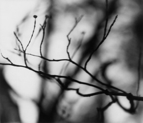
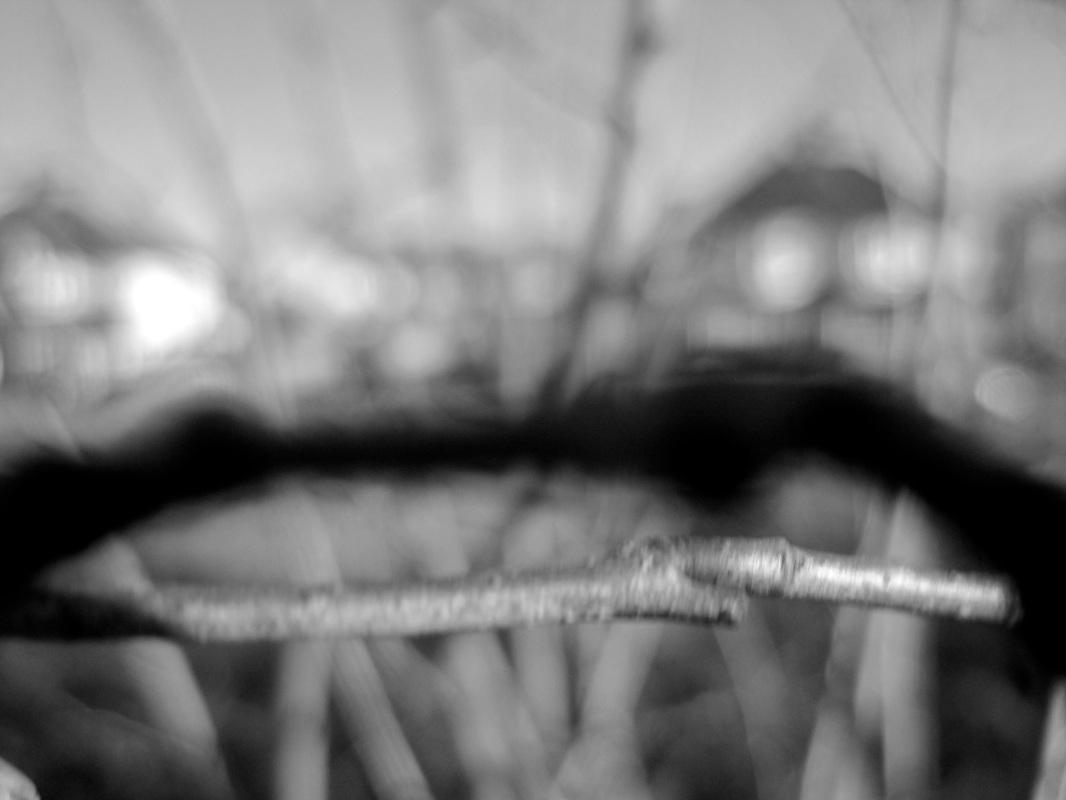
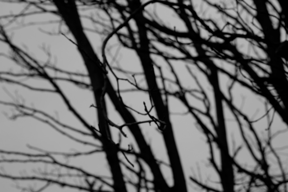
This photograph is by Ralph Engene Meatyard. In the photograph I see that the main subject is very shallow looking twig(s). Also in the background I am able to see branches however, it is quiet hard to define what it might be because of how blurry and out of focus it is. The image has dark tones, there is not much light present, except from to left side of the photograph. This could indicate that the image was taken November - December, during the winter when it's day but the sun sets extremely early, so there is not a lot of sunlight. Futhermore, the photograph contains grey spaces in between the twigs and branches also the bottum right. This highly contrasts with the dark tones of twigs and the branches in the background, this results with an omnious aura being created around the image. In my opinion, this photography is naturalistic combined with abstract, because the whole subject is nature but the photographer has really gone into detail of the twig, he also made the background blurry. In addition, there is dark tones contrasting with the light/ grey parts, taking it further down the abstraction scale. Lastly, I think the background is the most abstract because it is hard to define what might really be.
The equipment the photographer used is Telephoto lens and a wide aperture setting. This is because the photograph has a shallow depth of field, the when the only a small section is in focus and everything behind is out of focus. If someone were to look l at the photograph they would be drawn to the section that is in focus. This photograph reminds me of something dark and depressing or perhaps a horror movie. Which is really ironic because it is suppose it represent peace and calmness,with the title being ''Zen twigs''. I would descride lines of twigs to be curvy when they start off and then they become sharp. What has interested me most about this photograph is how focused the main subject is, but the rest is dismissed and blurry. I find it intriguing how something so small can draw ones attention to it all because of how the photographer took the photograph. I find it odd how the image itself is mostly dark tones but still has an aspect of light in it.
The equipment the photographer used is Telephoto lens and a wide aperture setting. This is because the photograph has a shallow depth of field, the when the only a small section is in focus and everything behind is out of focus. If someone were to look l at the photograph they would be drawn to the section that is in focus. This photograph reminds me of something dark and depressing or perhaps a horror movie. Which is really ironic because it is suppose it represent peace and calmness,with the title being ''Zen twigs''. I would descride lines of twigs to be curvy when they start off and then they become sharp. What has interested me most about this photograph is how focused the main subject is, but the rest is dismissed and blurry. I find it intriguing how something so small can draw ones attention to it all because of how the photographer took the photograph. I find it odd how the image itself is mostly dark tones but still has an aspect of light in it.
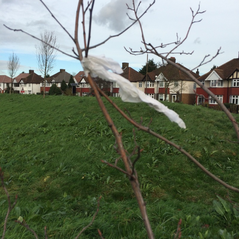
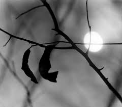
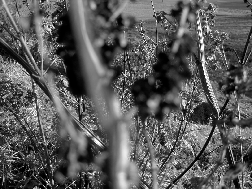
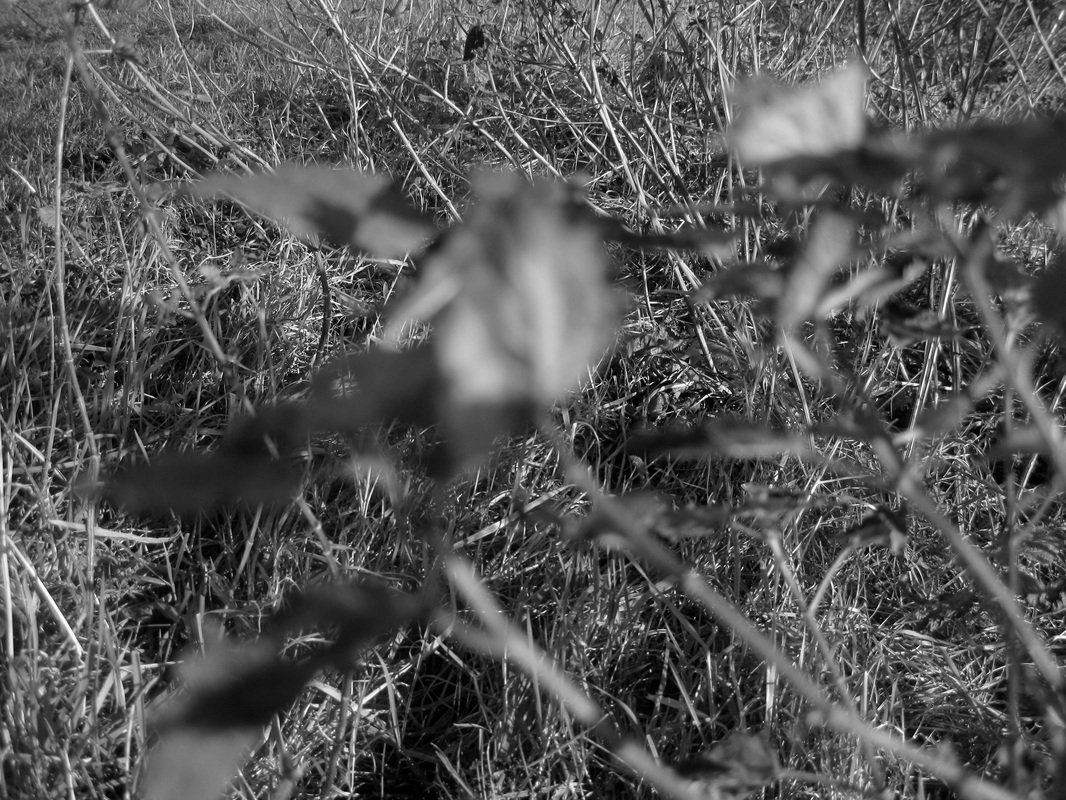
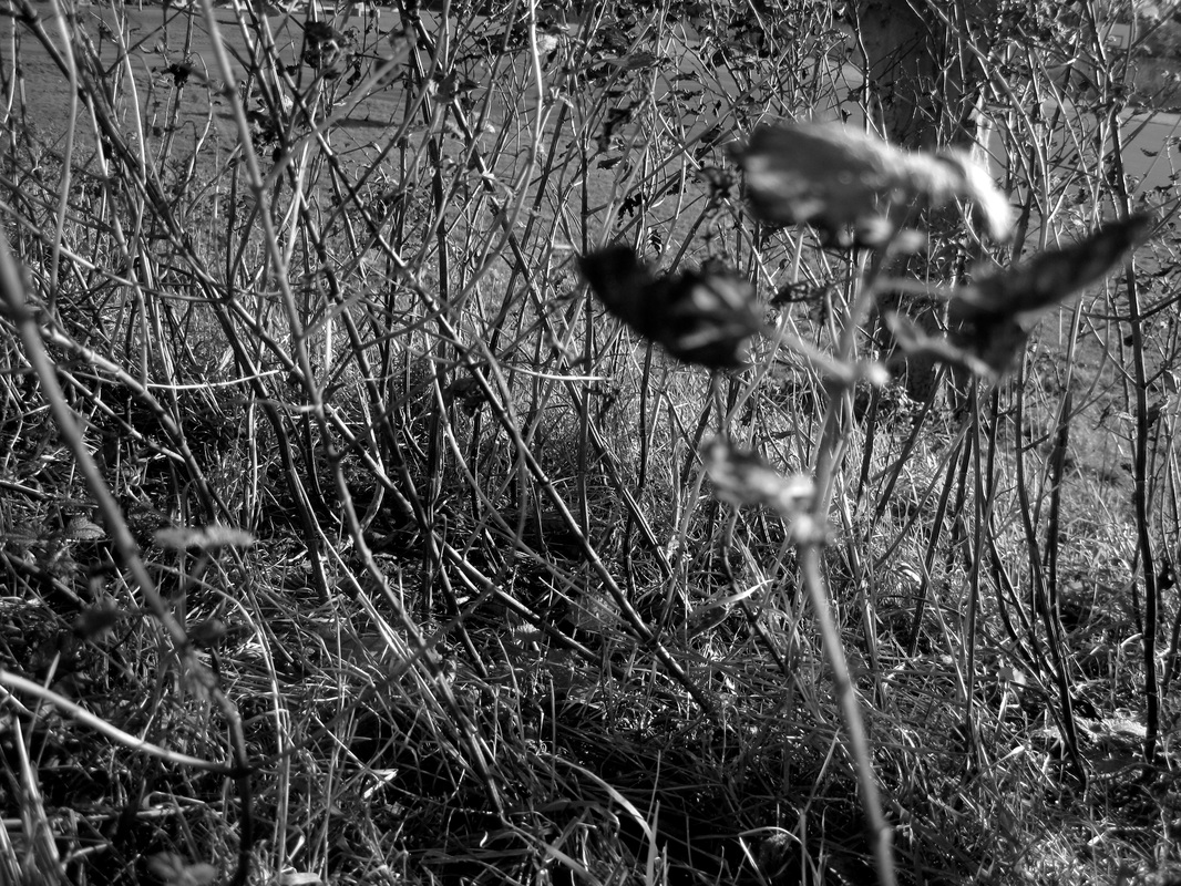
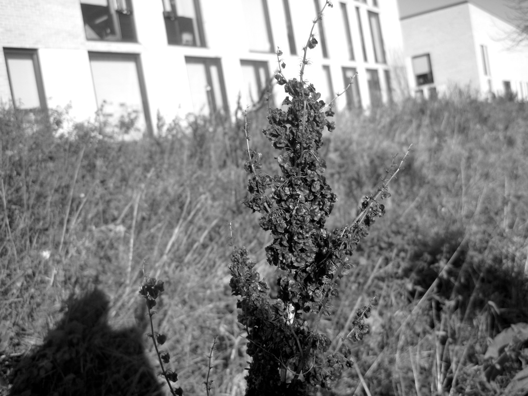
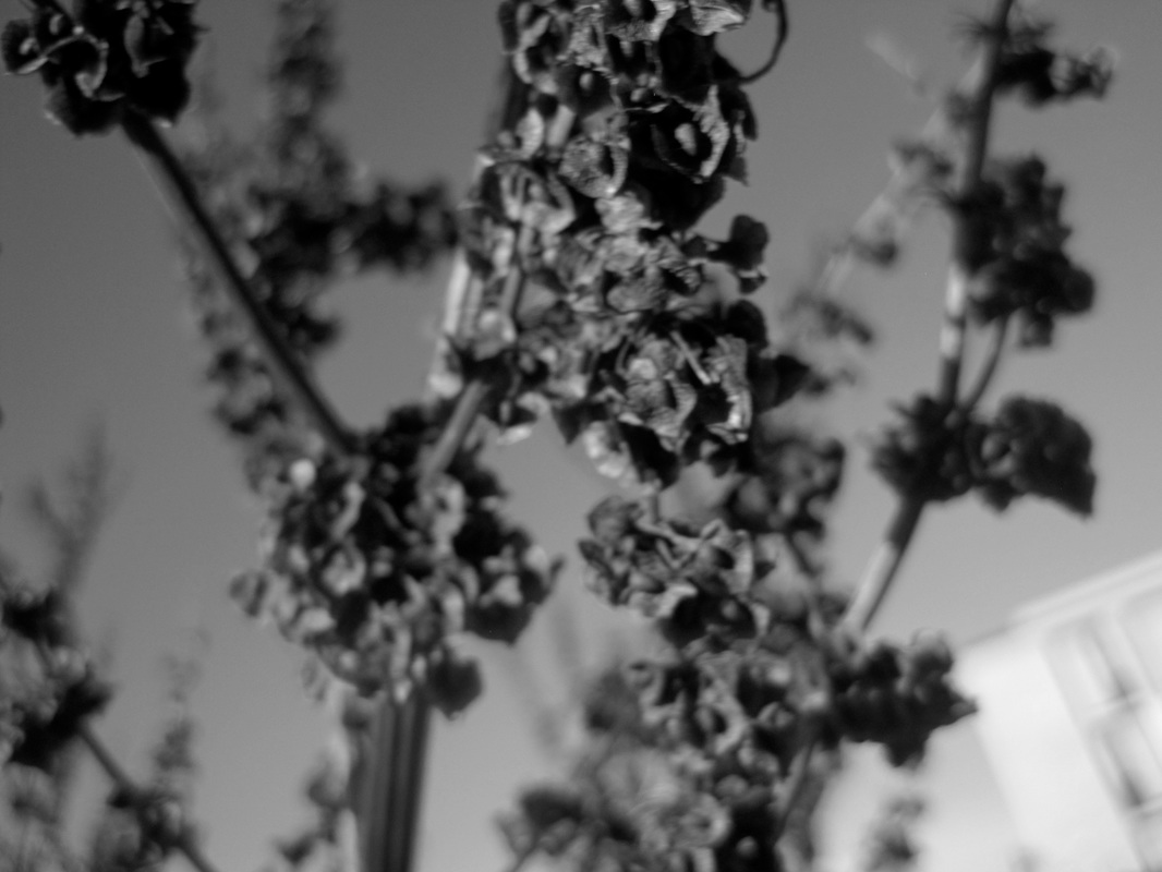
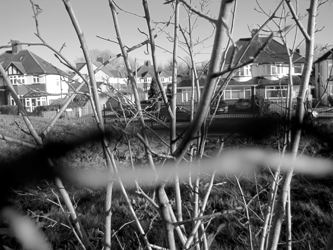
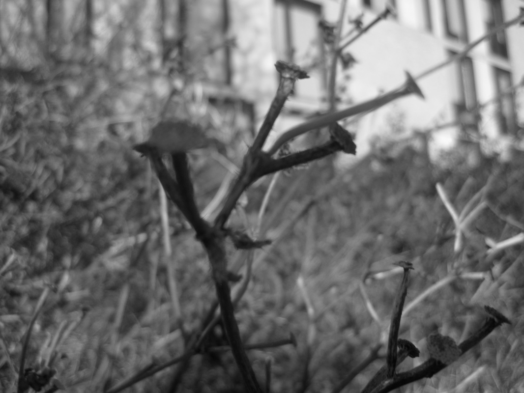
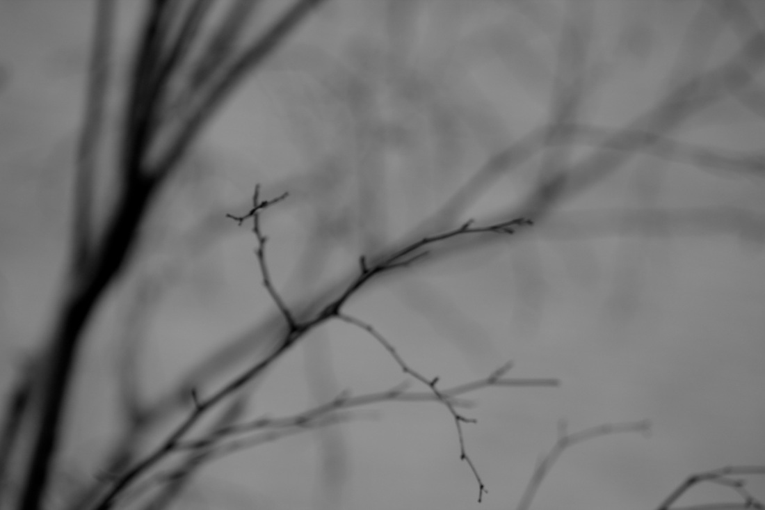
I was inspired by Ralph Eugene Meatyard and his photographs of twigs so I decided to create some of my own. I used a DSLR and took images that were out of focused on purpose. Futhermore, I also took images that only one part of it was in focus and the rest was blurry. This is called shallowed depth of field. I also zoomed in really close to some subjects and made it unfocused. I did this because I wanted my own image to look inspired by Ralph Eugene Meatyard, in addtion I wanted then to have them have the formal element such as, light, texture, shape.
It would have been even better if I used telephoto lens to intensify the main subject of the image even more and to dismiss the background as blurry. This would have made the photograph abstract and unique because the the parts that would have been in focus would catch the viewers attention more. They would be able to see the texture and small patterns on the leaf.
It would have been even better if I used telephoto lens to intensify the main subject of the image even more and to dismiss the background as blurry. This would have made the photograph abstract and unique because the the parts that would have been in focus would catch the viewers attention more. They would be able to see the texture and small patterns on the leaf.
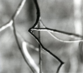
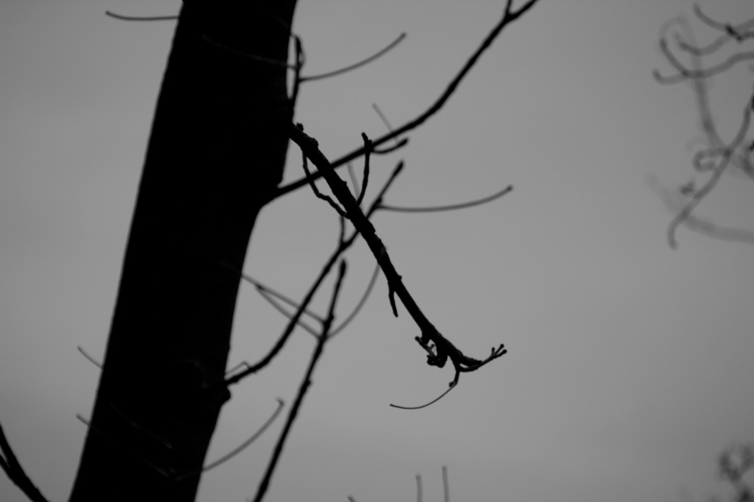
Meat yard inspired in Black and White
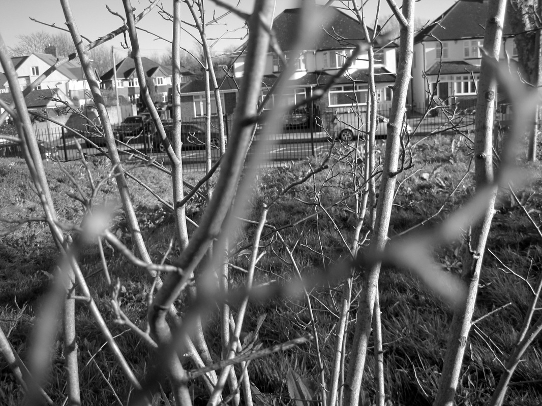
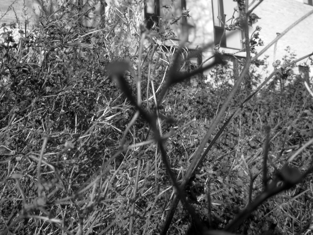
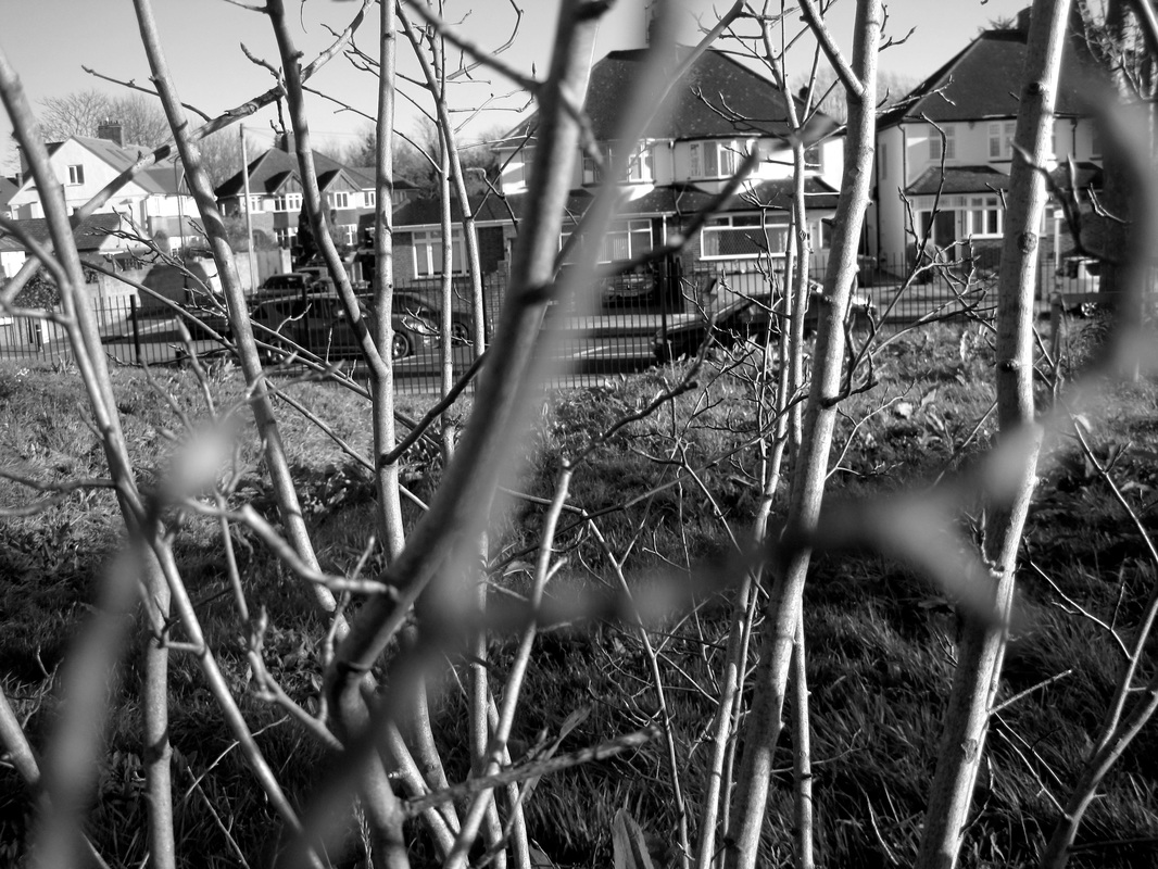
I am pleased with these sets of images. Although there some failed examples, there are also very successful ones where the macro setting worked quite well to the point the shallow depth of field is prominent. In photoshop, I developed/edited the photos and made them black and white I also increased the contrast so the images were able to have the 'dark' aura. What really went well in my opinion is that I was able create a variety of images that were able convey my understanding of Meatyard's images. For example, what I did different this time with my Meatyard inspired photos is changed the colours to black and white tones in iphotos.
On the other hand it would have been better if I used the camera better. When I used a point and shot camera (on macro setting) so it took me a while to understand that in order to get a shallow depth of field I had to very very close to what I wanted to photograph. Due to this I was not able to take shallow photos from a far distance because the image would immediately blur. This resulted in having more failed images. Next time I will a telephoto camera so that I taking an image from a far distance.
On the other hand it would have been better if I used the camera better. When I used a point and shot camera (on macro setting) so it took me a while to understand that in order to get a shallow depth of field I had to very very close to what I wanted to photograph. Due to this I was not able to take shallow photos from a far distance because the image would immediately blur. This resulted in having more failed images. Next time I will a telephoto camera so that I taking an image from a far distance.
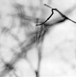
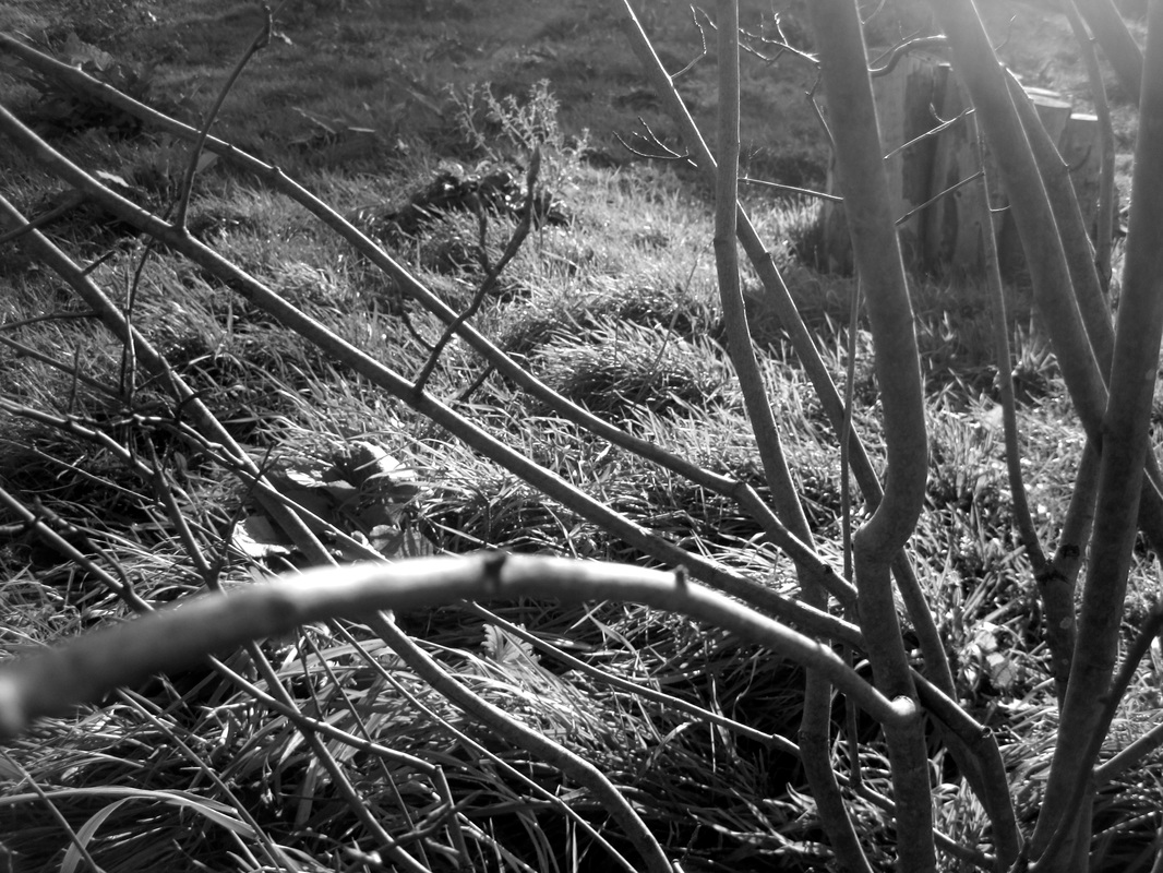
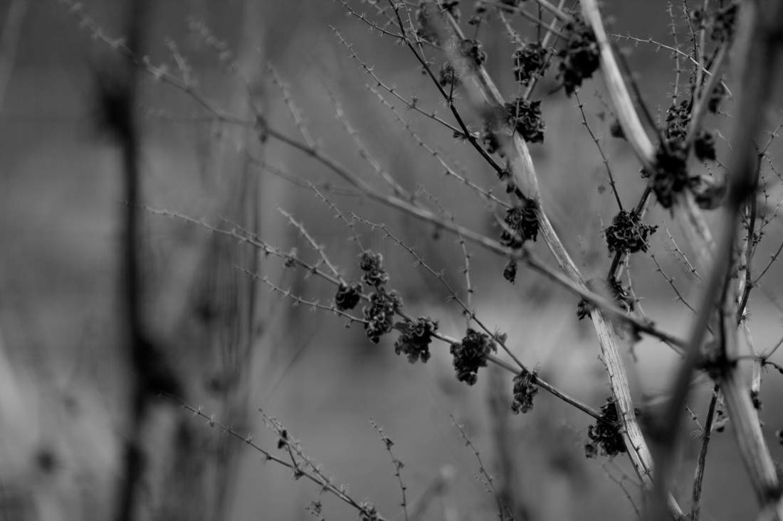
More photos inspired by Ralph Meatyard
|
Before
|
After
|
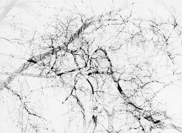
The Process
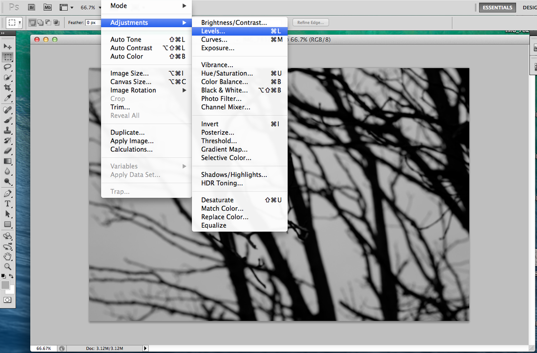
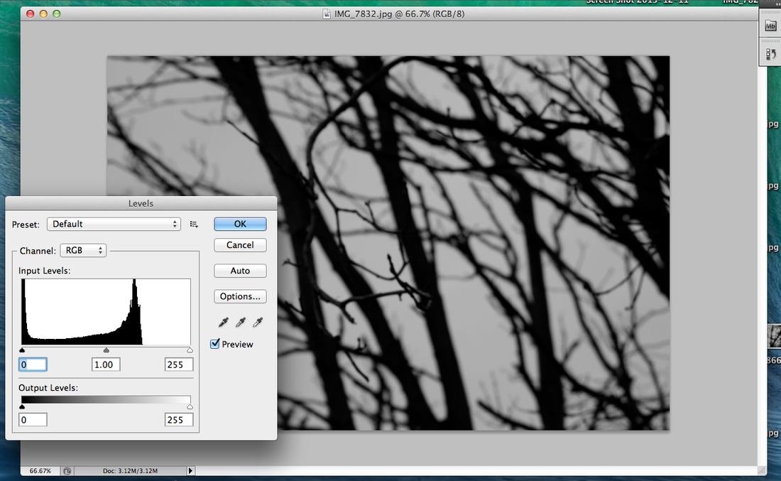
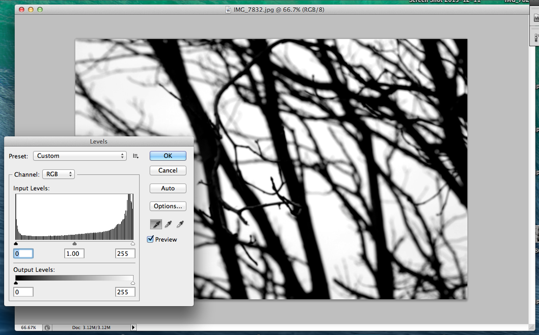
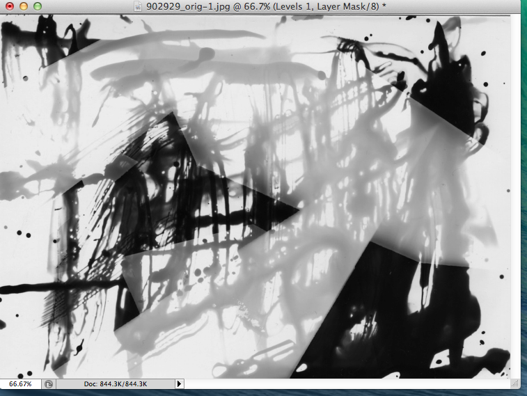
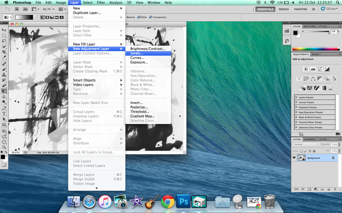
I used photoshop to improve the photos I took. I adjusted the levels of the images I took, I edited the grey bits and made them white. I did this so that there was very high contrast between the black branches and white background. I also wanted to experiment with photoshop so that I can have a variety of different well-throught abstract to contribute to creating my final piece.
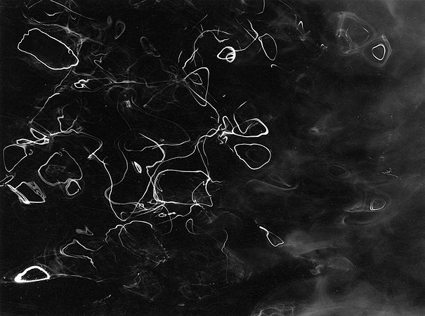
Experiment: Photograms
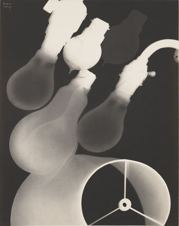
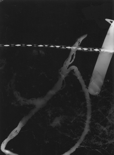
A photogram is when you make a photograph without a camera. When making a photogram you use photographic paper in the dark room so that the paper isn't exposed to natural light. The paper is first put into the developer then the stopper, fixer, lastly water. Here are examples of some famous Photograms:
A photogram is when you make a photograph without a camera. When making a photogram you use photographic paper in the dark room so that the paper isn't exposed to natural light. The paper is first put into the developer then the stopper, fixer, lastly water. Here are examples of some famous Photograms:
My photograms
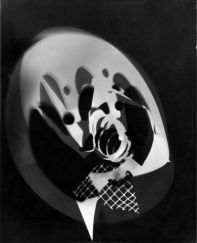
|
I'm generally pleased with this image because I feel that the objects compliment each other really well. The line that runs along the top of the image is really interesting because, the of how it is in an repeated pattern. The object it's self is a chain with tiny spaces in between, which in my opinion is quite effective when making photograms because the spaces will stay black. furthermore, the objects below the chains almost look translucent, like they are in water. Because the net in bottom right hand side is covering a piece of the objects making it seem blurry and unfocused. The first thing that gets people attention, is the object in corner that is bold and then starts to fade away because that is the brightest and strongest in light.
I could have experimented more with the photogram and taken more risks, leaving it to chance. For example, I could have left the light on longer to make the objects more opaque to make the net in more bold. Or I could have used different ways to put the developer on the paper such as, paint it on, put half of the paper in the developer, and splash it on. If I were to do this the images would come out more interesting and I would be able to refine my work each time. |
In my next lesson I will:
- Leave the light for less time on the photographic paper
- Splash, drip, dip, and paint the developer on the paper
- Move the objects around while they are on the paper
Photograms set 2:
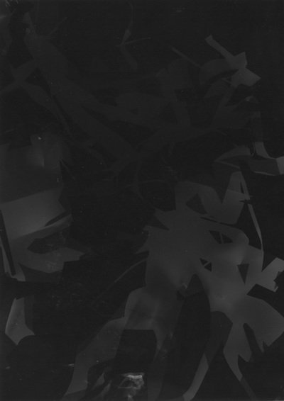
|
I am fairly pleased with this image. I made this photogram using cut up pieces of paper that I then scrunched up all together and pulled apart so that they where all curved and ruined. I put them on the photographic paper and left that under the enlarger for 7 seconds during that time I moved the paper so that it could create a shadowy effect when I developed it. When I developed the photogram I simply placed the photographic paper in the liquid. I did this because I wanted the photogram to come disoriented and weird, so that it is more abstract as it is now. To me this photogram looks like big pieces of dust.
It would have been even better if I left if under enlarger for a little bit longer so that you could see the papers more clearly. Futhermore, it would have been better if I added more soiled shapes, or if I painted the developer onto the paper. |
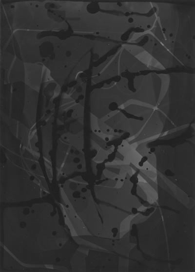
|
What went well in this photogram is how abstract it is. It is very hard to tell what is making it even more abstract. To make this image I used paper that I had wrapped around in wires and then made them overlap each other. I used a paint brush to splash and paint some developer on it, when I did that I left the photogram in the developer for and 1 minute. I did this because I wanted to splashed on developer to appear more darker then when the whole paper was dipped in developer. Also, I wrapped the wires in paper because I wanted to everything to look all over the place so that when the viewer of the image looks at my photogram I want them to not understand what they are looking at.
What I could have improved with this image is if I left the enlarger on for longer so the paper and wire look stronger and bolder because now they look really light and its quite hard to see them. However, its good both ways because they are still abstract. |
|
|
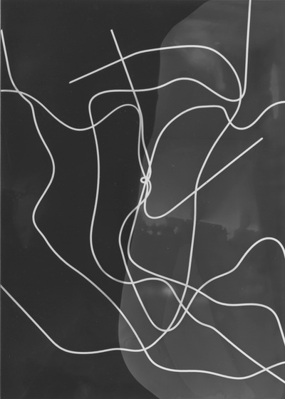
Overall I am pleased with this photo because I like the way the wires look like they meet in the centre when they are actually just overlapping each other, in addition I like the way the wires are curved in different places, this gives the illusion that they are moving. I left the photogram under the enlarger for only 4-5 seconds because I wanted the wires to be very opaque and prominent so that when people see this image they can somewhat understand what they looking at. When I was developing the photogram, I first dipped the right side in first and let is develop for a bit and then put the whole paper in the developer. I did this because I wanted to create an effect of something that is a bit light and dark next to each other and show how they contrast.
It would have been even better if I maybe added something to the objects used to make the photogram more interesting because the out come now looks a bit boring and depending on whose looking at the image, some people can tell what it is. Also, if just developed bits and pieces so that only certain parts can be seen. |
Cut-out of photogram
|
|
To further adapt my photo photograms I started by cutting it up and rearrange and taping all of it together so that it is eniterly different from the original. When I do this, I will take it to the darkroom and make another photogram that is negative. I cut the original piece first in an horizontal line and taped the pieces together with clear tape after I did this and I cut the photogram vertically and then taped that again. In the darkroom I again created a positive from the negative however, when I developed with I painted and splashed the developer on. Lastly I created one more positive photogram, instead when I developed it I did not let it develop all the way. Overall I am extremely pleased with my final result. I will continue with this method until I am satisfied
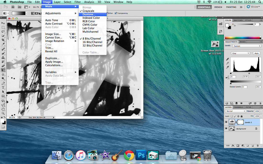
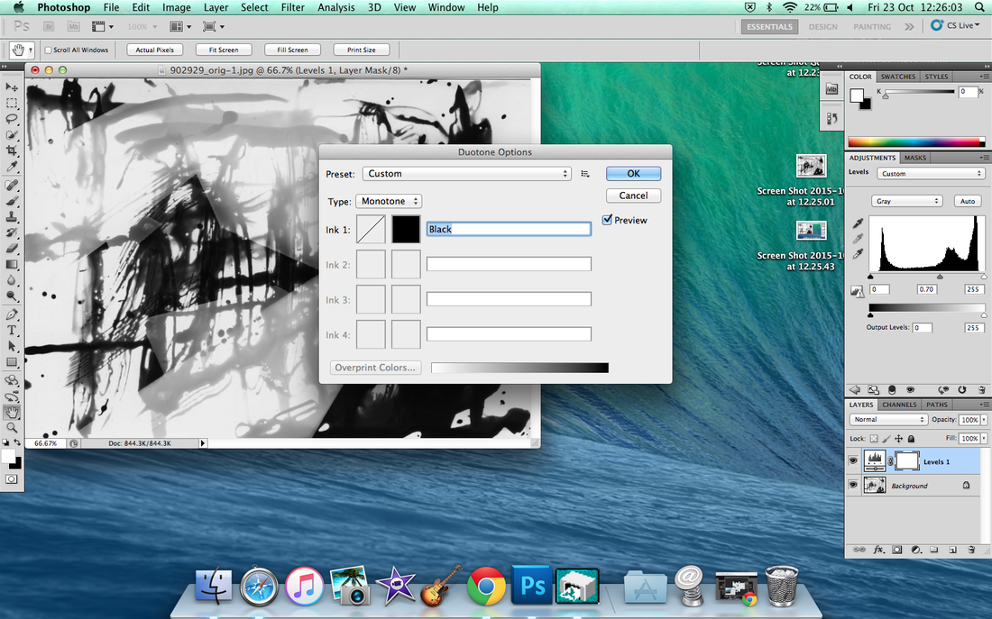
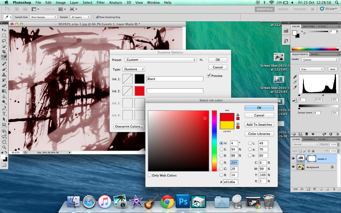
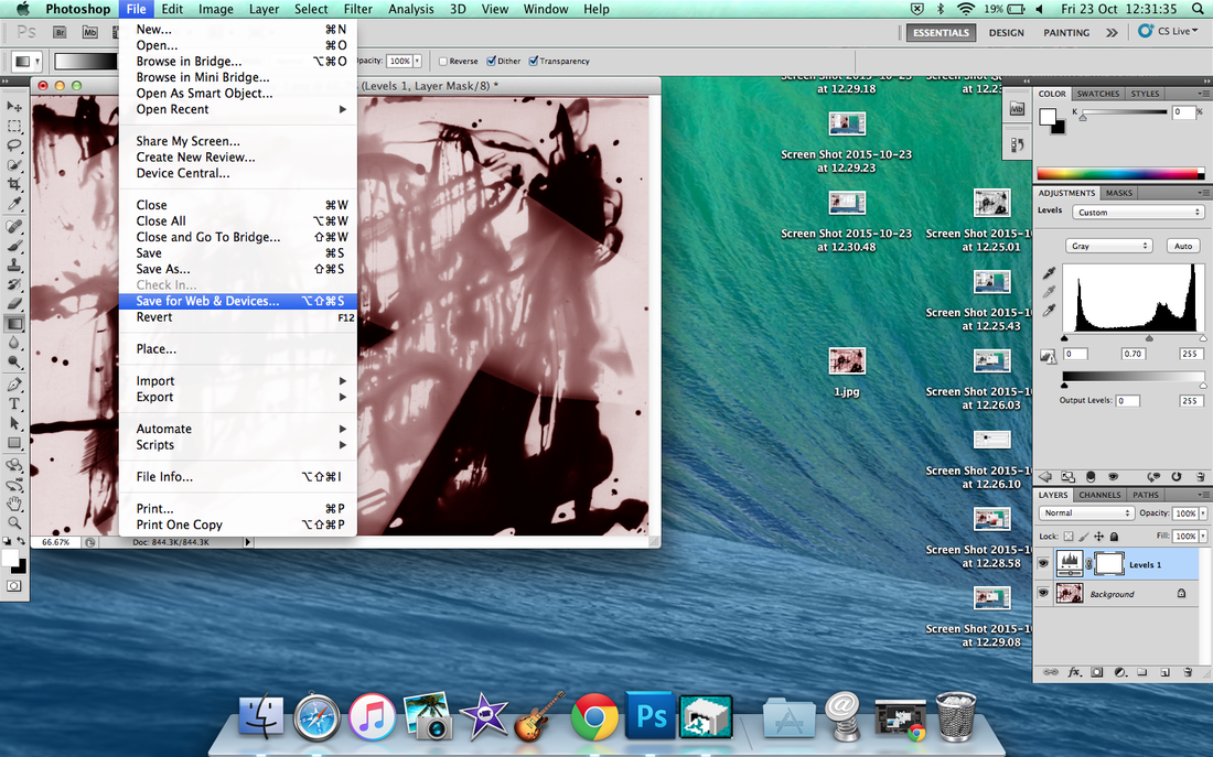
Photoshop Duotones
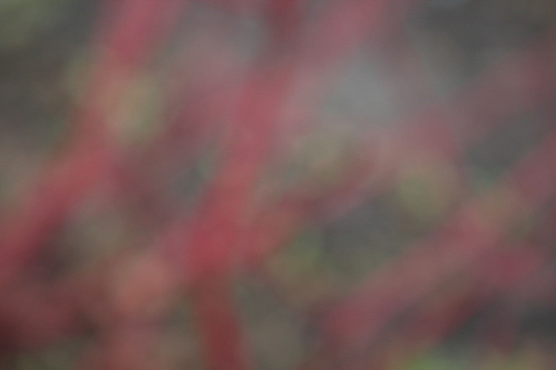
I wanted to make a scanned version of my original image in photoshop. I want to add a layer of colour to the image so I decided to make a duotone. This is an old printing technique that uses contrasting tone such as black another colour. This can only be achieved Duotone to the Greyscale image. Lastly I chose a red colour as my final outcome. When saving the image I saved it to the web as JPEG so that is was easier to upload.
I wanted to make a scanned version of my original image in photoshop. I want to add a layer of colour to the image so I decided to make a duotone. This is an old printing technique that uses contrasting tone such as black another colour. This can only be achieved Duotone to the Greyscale image. Lastly I chose a red colour as my final outcome. When saving the image I saved it to the web as JPEG so that is was easier to upload.
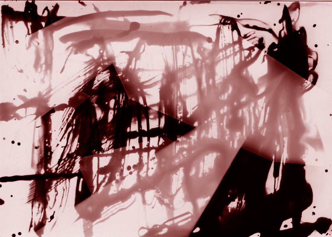
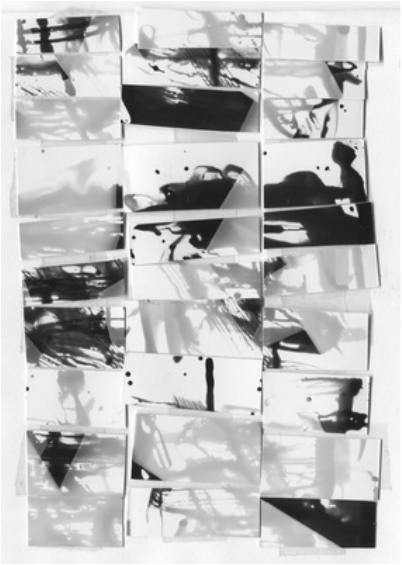
Final Outcome of Photograms
I am very please with this outcome, it demonstrates what I have learnt and how I have refined and developed my idea throughout the course. It shows the audience first results against my end results which I think gives them an idea of the whole process.
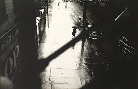
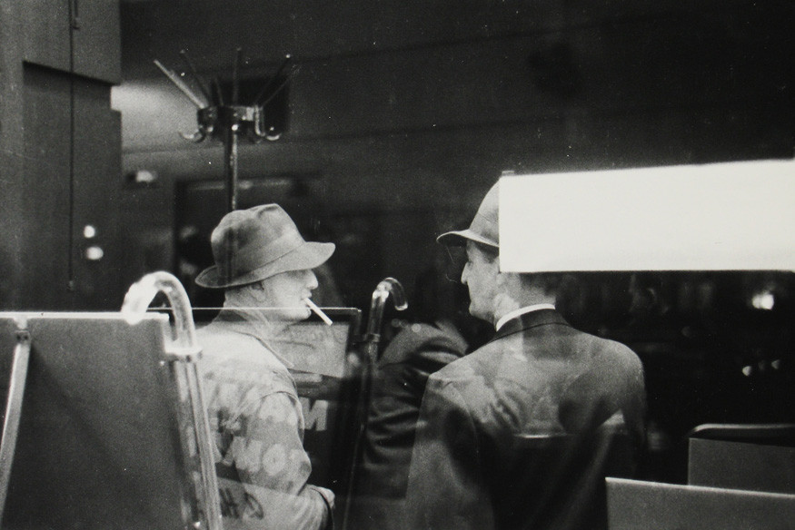
In Focus: Saul Leiter
5 characteristics - Saul Leiter's Photos
5 characteristics - Saul Leiter's Photos
- Mysterious - Hard to define photographs
- Peculiar - The way he takes images is very interesting.
- Unique - Different.
- Busy - There always seems to be a lot or, little going on in his images. It takes time to digest the whole image properly.
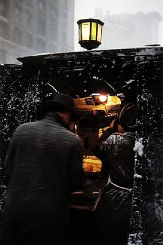
- Gloomy - Leiter's photos can be dark, due the time of day or just has a dark aura in general.
1950-60

Formal Elements and Saul Leiter
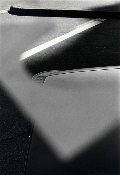
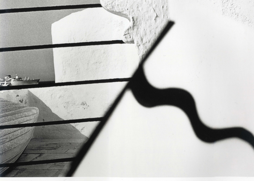
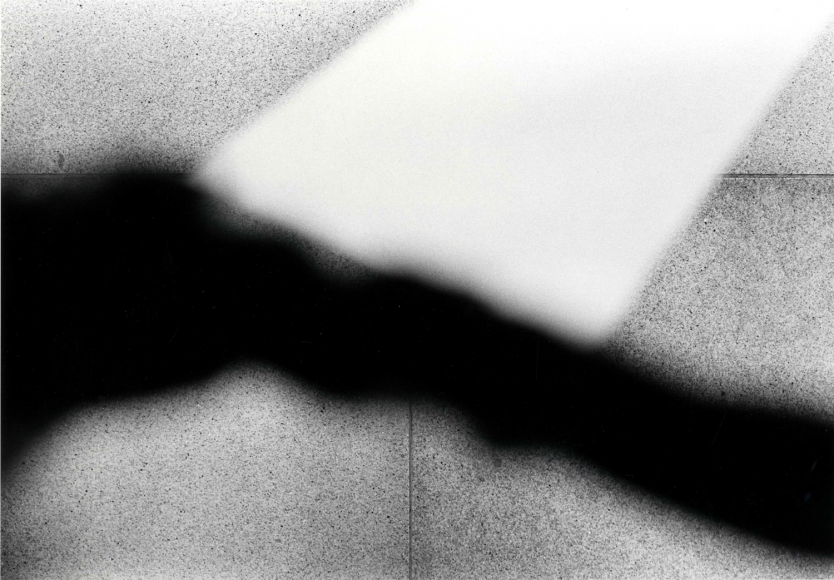
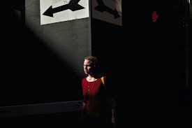
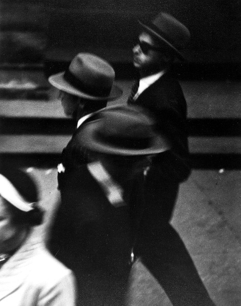
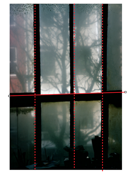
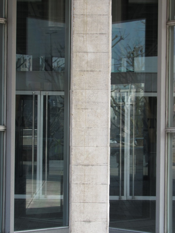
Saul Leiter uses focus and shape as the two main formal elements. Many of his images have a section in focus or not in focus, this is really effective because when looking at his photos, your eyes first go to the in focus section. It makes the viewer curious as why he did that. In addition, when Leiter takes photos he is very particular. He uses the rule of Thirds just by looking through the view finder, he can geometrically work out the edges and curves only by looking.
Saul Leiter uses focus and shape as the two main formal elements. Many of his images have a section in focus or not in focus, this is really effective because when looking at his photos, your eyes first go to the in focus section. It makes the viewer curious as why he did that. In addition, when Leiter takes photos he is very particular. He uses the rule of Thirds just by looking through the view finder, he can geometrically work out the edges and curves only by looking.
|
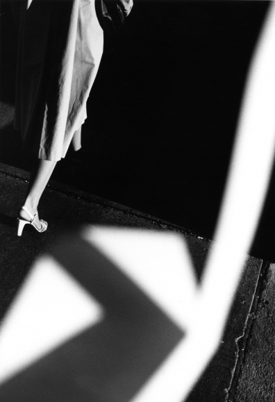
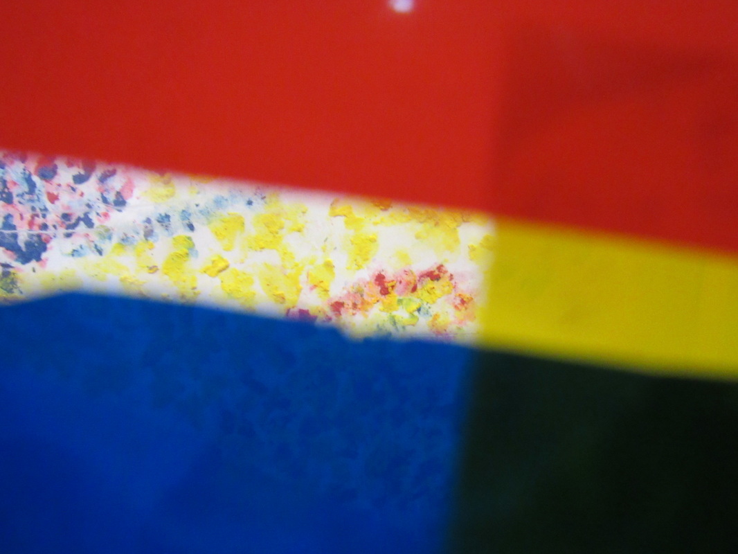
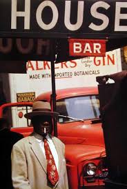
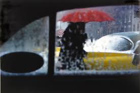
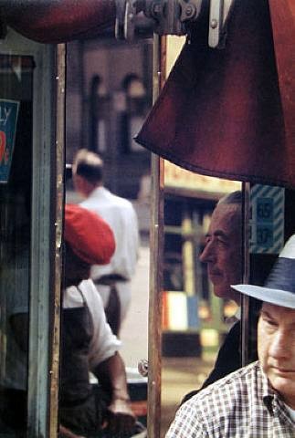
My favourite image
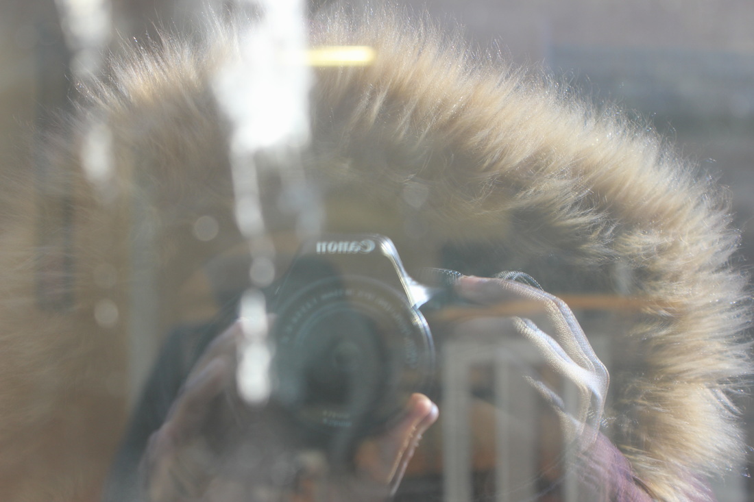
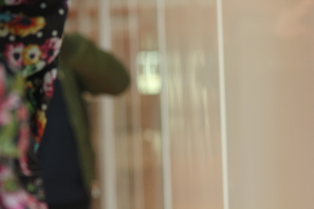
I choose this image because I find that its the most interesting and peculiar. Most of the image is cover by a large red black (possibly fingers). It seems as though the image was taken from a far distance on purpose. This surprising because you wouldn't except an image to be covered 1/3 of the way by something. It gives the impression that the photographer was secretly spying on the subject or he was just hiding his camera so that it would not be obvious he was taking a photograph . One of the formal elements that is important this, and in nearly all of Leiter's photographs is focus. The reason for this is that in this image this part that is not covered is in focus and the rest in blurry and unknown. Also, in other Leiter images there is always part of the image that is in focus and the rest if blocked or covered by something that isn't. I think Saul Leiter does this because he wants us, to focus on one particular part. |
''If you take a picture of a row of cars in 1950, it’s a boring picture of a row of cars. But in 2013, you’re looking at antiques and objects that have a certain kind of something or other. Sometimes I say time is on the side of the photographer.'' - Saul Leiter
I've chosen this quotation because it shows how something from the 1950s can have such great significants 63 years later. 63 years later, that object is rare and vintage people will look at it amazed people and think about how other people used such things. Compared to modern day things that they have now. He also says time is on the photographers side, I think he said this because it shows how a photographer can capture every moment and can have their own personal timeline of photos they took.
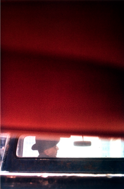
Saul Leiter's Composition
|
|
When Leiter takes photos he thinks every carefully about composition and how the picture will turn out before he even presses the button. It is like Saul Leiter has the Rule of Thirds embedded into his mind, so whenever he takes photos he sees it through the view-finder. Due to this he is able to take very precise images that are somewhat geometrical when looked at closely. Such as, the ones above.
|
|
|
Cameras ‘see’ the world differently to the way we see the world with our eyes. The photograph (whether this is a printed image or pixels on a screen) can sometimes ‘disappear’ because photography is able to create an almost perfect illusion of reality. We tend to see only the subject of the photograph rather than the photograph itself. However, all photographs are, to some extent, abstractions. The flatness of photographs creates relationships between objects that may not have existed in reality. All photographic images are shaped by the technology the photographer chooses and by a process of selection, editing and manipulation. Each and every photographic image is therefore made or constructed, rather than being a window onto the world.
|
Photography is unlike other visual arts in that it begins with a world full of things rather than with a blank slate. Photography is more an art of selection and translation rather than of invention. However, photography is also an art of production, not just reflection. It does things to the subjects it represents.
|
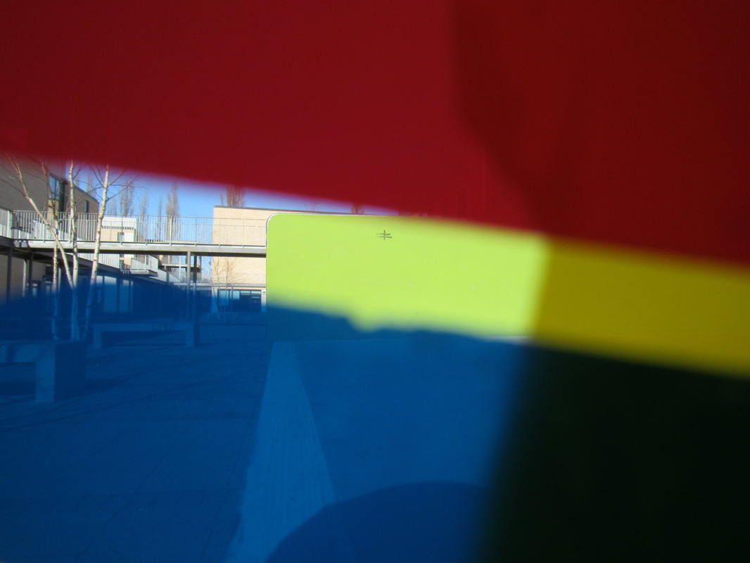
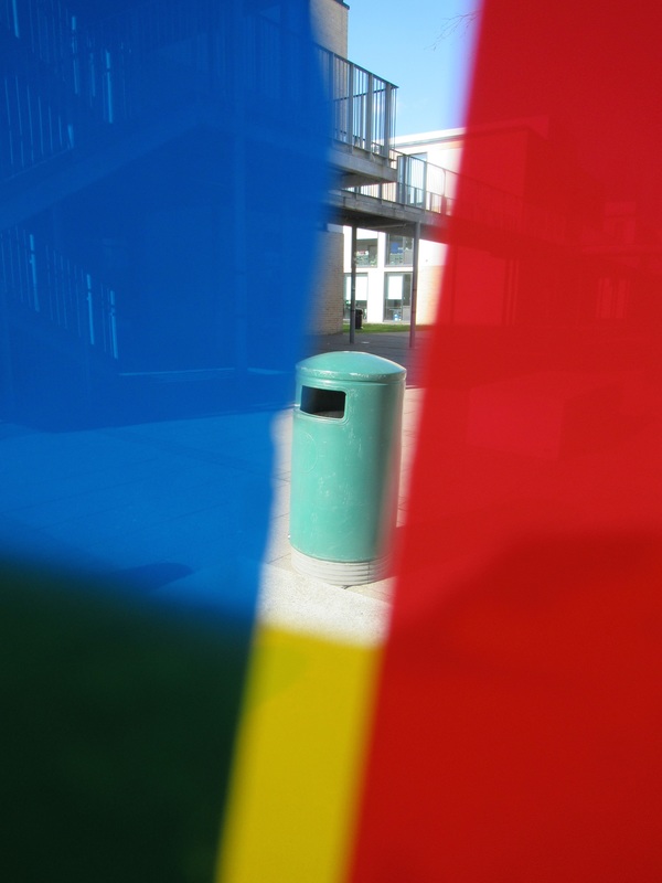
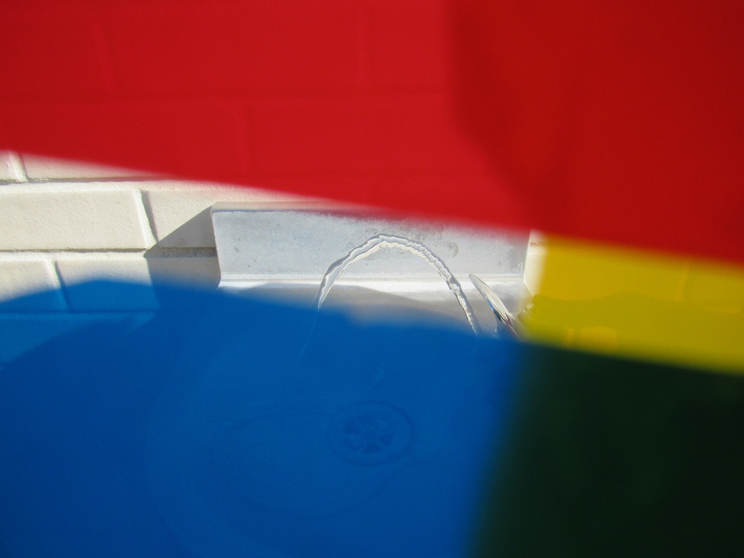
Saul Lieter's Paintings
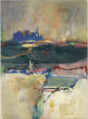
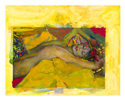
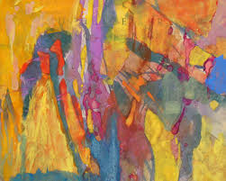
Lots of Saul Leiter's paintings are simliar to his photographs, and they best way to understand them is to compare two. When looking hard at both images, you begin to establish the idea the that you can translate the colours, tones, patterns, lines ect in the paintings. Furthermore, you can see the amount of abstraction the photos have because you to look carefully at every detail.
|
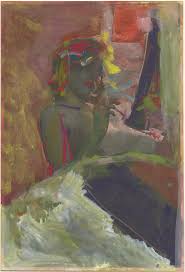
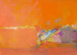
Saul Leiter's photo
|
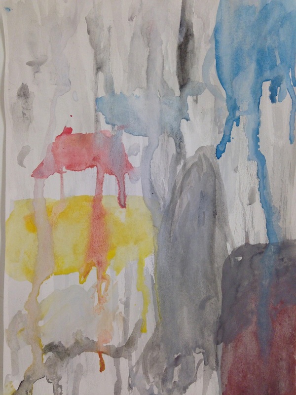
My water painting
|
When Saul Lieter paints, it sometimes results in looking quite similar to his photographs. For example, the two images above look very similar in the way they are composed. They both have bold colours on the top and bottom of the images and both have a section in the middle that is bold and with more colour. I think Saul Lieter did this because he wanted the viewer to have a journey when looking at both images, because when I first look at the images my eyes first go to the bold plain colours and then the middles section, where everything is going on.
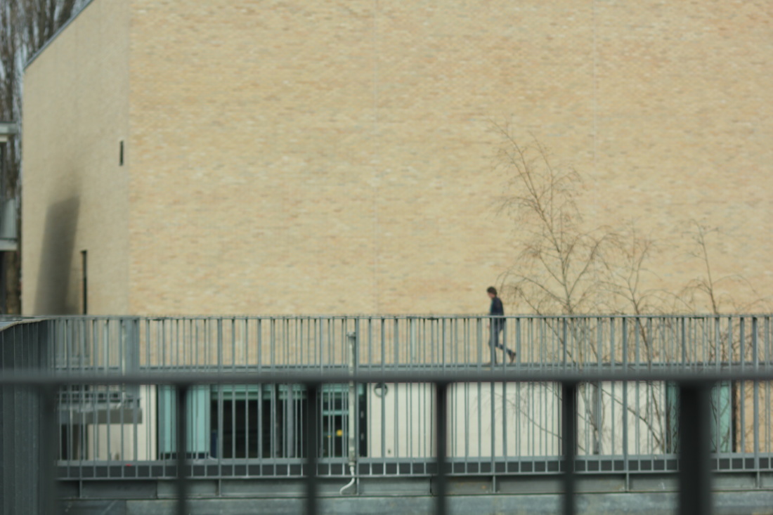
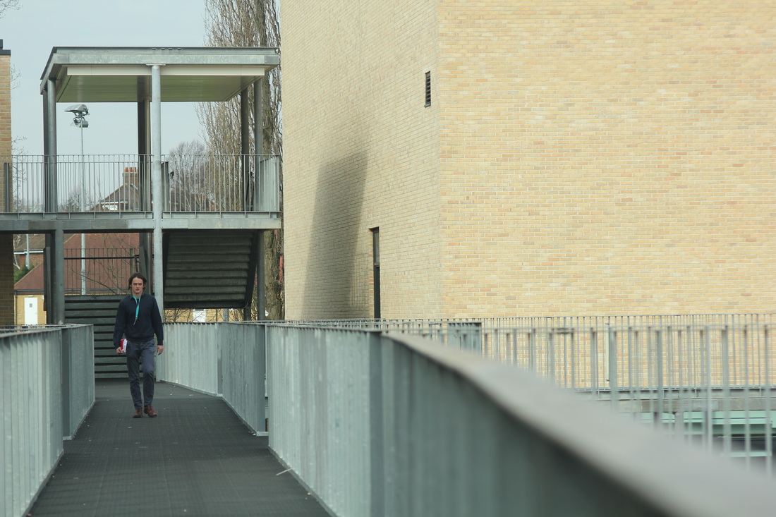
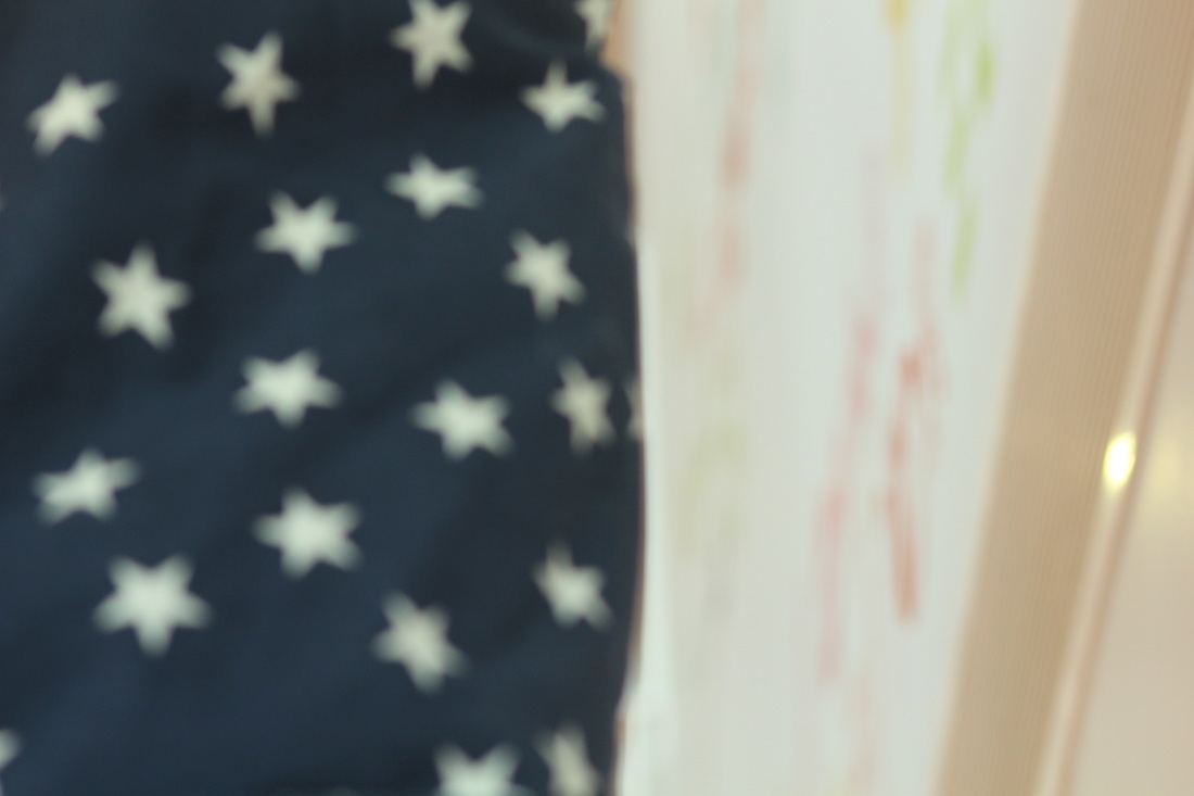
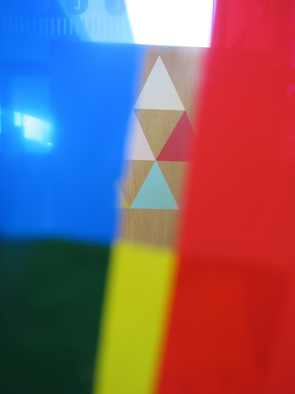
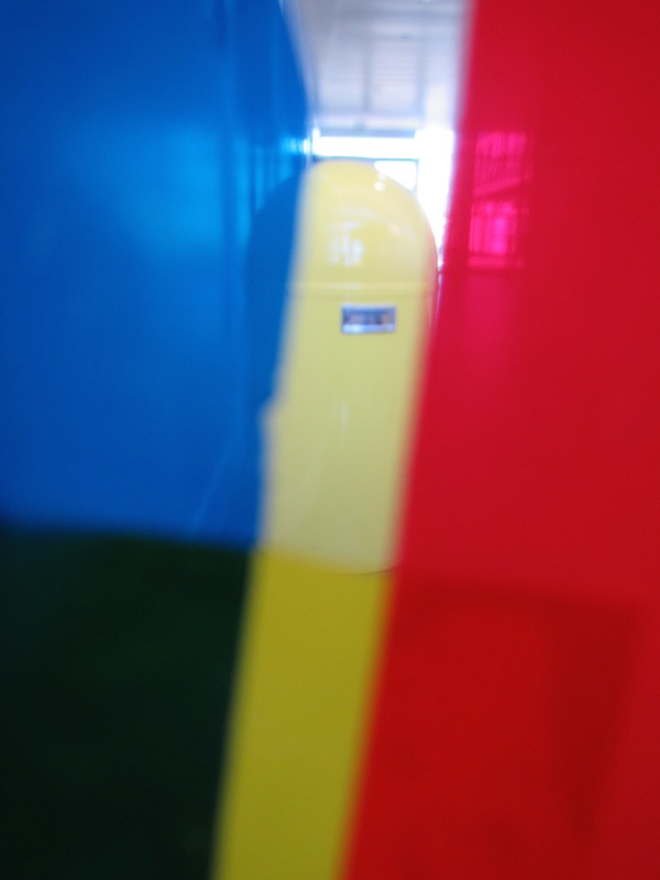
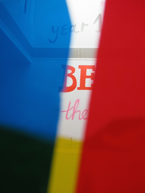
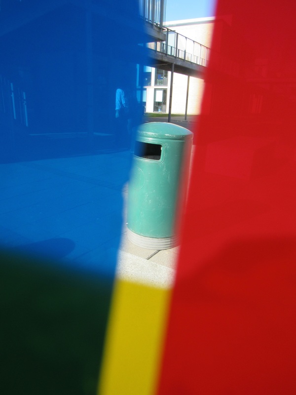
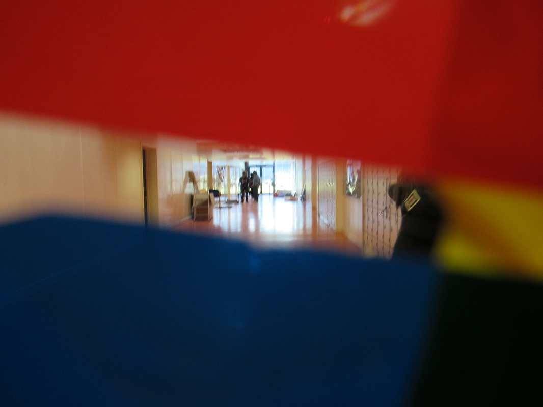
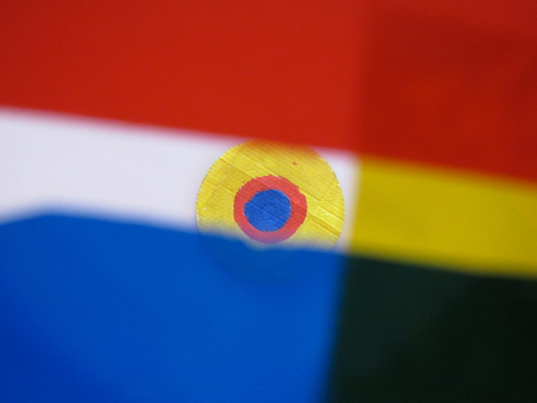
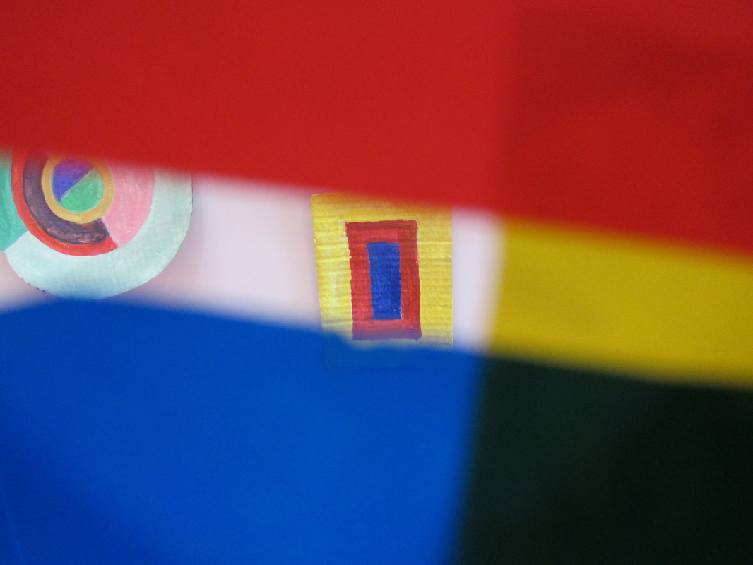
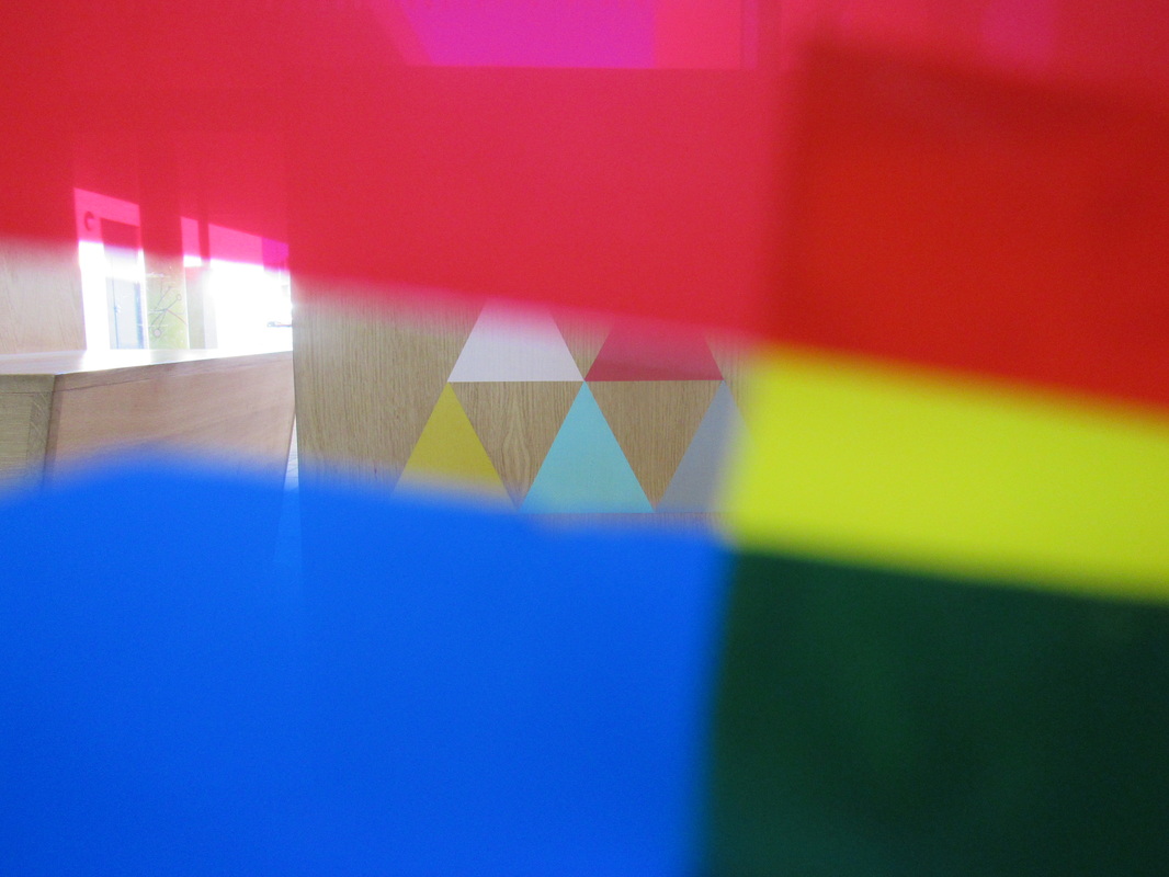
What went well in these series of images is that I was able to catch the sunlight fairly well and use it to my advantage. Also I was able to use the things around me to obscure the images and make them look Saul Lieter inspired.However, it would have been even better if I focused on a small section and paid more attention to the little details instead of the huge parts of the school.
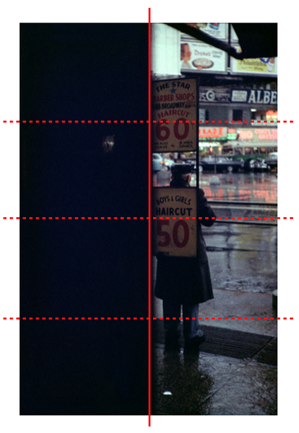
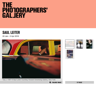
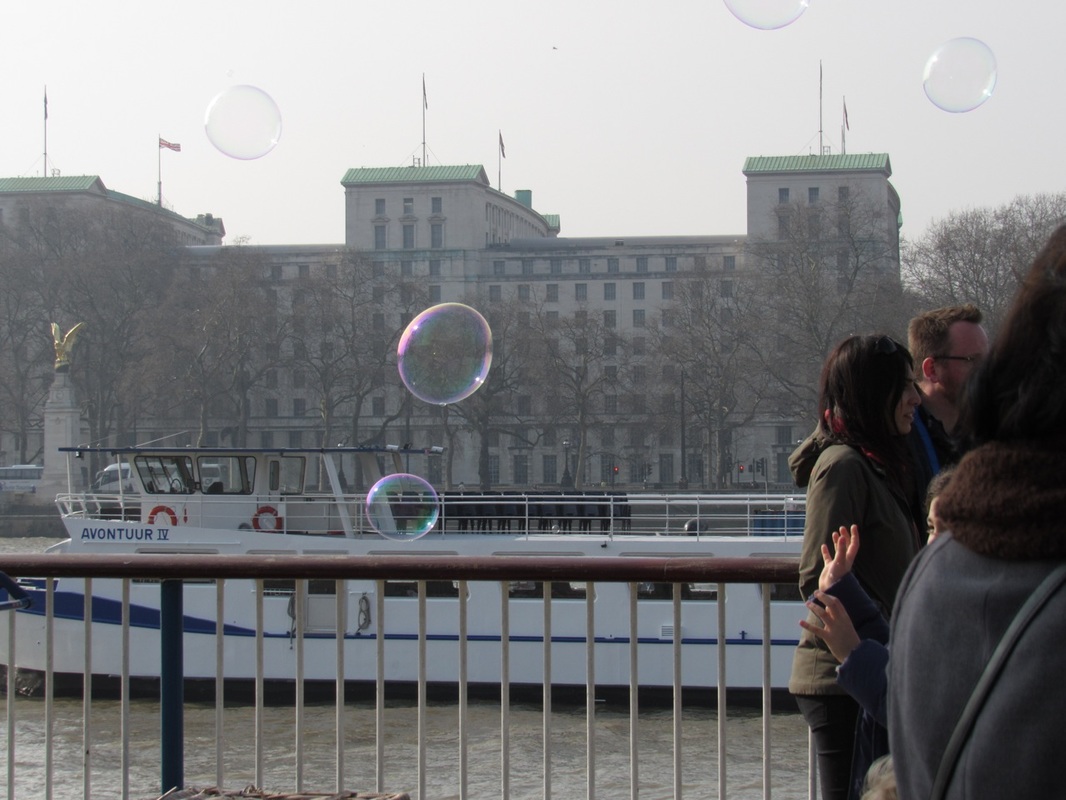
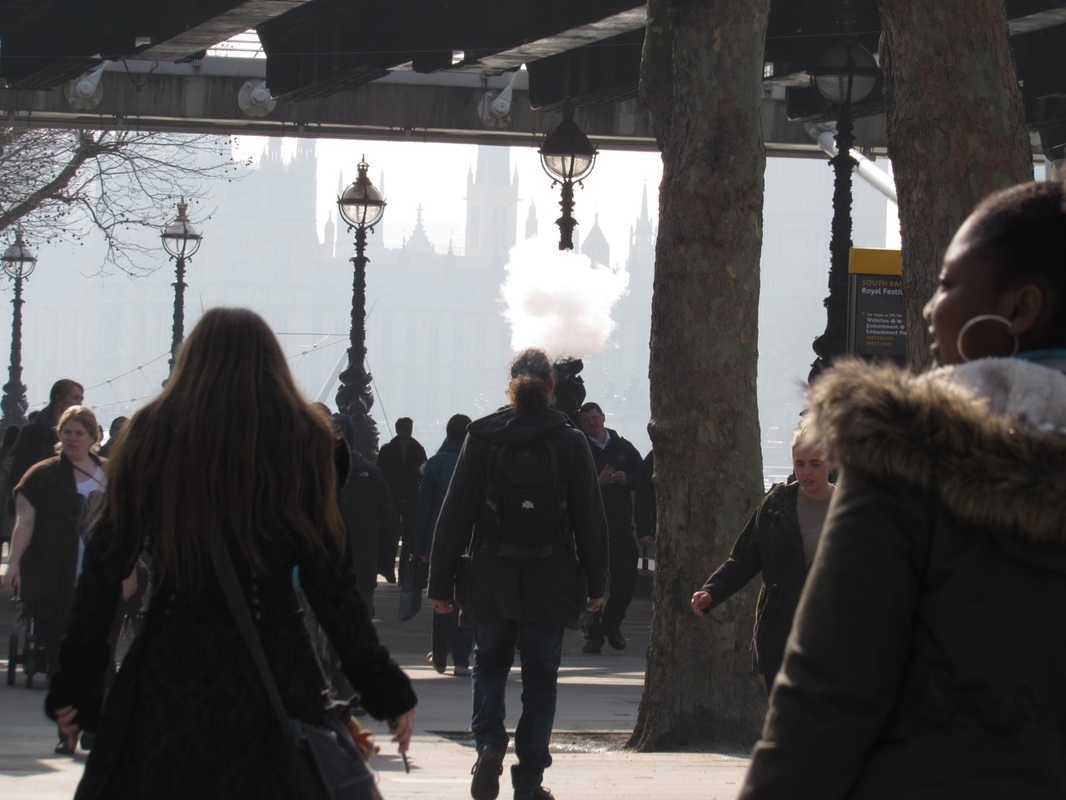
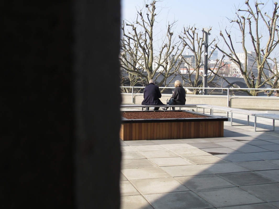
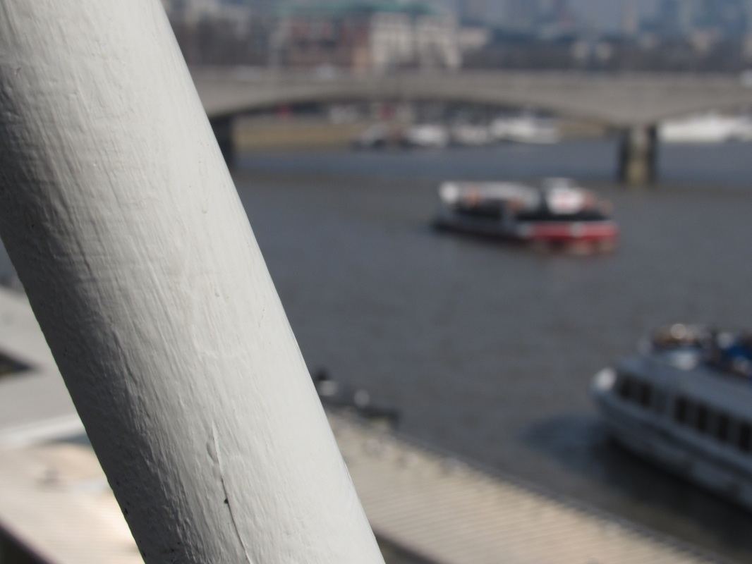
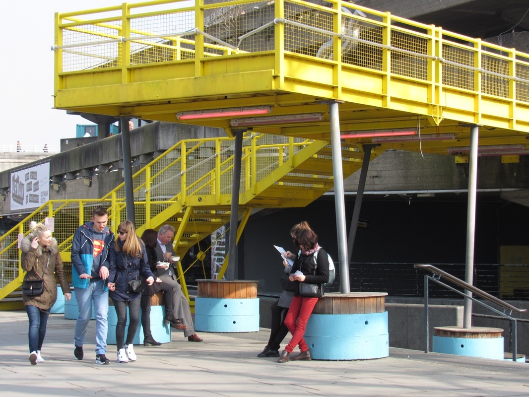
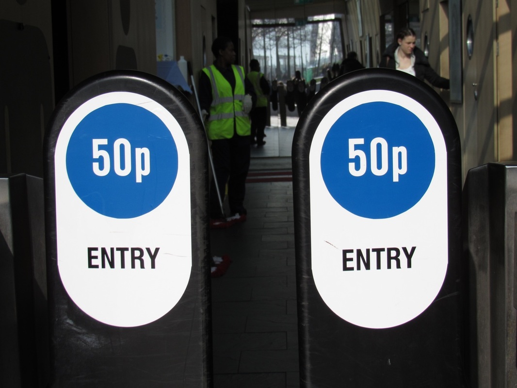
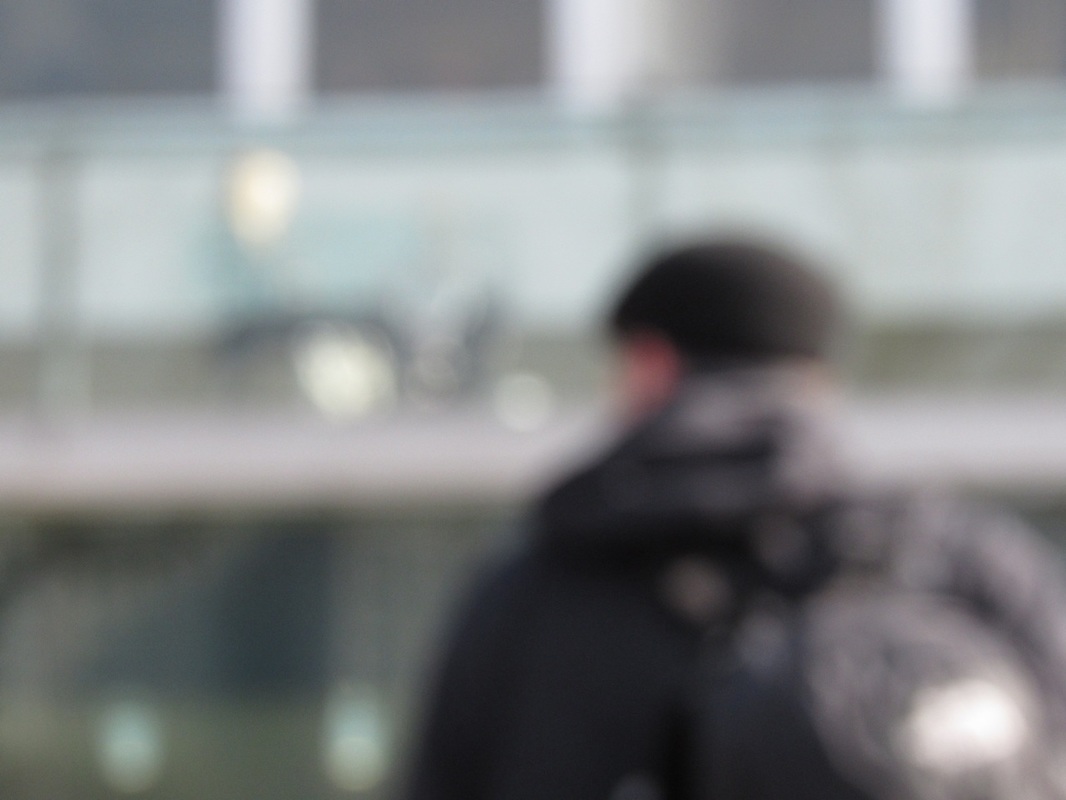
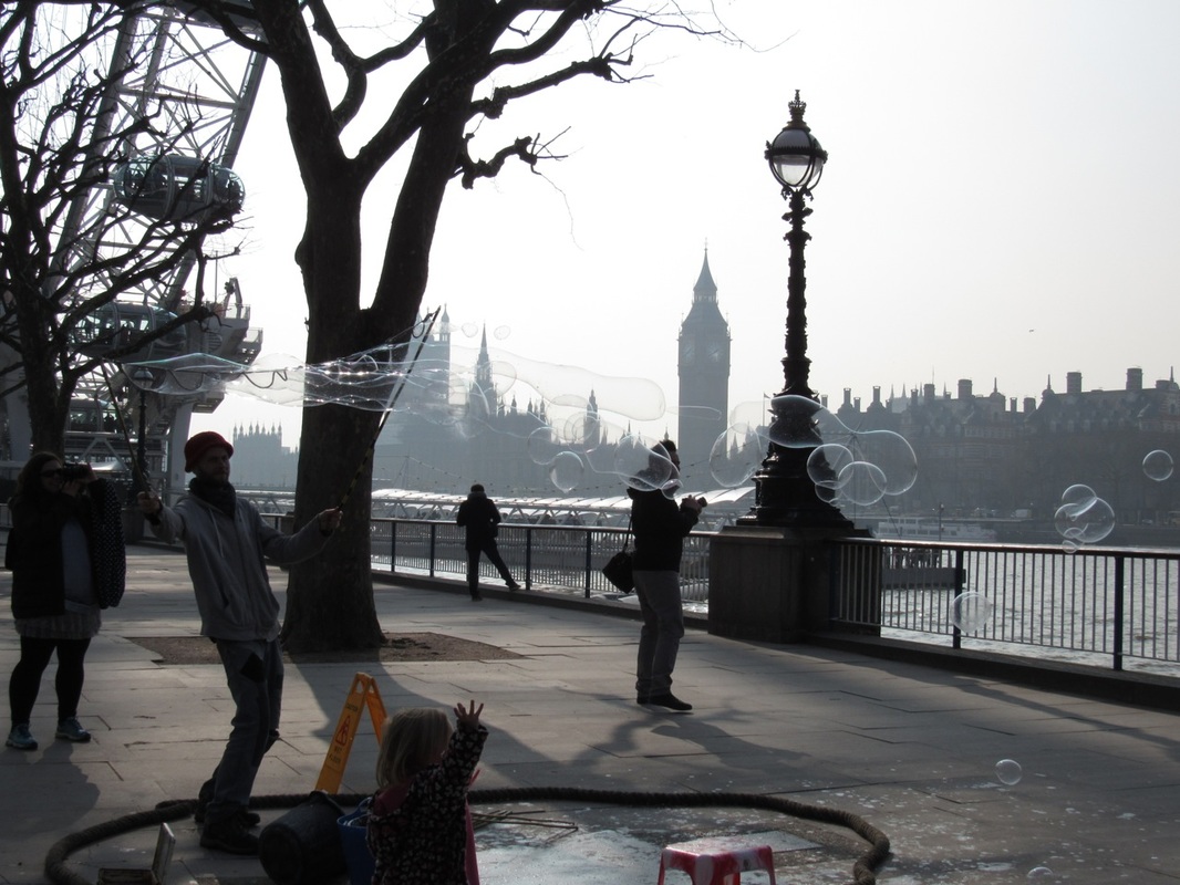
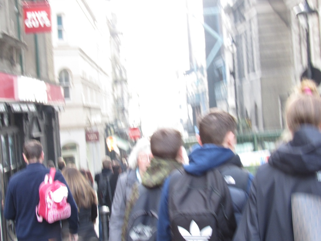
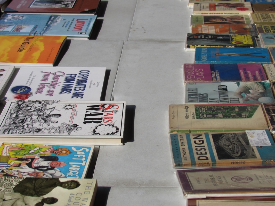
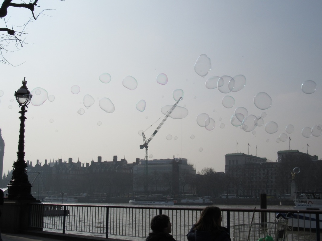
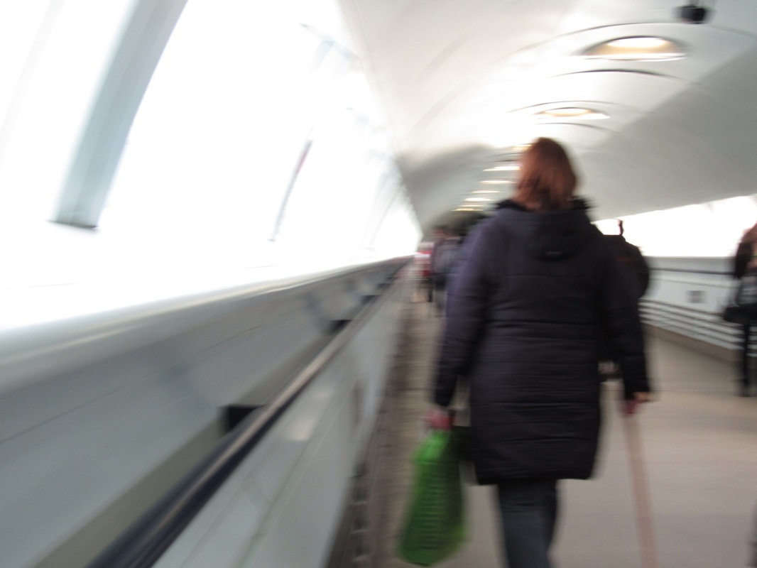
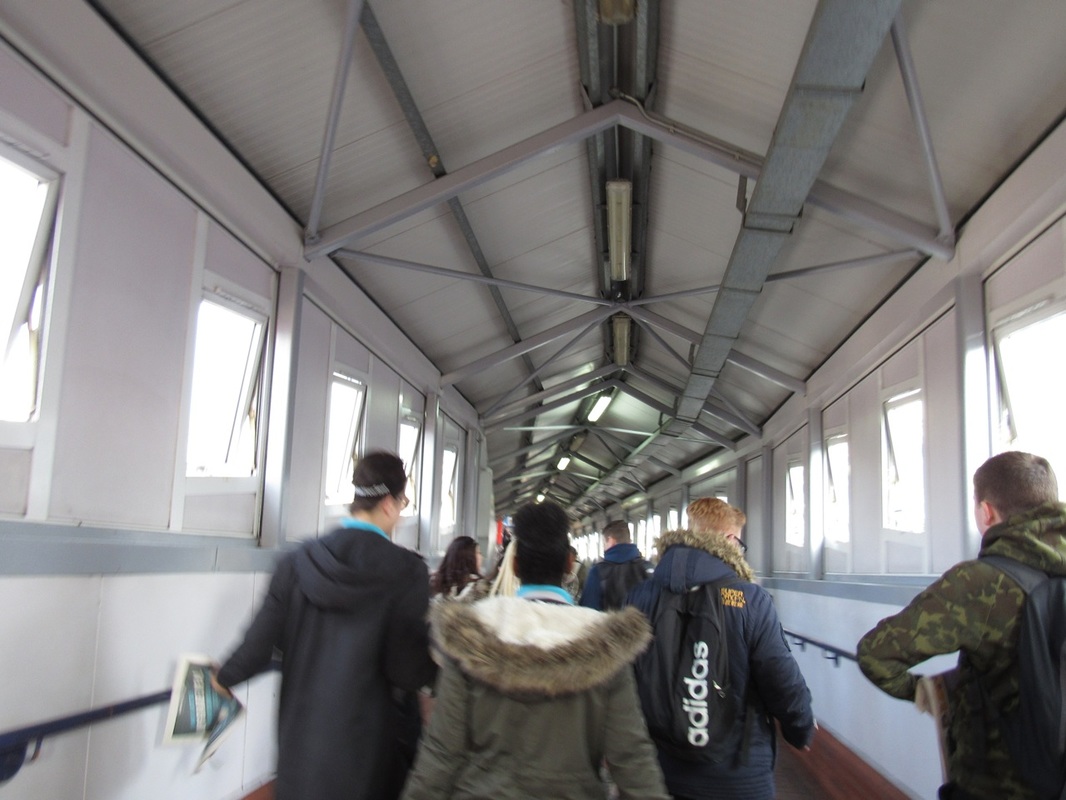
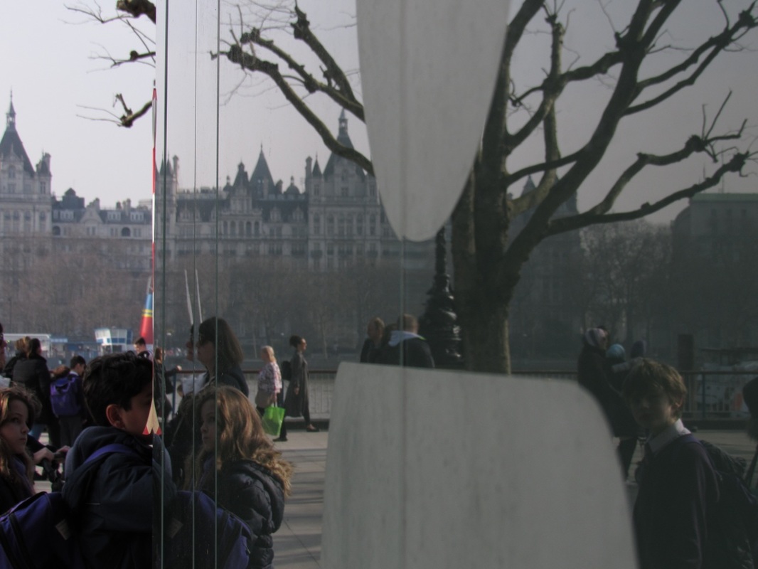
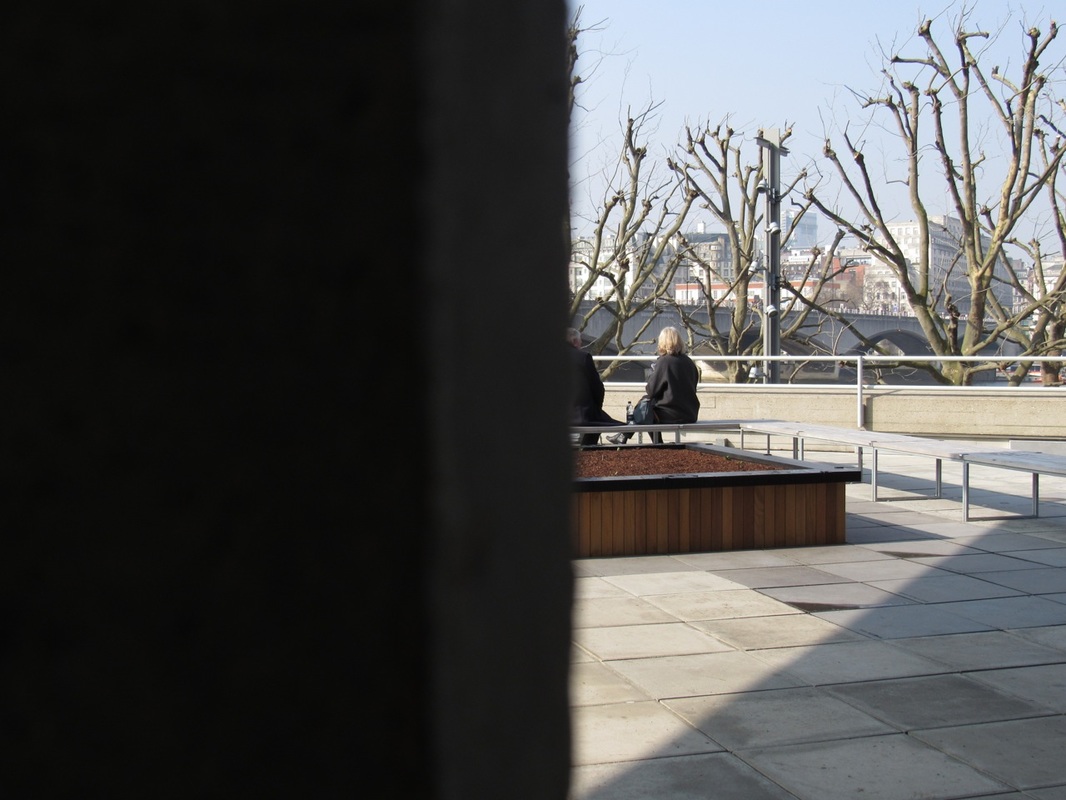
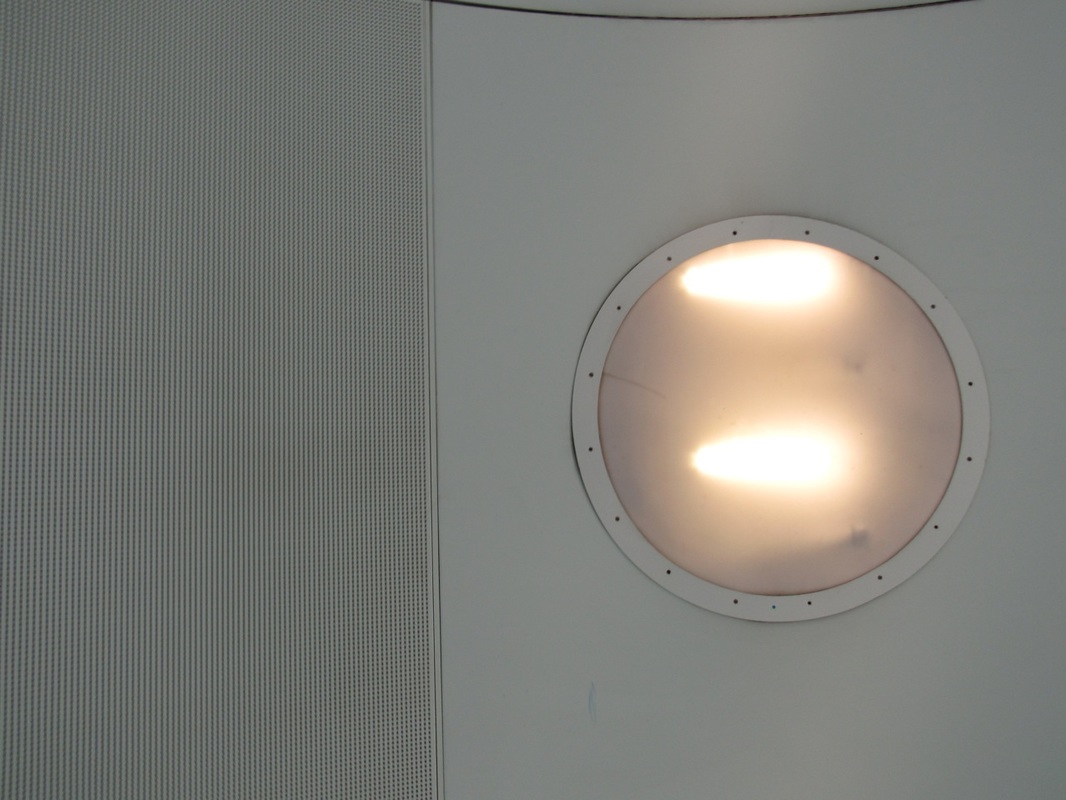
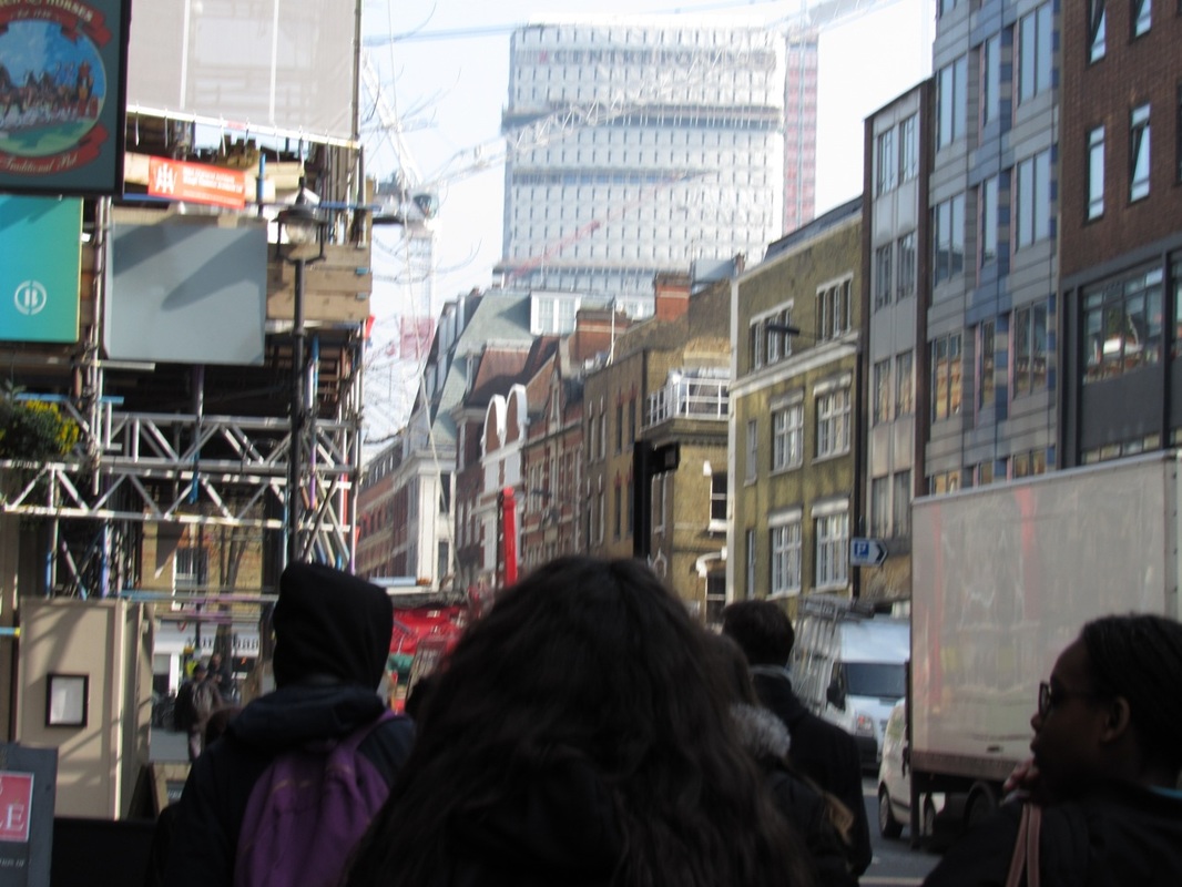
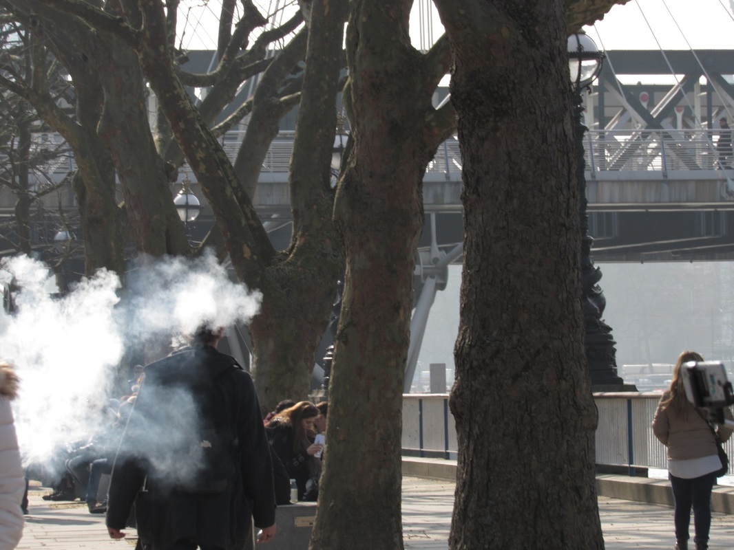
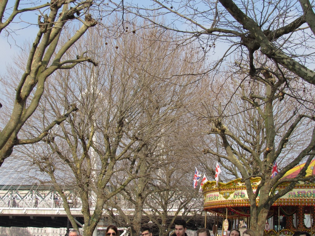
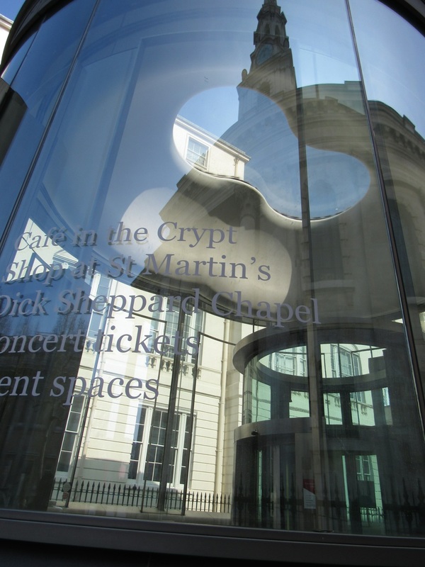
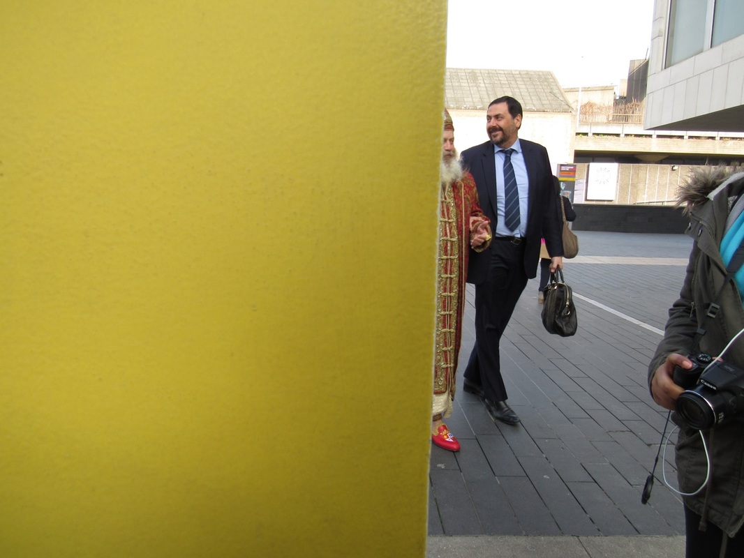
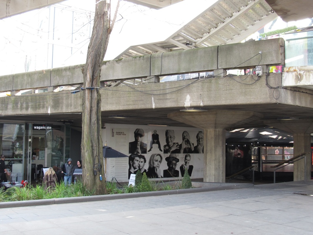
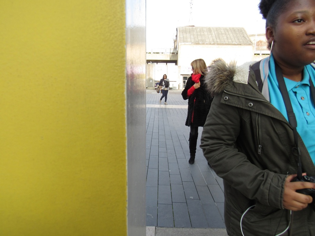
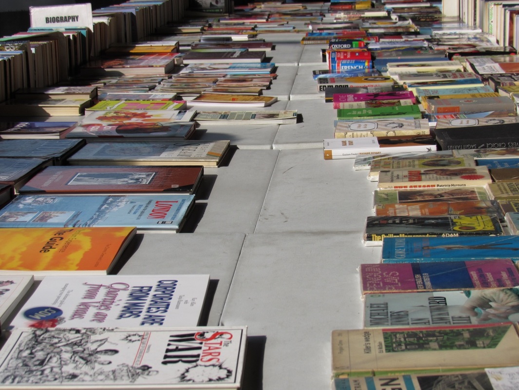
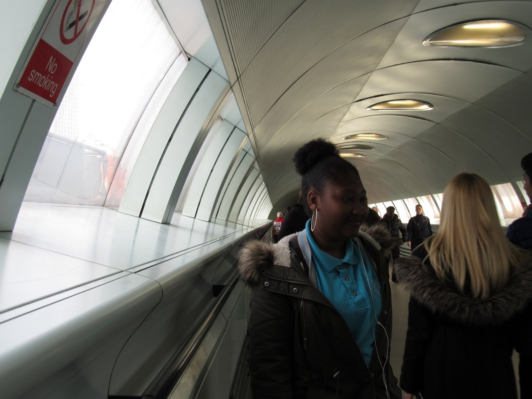
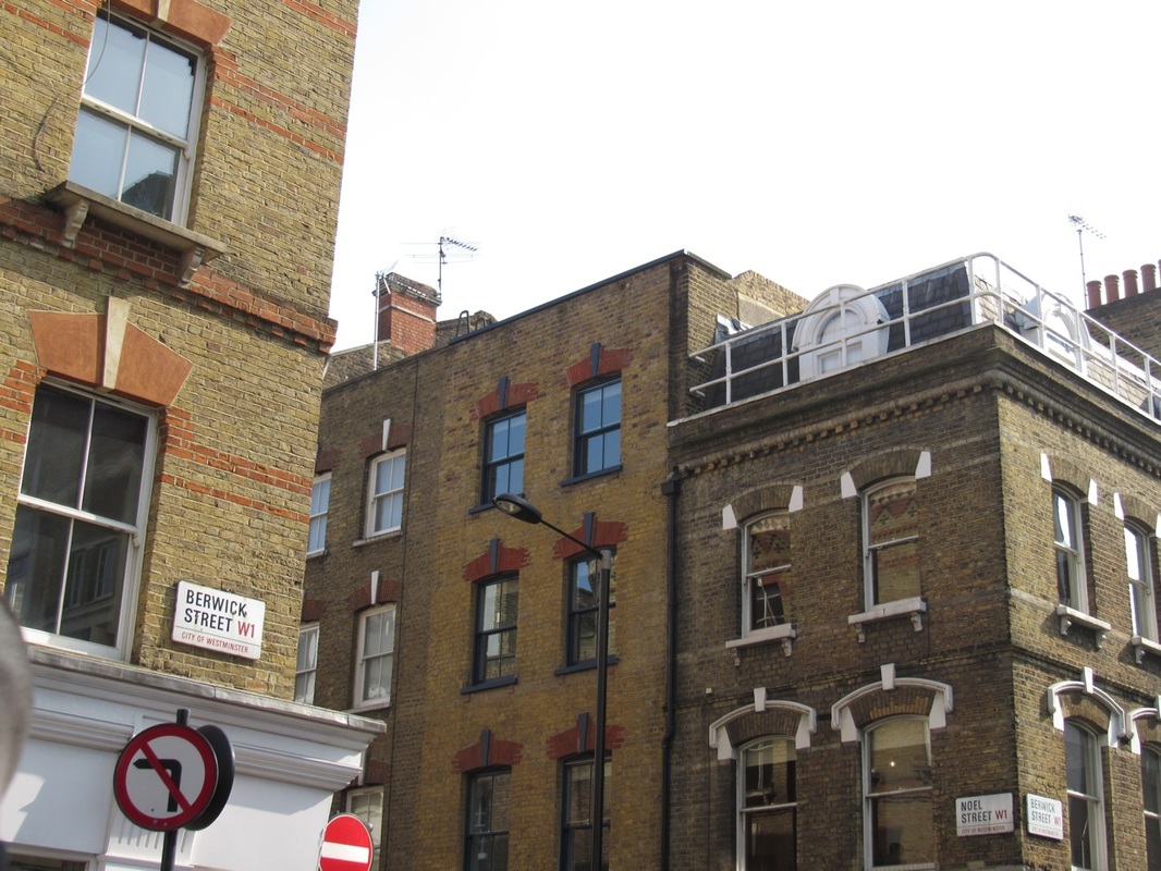
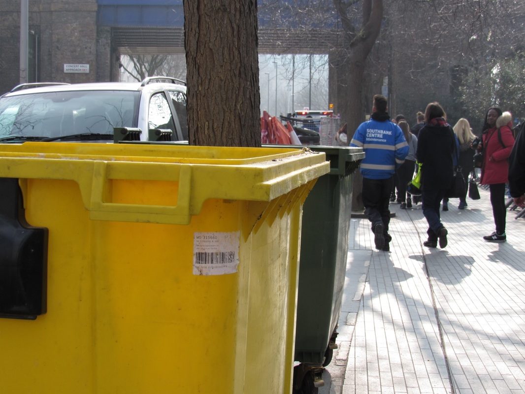
A visit to the Photographers' Gallery:
|
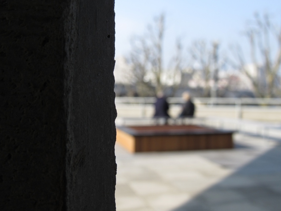
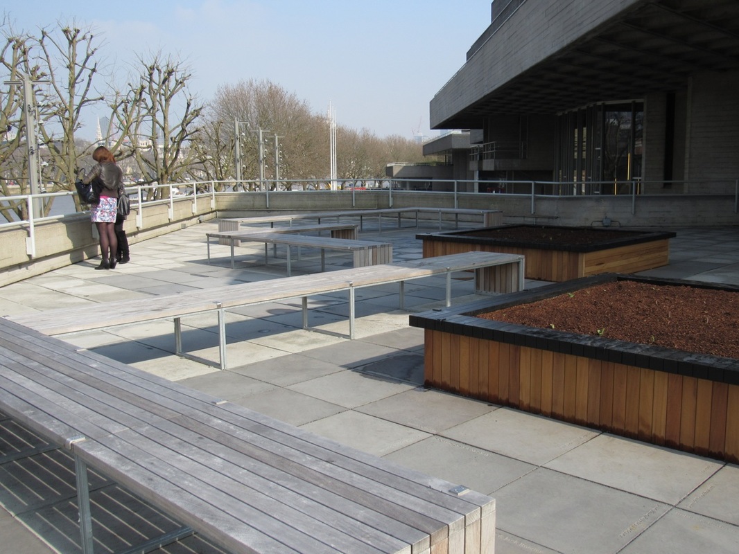
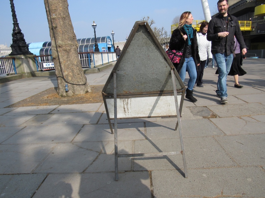
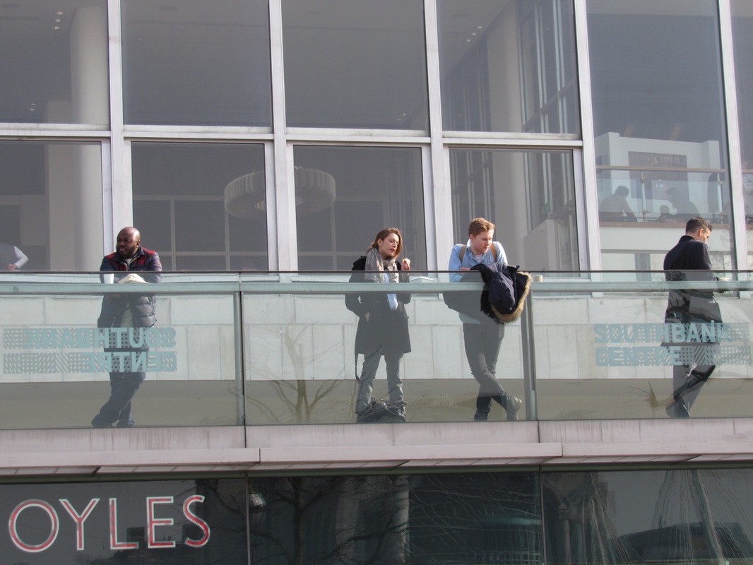
On the 11th of March we had the opportunity see Saul Lieter's work in an exhibition. We were able to see his more dated works with Kodachrome and some recent ones, using digital cameras. During the journey back we passed Southbank and took some Saul Lieter inspired photos.
|
|
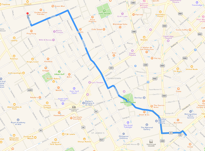
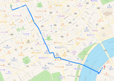
The maps show our journey from Charing Cross Station to The Photographs' Gallery and then to Southbank, where we took Saul Lieter inspired photos.
|
|


EVALUTION
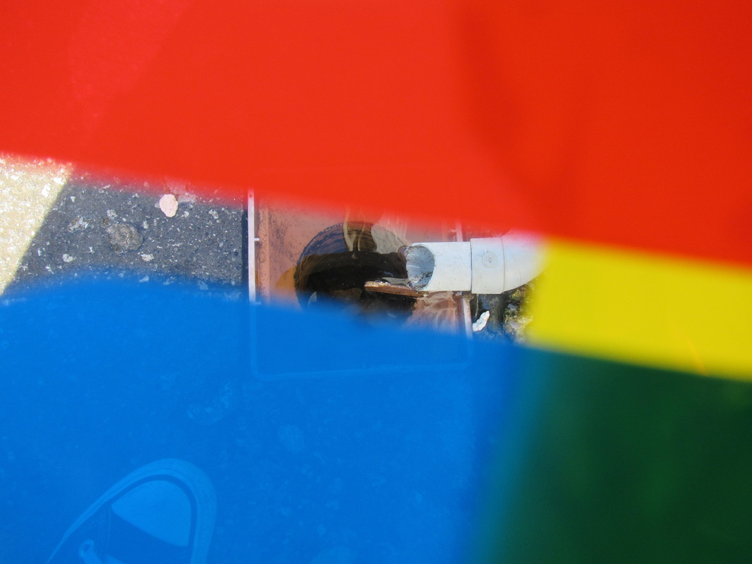
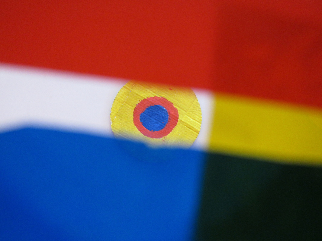
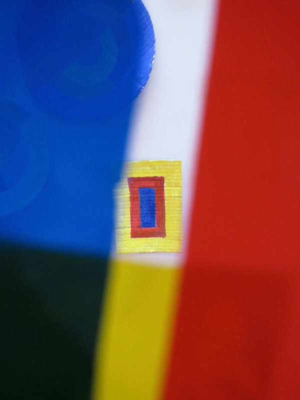
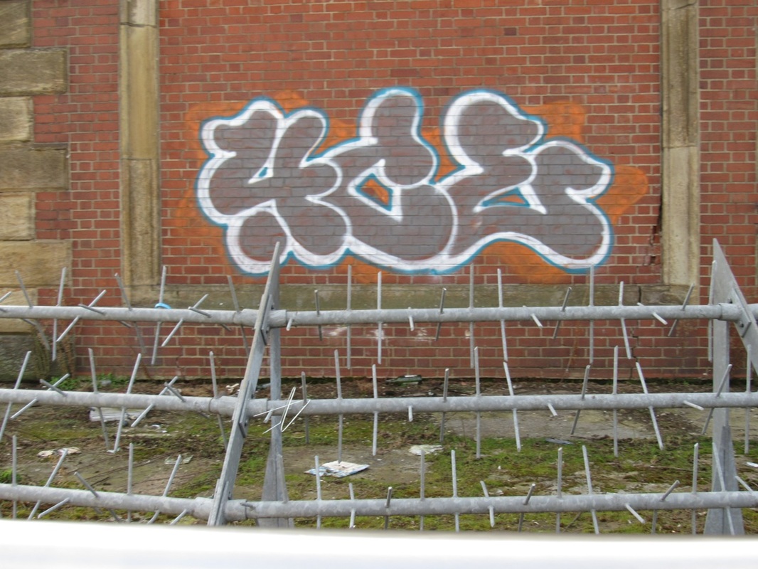
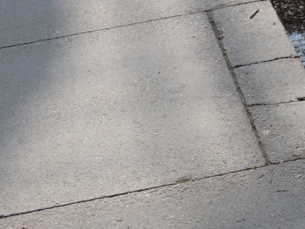
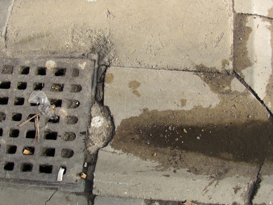
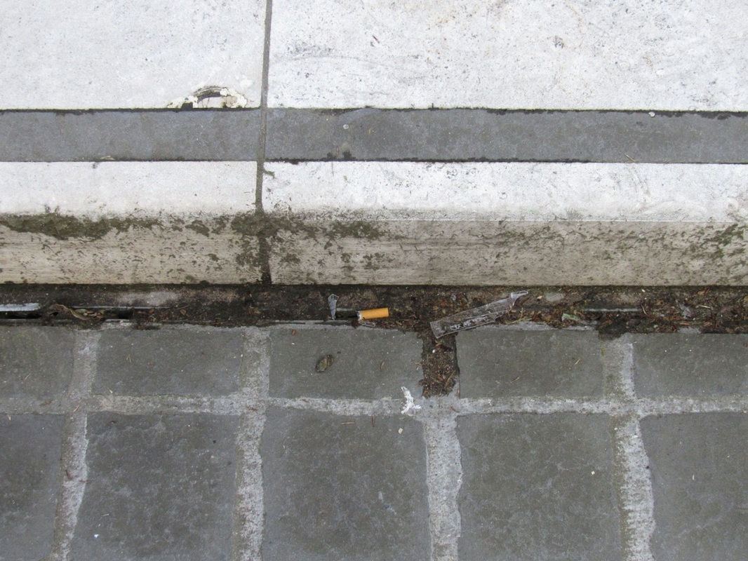
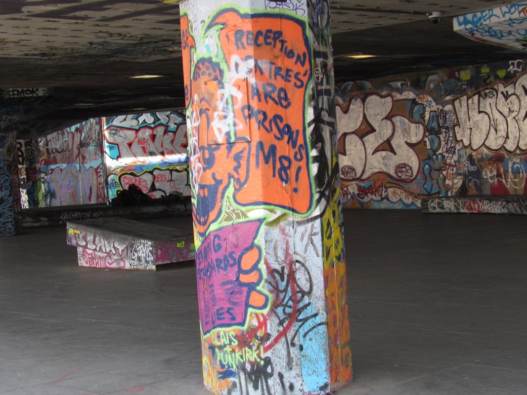
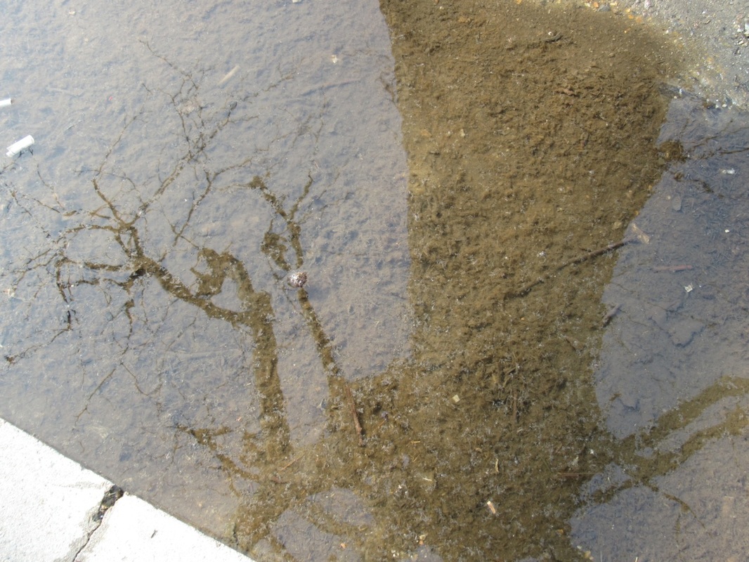
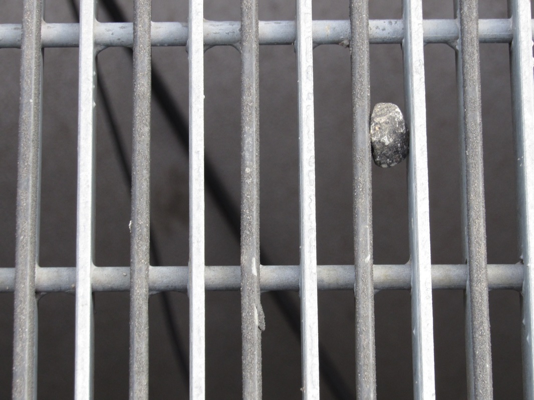
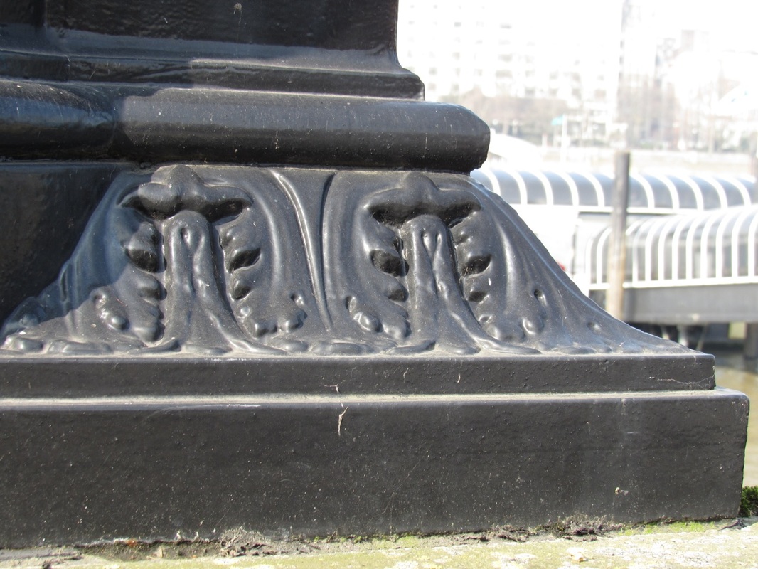
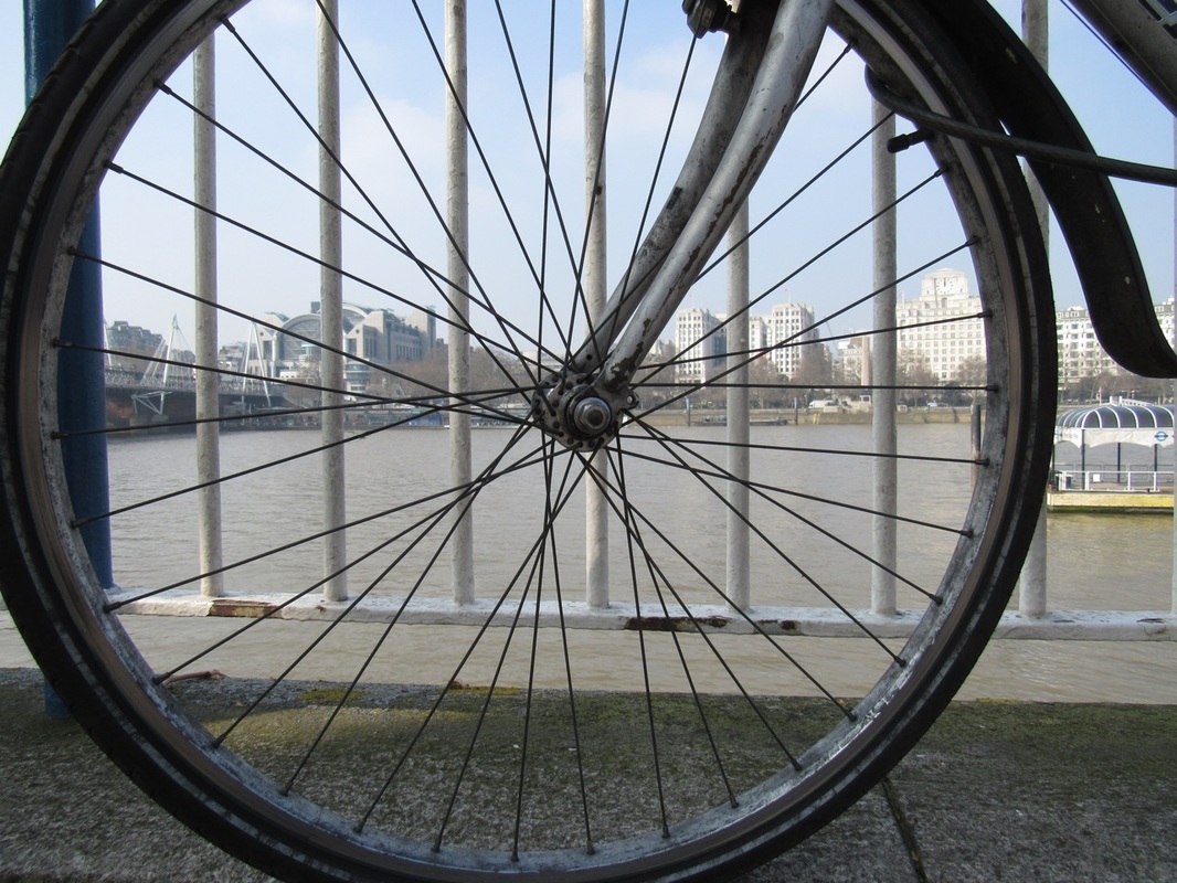
It was really interesting seeing the Saul Lieter exhibition at The photographs Gallery, and I really enjoyed it. I had an amazing time begin able to see all of his life time of working in one building. I was able to compare and contrast his photographs to his paintings. During our journey to and from the gallery and our visit to South Bank, I attempted to take Saul Lieter inspired photographs. I tried taking photographs of anything that seem/ looked out of the ordinary, also anything with bold colours compared to its surroundings. I looked out for glass and anything with reflections. I was really interested with the things on the ground for example, dirt, cigarettes, rain water, rocks ect. I really loved the graffiti skate-park in South Bank, it had extremely bold and loud colours that had some abstraction to them. For my final outcome I chose 6 of my favourite photographs that I thought complimented each other fairly well and mounted it on card.
It was really interesting seeing the Saul Lieter exhibition at The photographs Gallery, and I really enjoyed it. I had an amazing time begin able to see all of his life time of working in one building. I was able to compare and contrast his photographs to his paintings. During our journey to and from the gallery and our visit to South Bank, I attempted to take Saul Lieter inspired photographs. I tried taking photographs of anything that seem/ looked out of the ordinary, also anything with bold colours compared to its surroundings. I looked out for glass and anything with reflections. I was really interested with the things on the ground for example, dirt, cigarettes, rain water, rocks ect. I really loved the graffiti skate-park in South Bank, it had extremely bold and loud colours that had some abstraction to them. For my final outcome I chose 6 of my favourite photographs that I thought complimented each other fairly well and mounted it on card.
final outcome
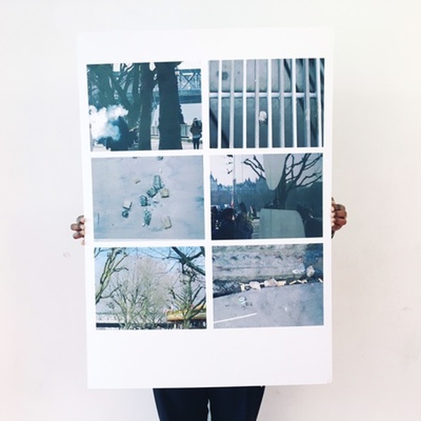
Overall, I am very pleased with my final outcome as it illustrates what I have learnt from this abstraction personal project. For example, the composition of the photos. I have some close ups of rocks, and different materials and then long distance photos, however the way that I have composed them stops the viewer from seeing the wider aspect of the piece and how they fit together. In addition, the colours are mostly grey and blue, almost monotone and compliment each other well. I feel that my final piece portrays what I have learnt from abstraction, Saul Leiter's exhibition and the research I have done about him, which is to always think carefully about I am photographing before I press the button. Furthermore, how I take my photographs is key to creating images that show my understanding of whole abstraction theme. Which is before I took these images I thought about the Rule of Thirds and how everything fit into the view finder.
